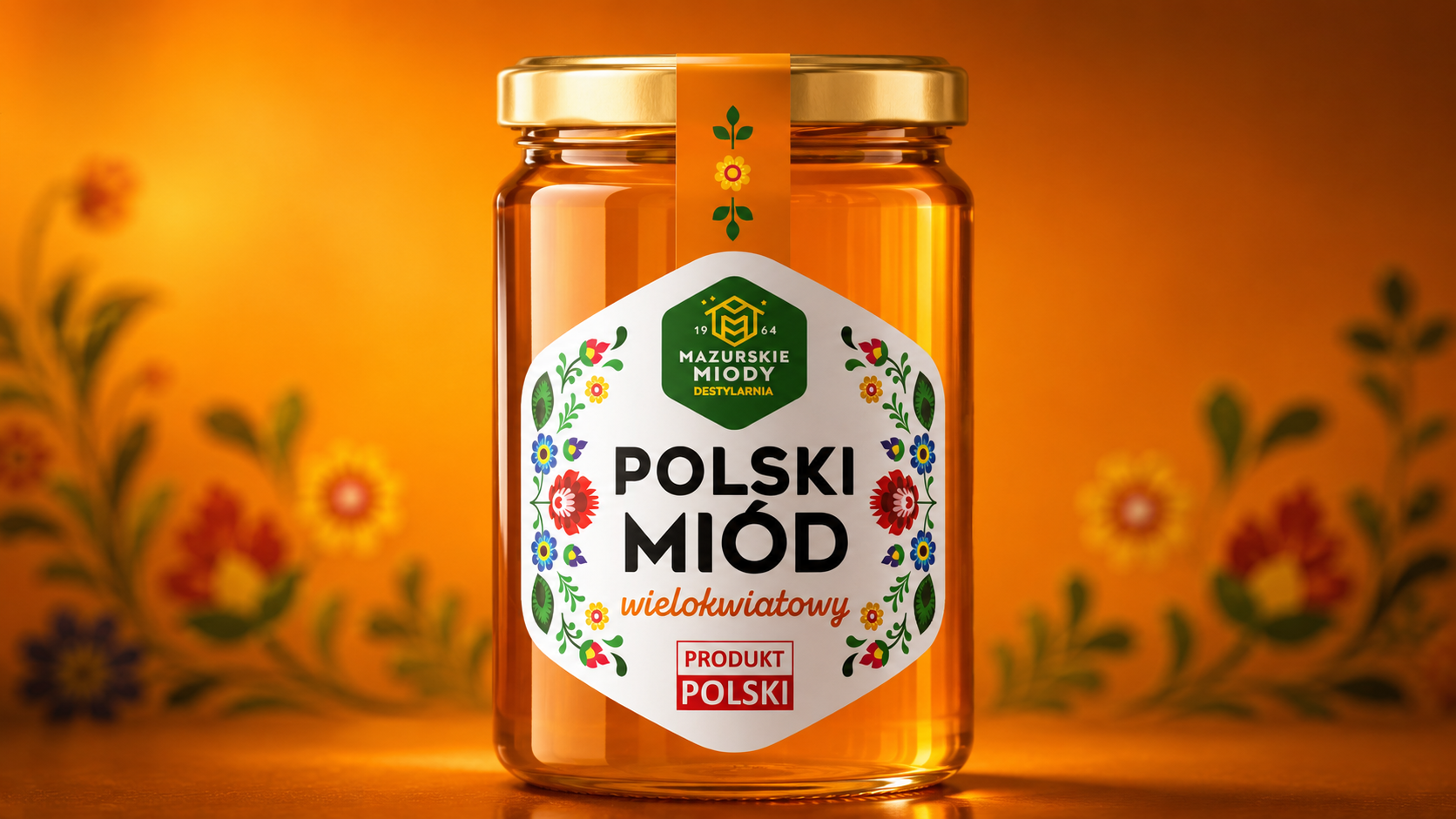
Mazurskie miody
Family tradition in a modern form
Mazurskie miody
Family tradition in a modern form
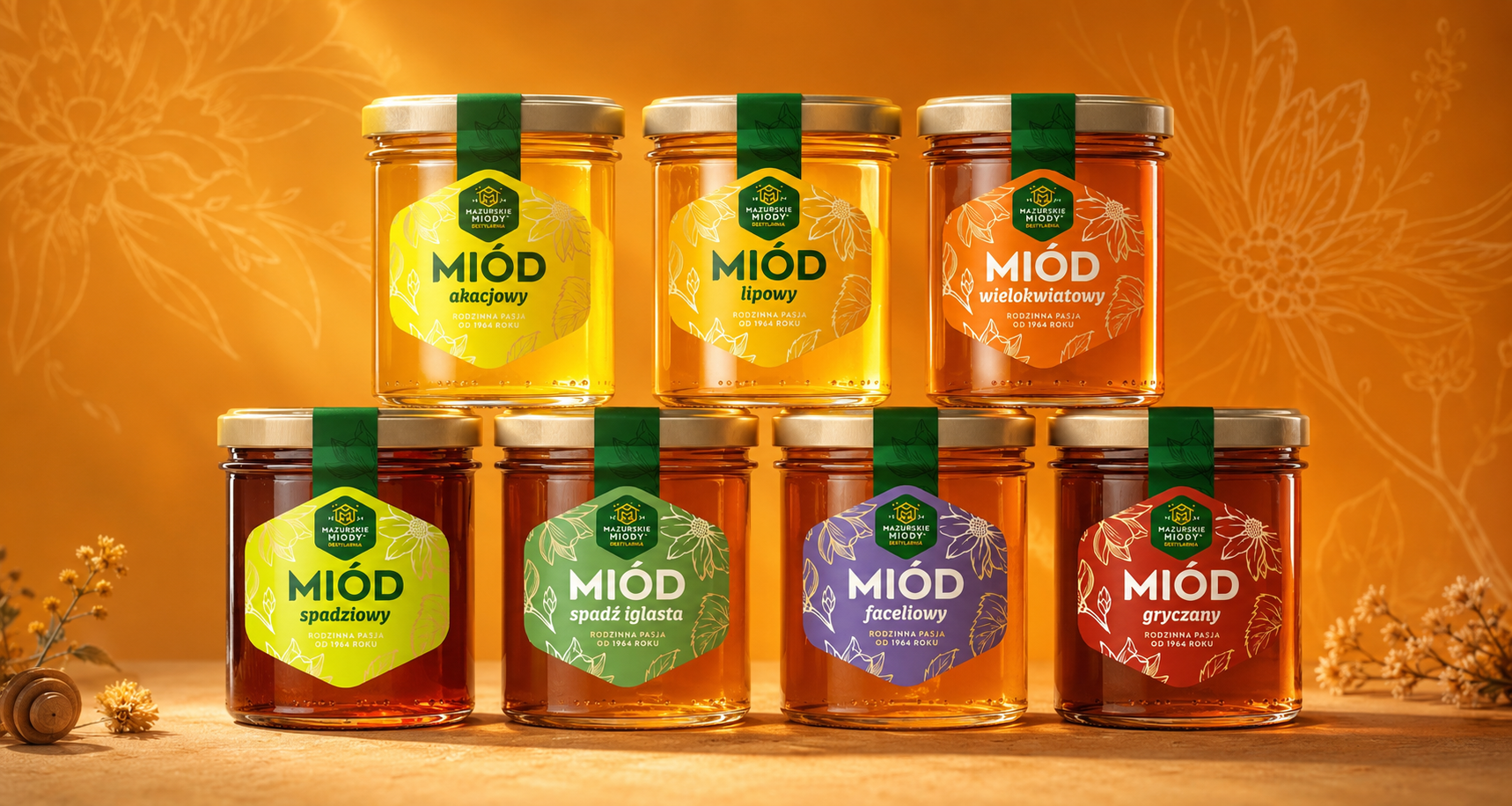
Working with Mazurskie Miody, we modernised the visual identity and the packaging in order to bring the brand's family origins together with a modern, professional image. The aim was to underline the authenticity, the quality and the local character of the products while preparing the portfolio for further growth.
We created a consistent label system built on legible typography, natural visual codes and a clear distinction between variants. The design showcases the honeys' provenance and craft character while remaining approachable and appealing to the contemporary consumer.
The end result is a recognisable, credible and flexible brand that stands out on shelf more effectively, brings order to the range and builds on the value of a family tradition in a modern guise.


Scholler
Premium-class design
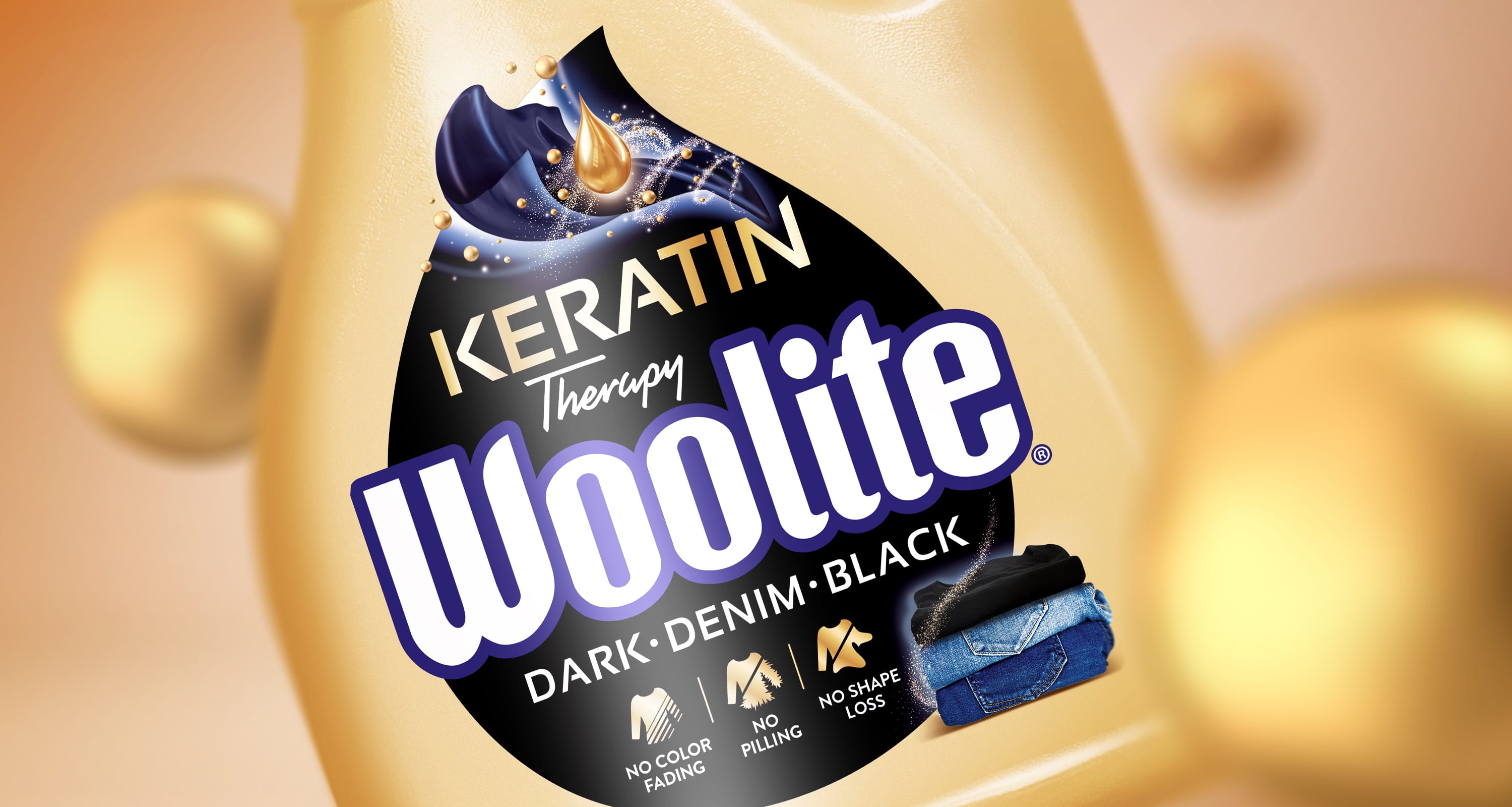
Woolite
We deliver the Woo effect!
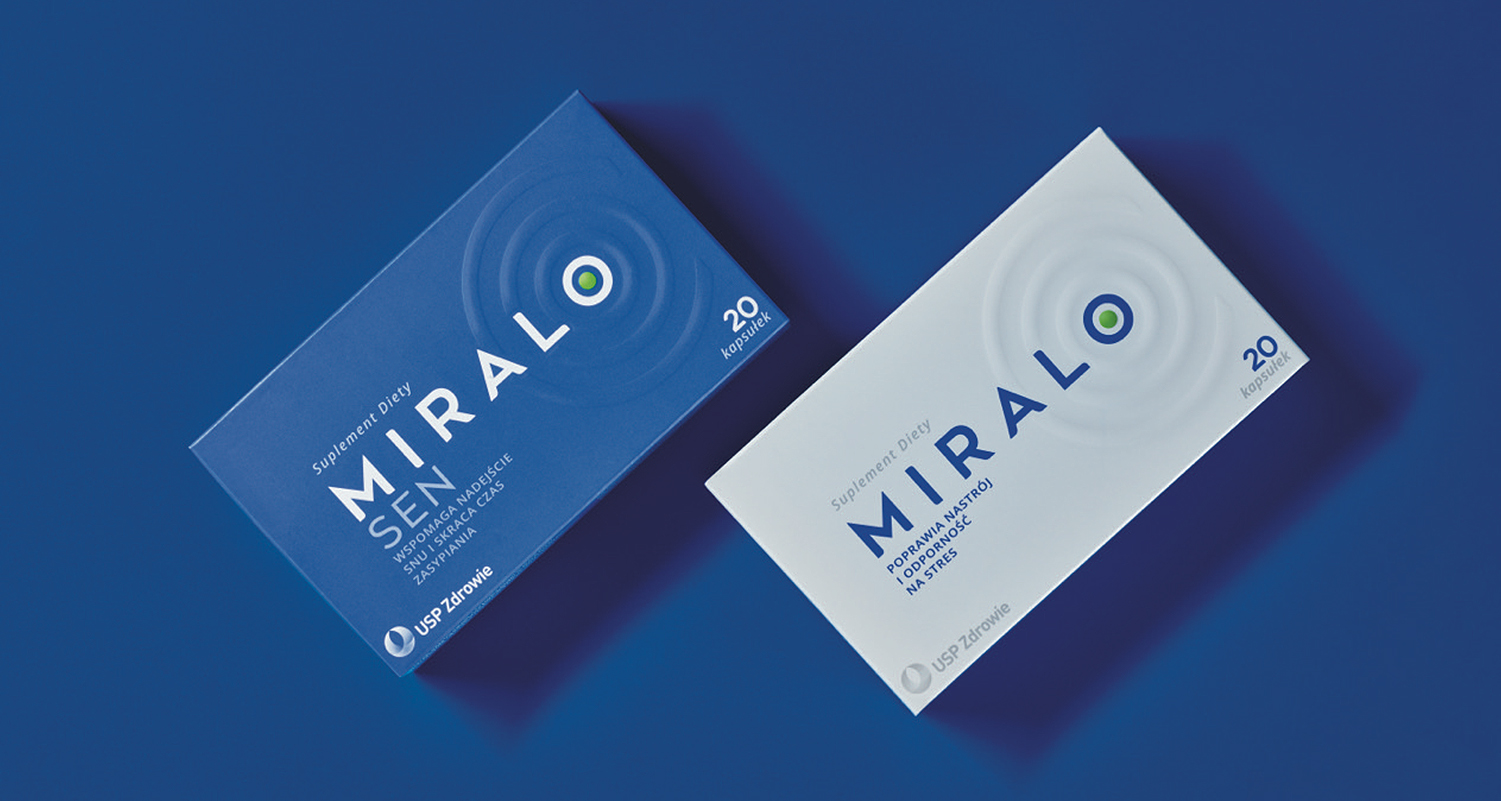
Miralo
A harmony of calm, sleep and design

Blistex
Blistex
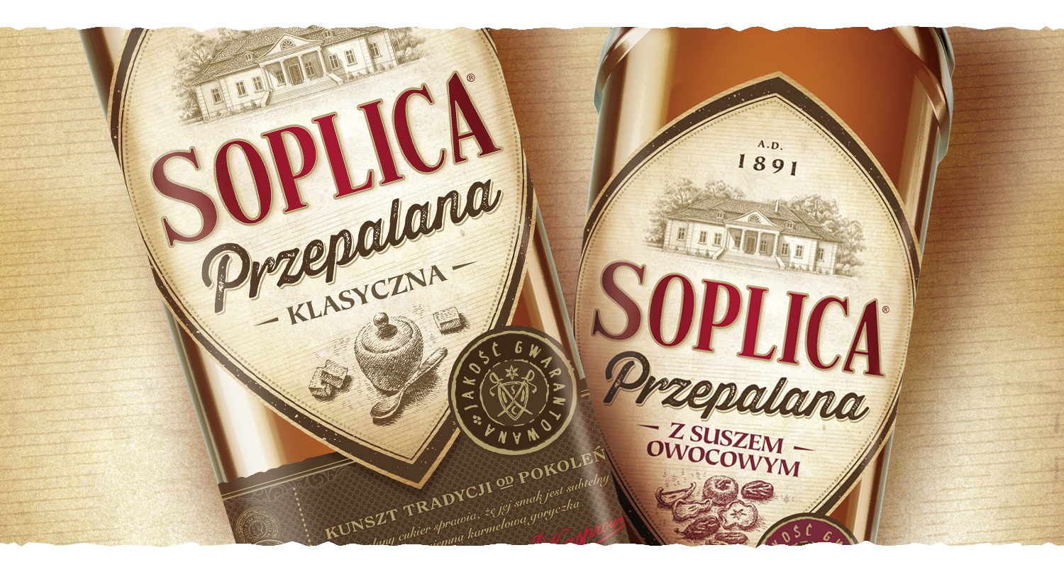
Soplica przepalana
A design journey back to the past
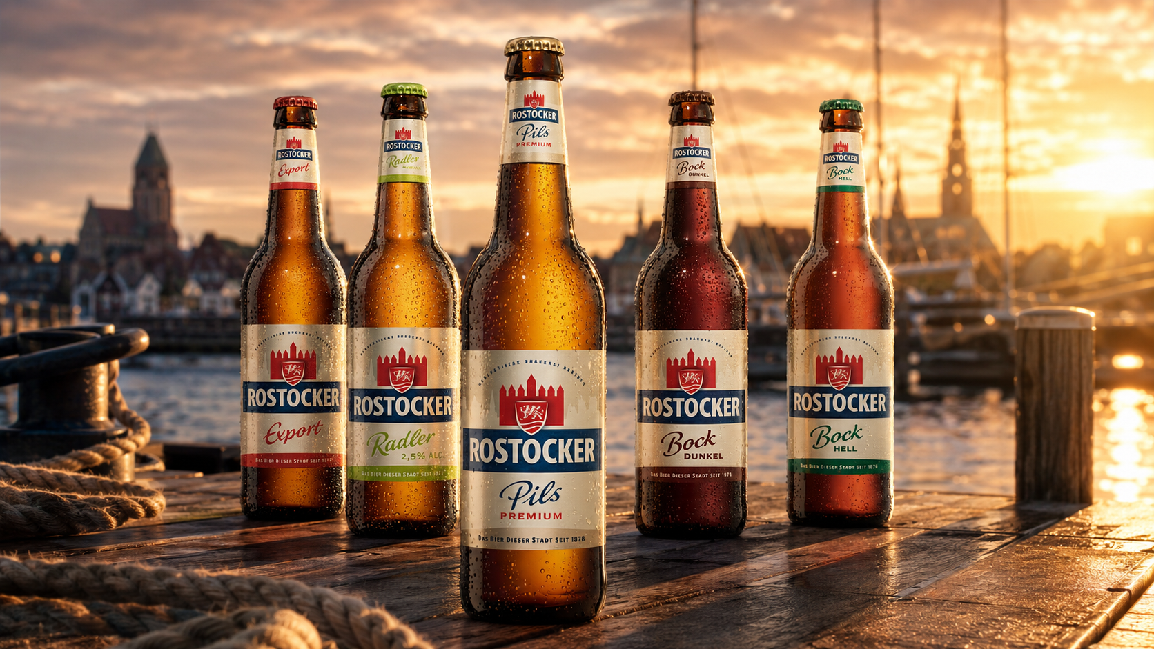
Rostocker
Rostocker
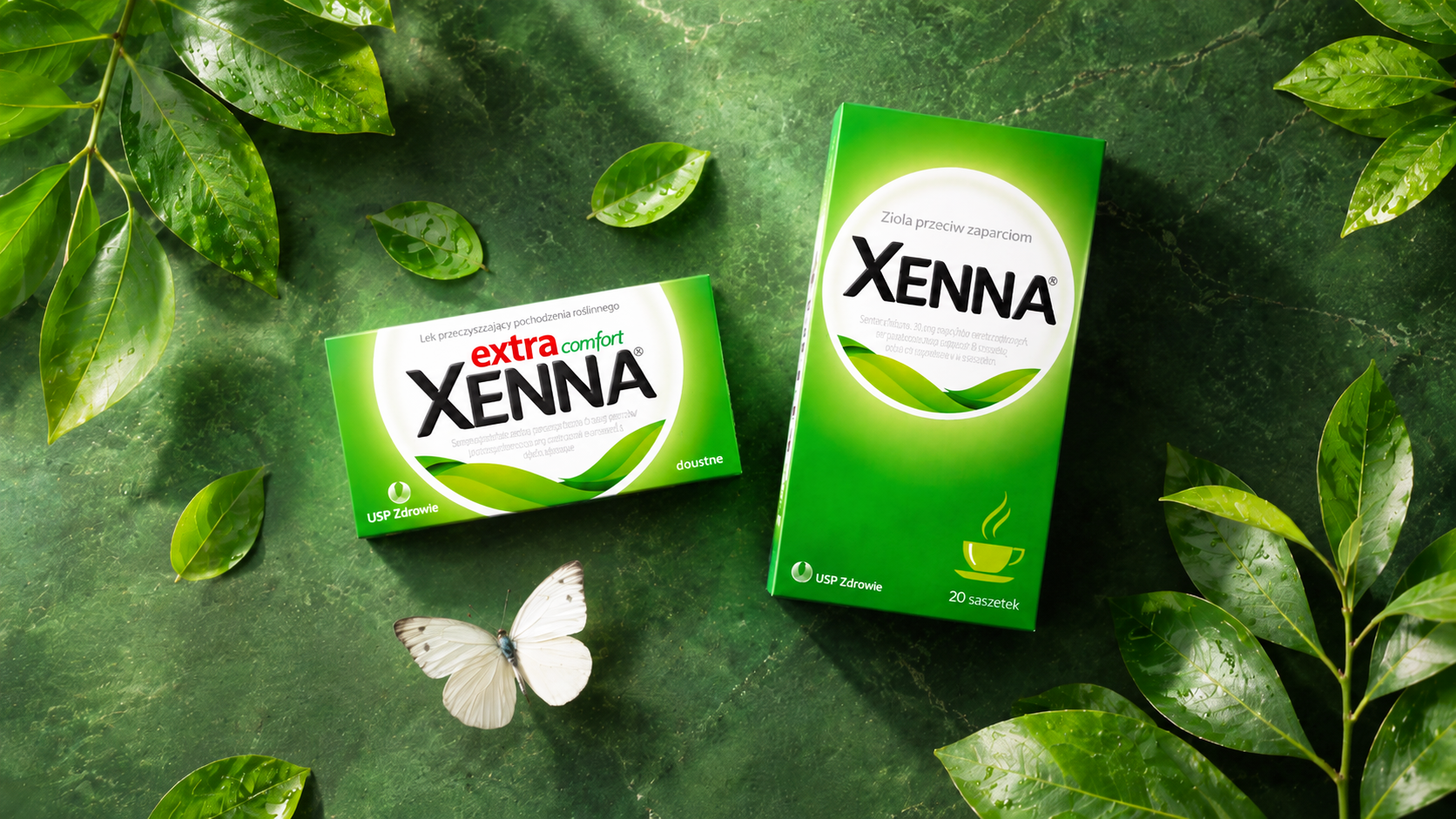
Xenna
Working on an iconic brand