Ottakringer
Working on a cult brand
Ottakringer
Working on a cult brand
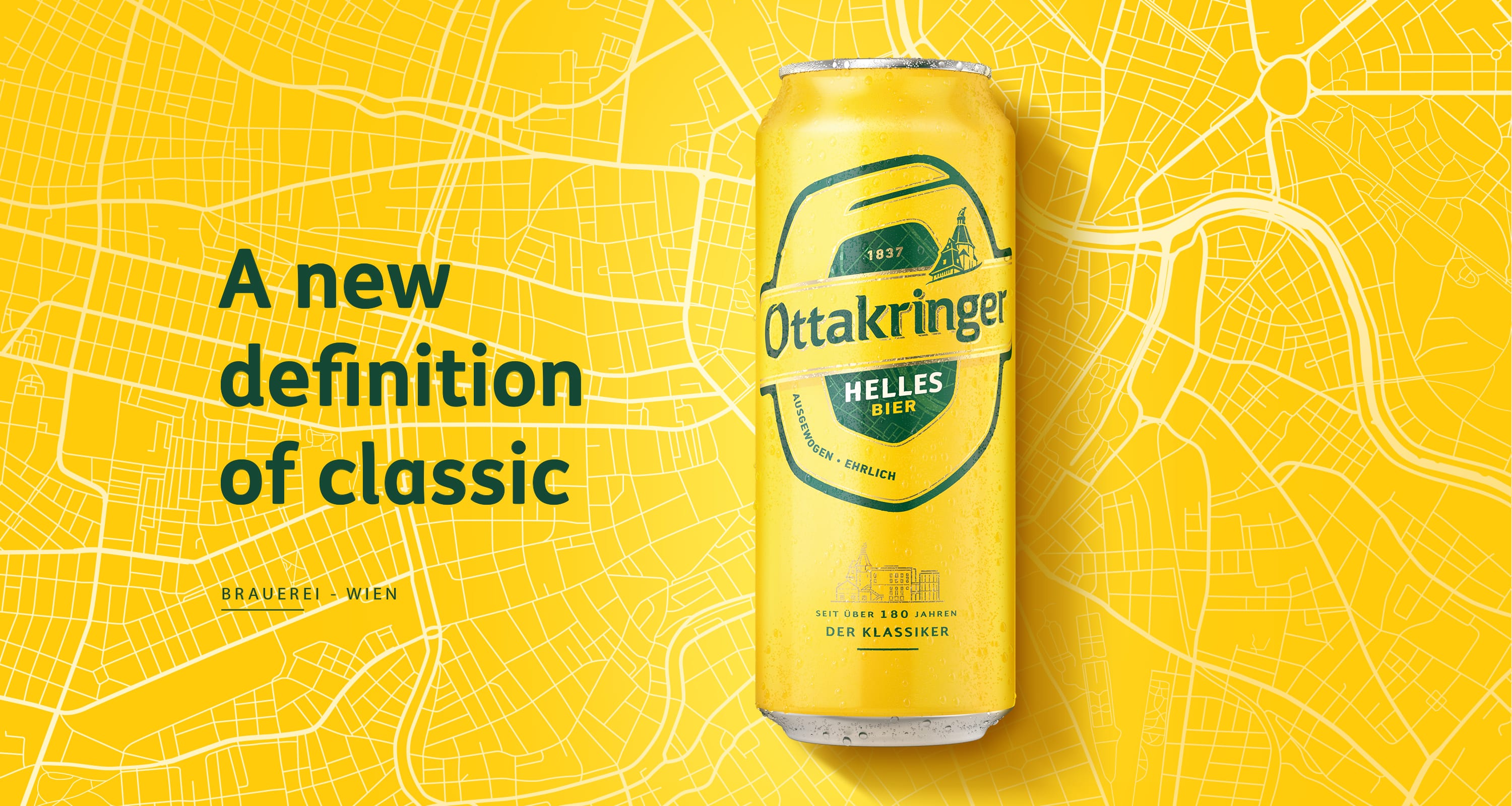
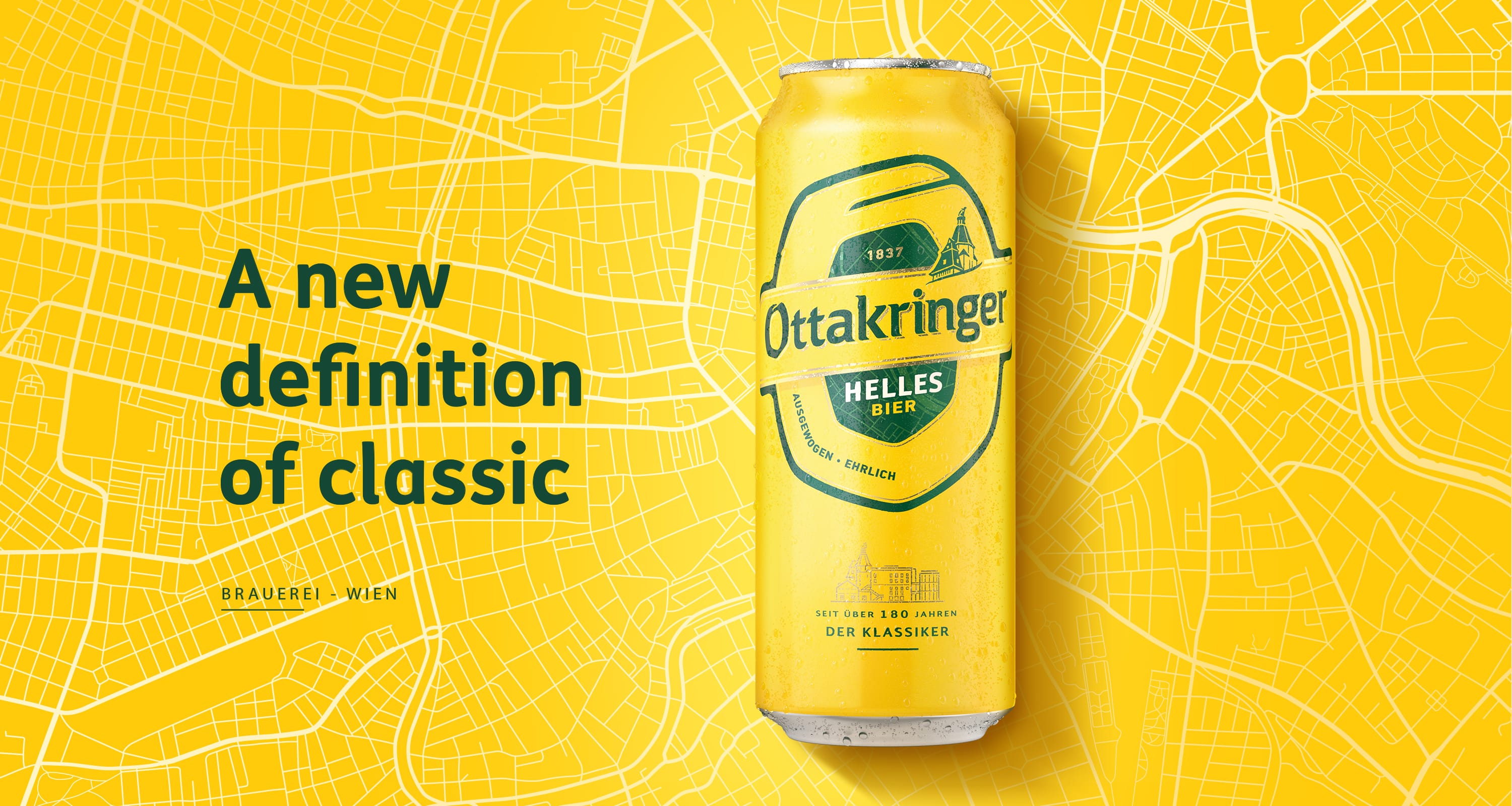
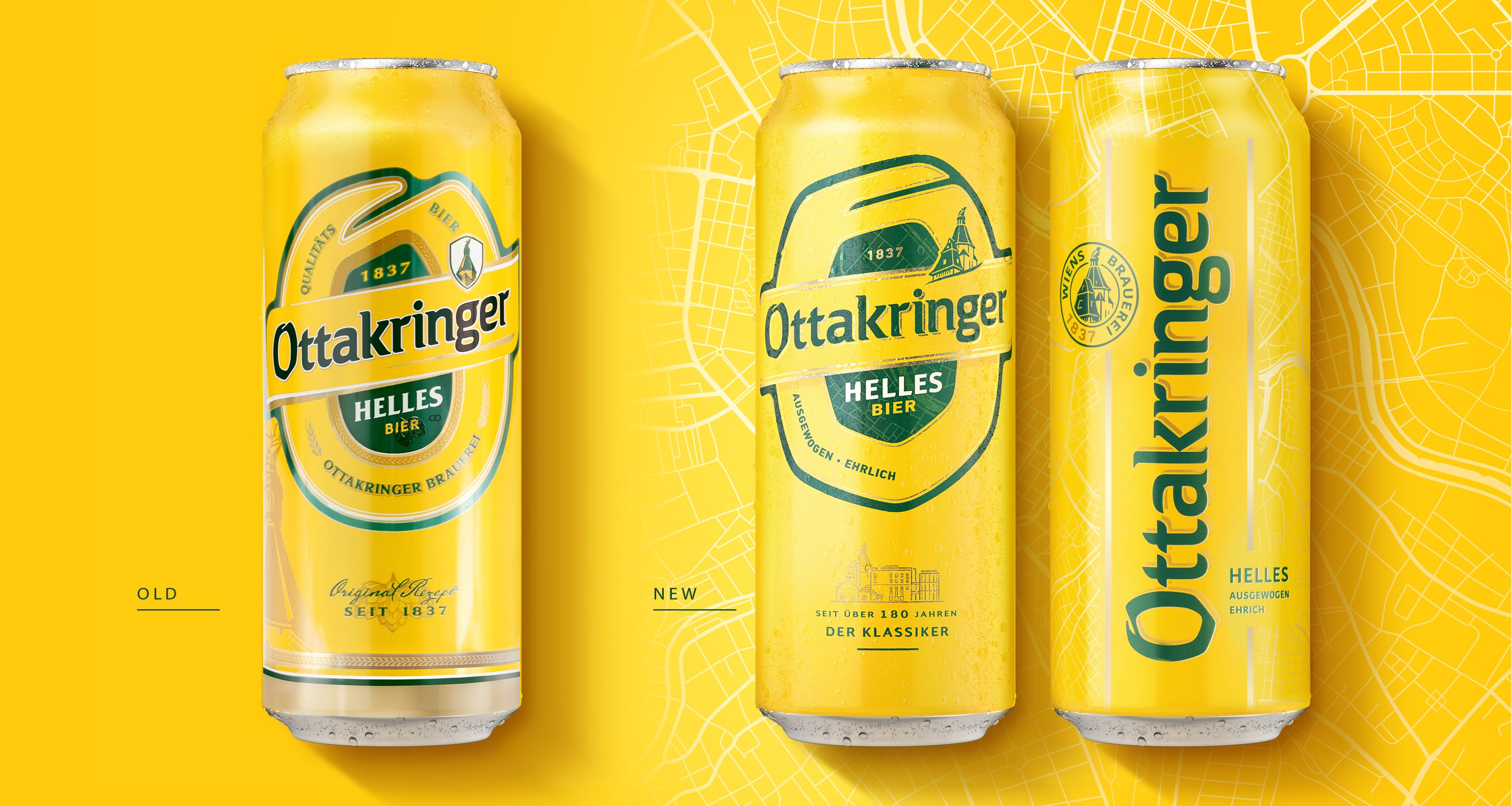
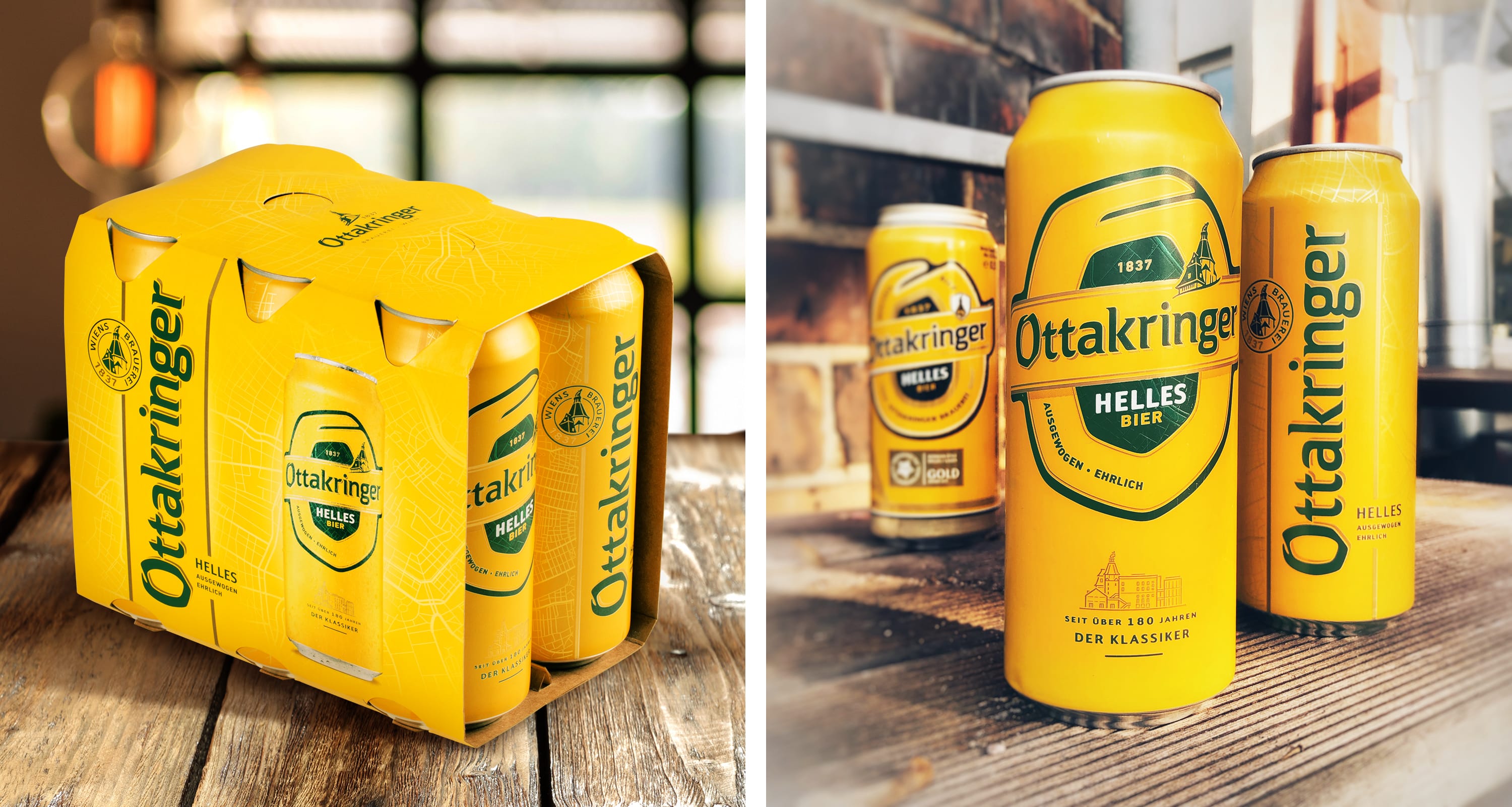
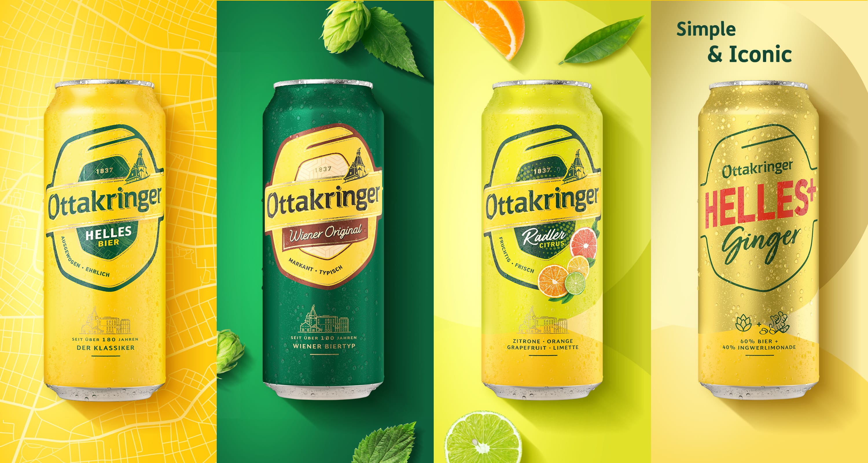
For the Viennese brewery Ottakringer we revitalised the brand and its packaging with the aim of reaching younger audiences without losing the loyalty of existing drinkers. The project set out to bring together the urban character of Vienna and the tradition of a family brewery.
We simplified and modernised the visual language, put the portfolio architecture in order and created a system that works both on packaging and in out-of-home communication. Bold typography and consistent variant codes strengthen recognition and give the brand a contemporary energy.
The result is a coherent, authentic and more accessible brand that keeps hold of its heritage, makes the products stand out on shelf more effectively and has flexible tools for further growth.

Viva con Agua
Water & Goldeimer
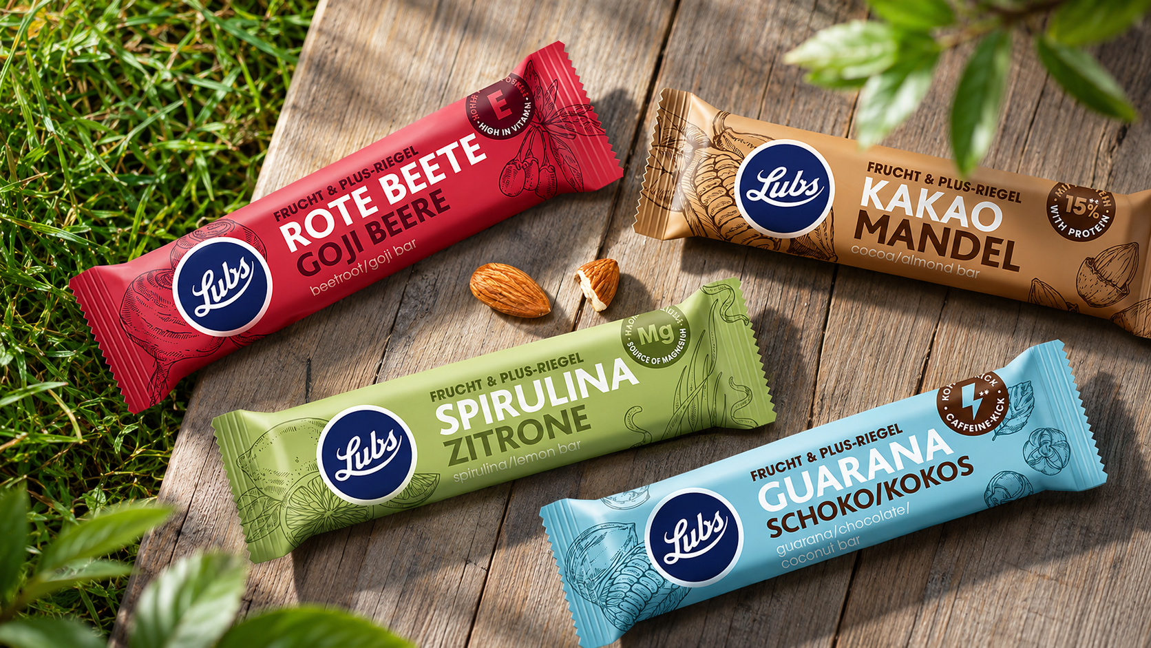
Lubs
Eco-friendly solutions for design

Scholler
Premium-class design
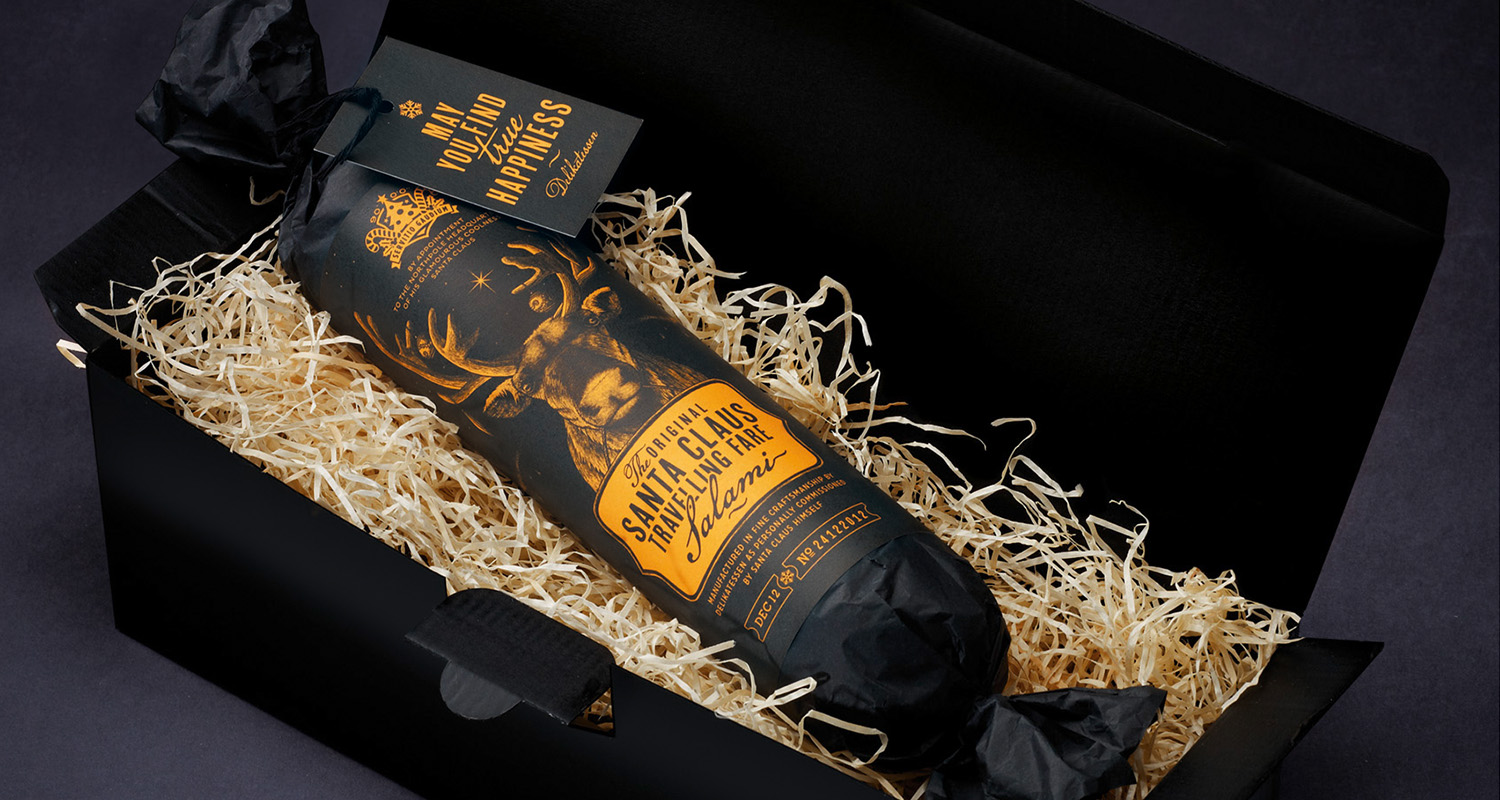
Santa Claus Travelling Fare Salami
Santa Claus Travelling Fare Salami
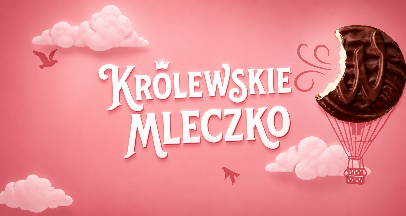
Królewskie Mleczko
We combine lightness with sweet pleasure

Iskial
Venturing into open waters

Hofstädter – Die Grillerei
We invite you to the barbecue
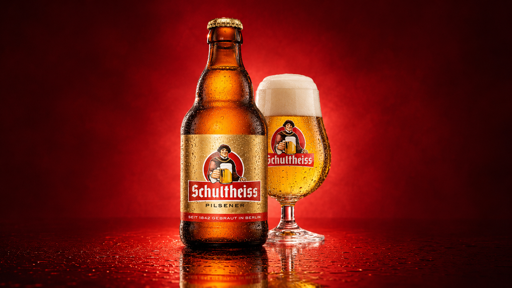
Schultheiss
Schultheiss
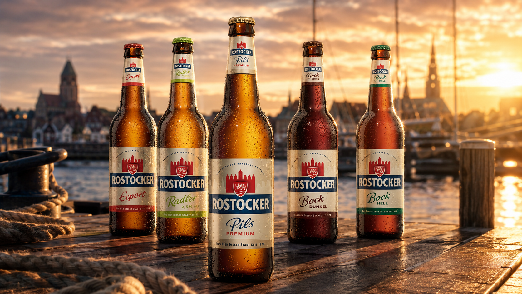
Rostocker
Rostocker