Herbitussin
Tradition in a new guise
Herbitussin
Tradition in a new guise
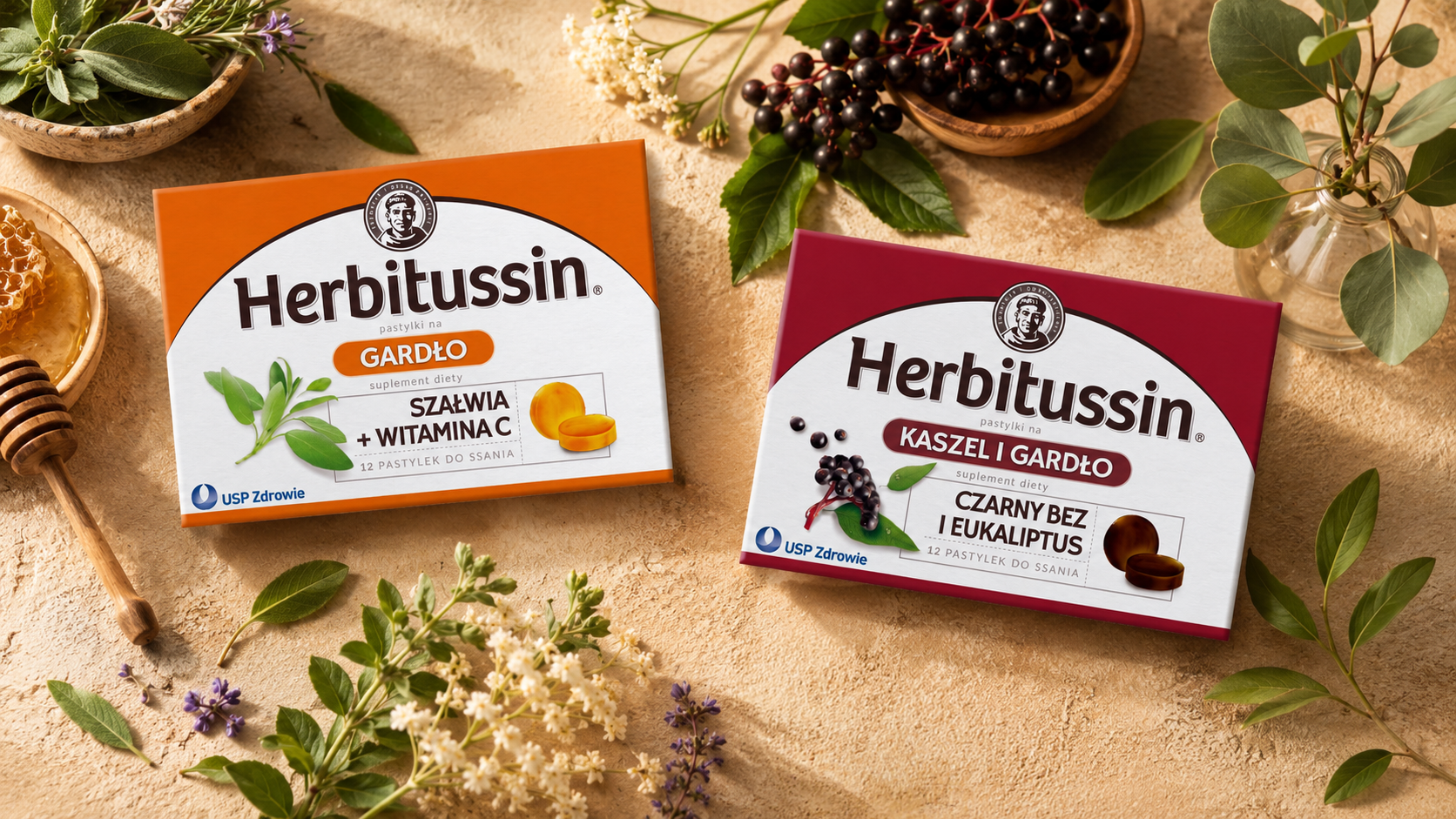
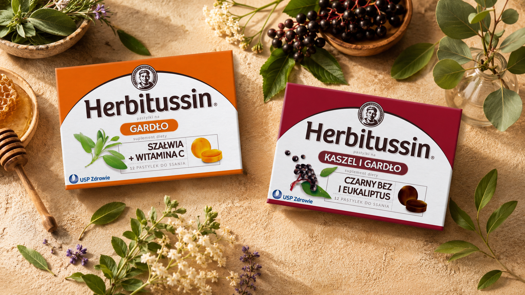
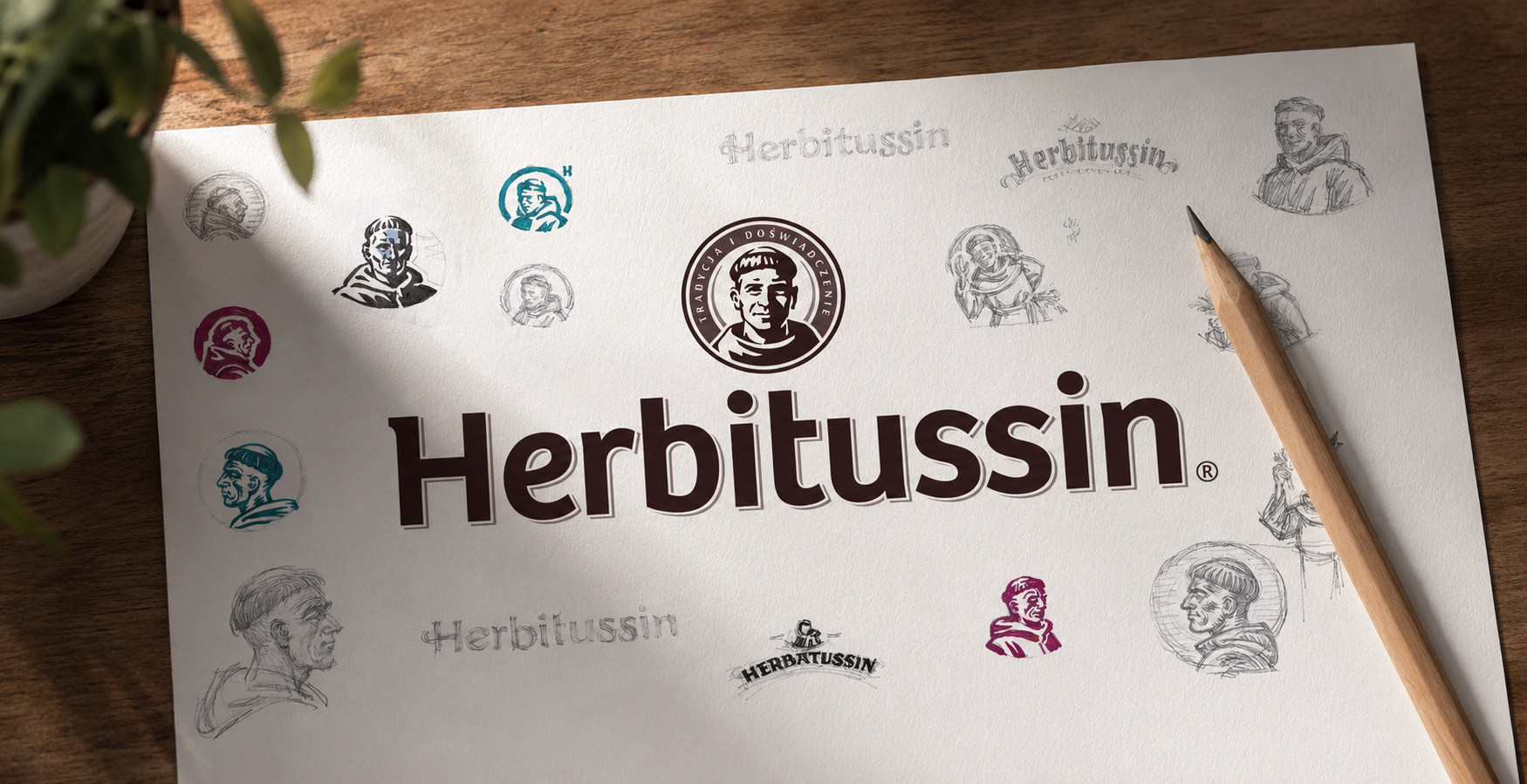
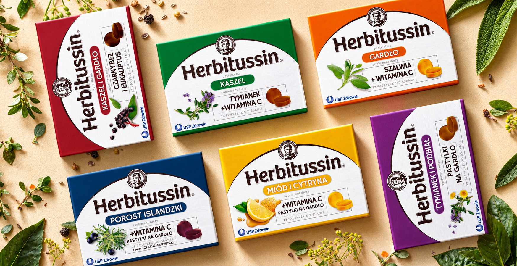
For Herbitussin we redesigned the packaging of natural throat lozenges, bringing together recipes rooted in herbal tradition and a contemporary expert image. The aim was to bring order to the portfolio, make the variants easier to tell apart and increase the products' appeal on the pharmacy shelf.
We created a consistent layout system in which botanical illustrations underline the natural composition, while a clear information hierarchy foregrounds the indication and the key benefits. The typography and colours combine the credibility of a medical category with the brand's warm, traditional character.
The result is a legible, recognisable and easily extendable portfolio that strengthens trust in the brand and communicates its natural origins more effectively.

Viva con Agua
Water & Goldeimer
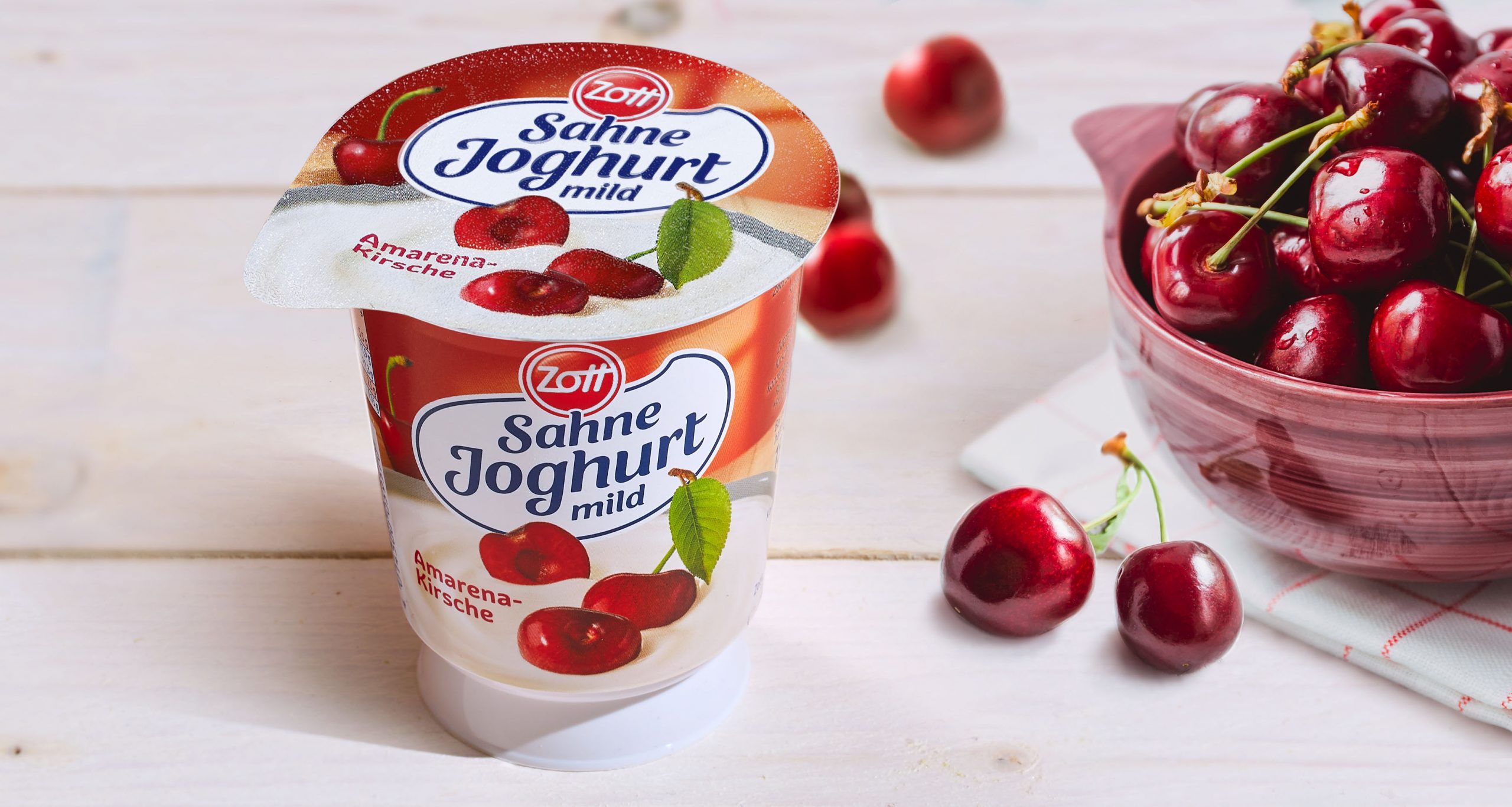
Zott Sahne Joghurt
A creamy relaunch

TCB Tokyo Cheesecake Bakery
An innovative gastro concept

Królewskie Mleczko
We combine lightness with sweet pleasure
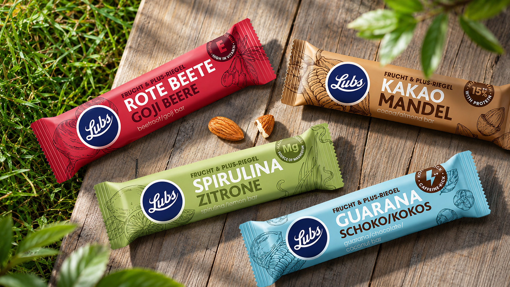
Lubs
Eco-friendly solutions for design
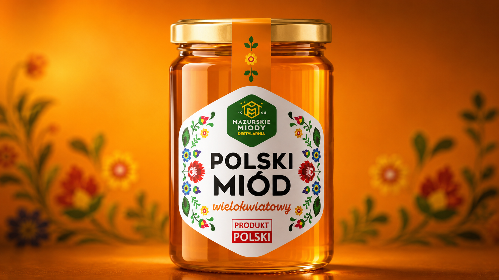
Mazurskie miody
Family tradition in a modern form

Legal Cakes
A brand that’s legal for everything!

Schultheiss
Schultheiss

Zielona budka
A well-known and well-loved brand
