Xenna
Working on an iconic brand
Xenna
Working on an iconic brand
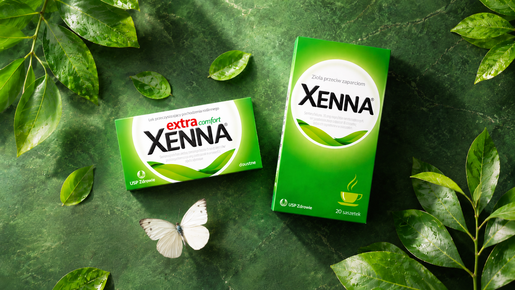
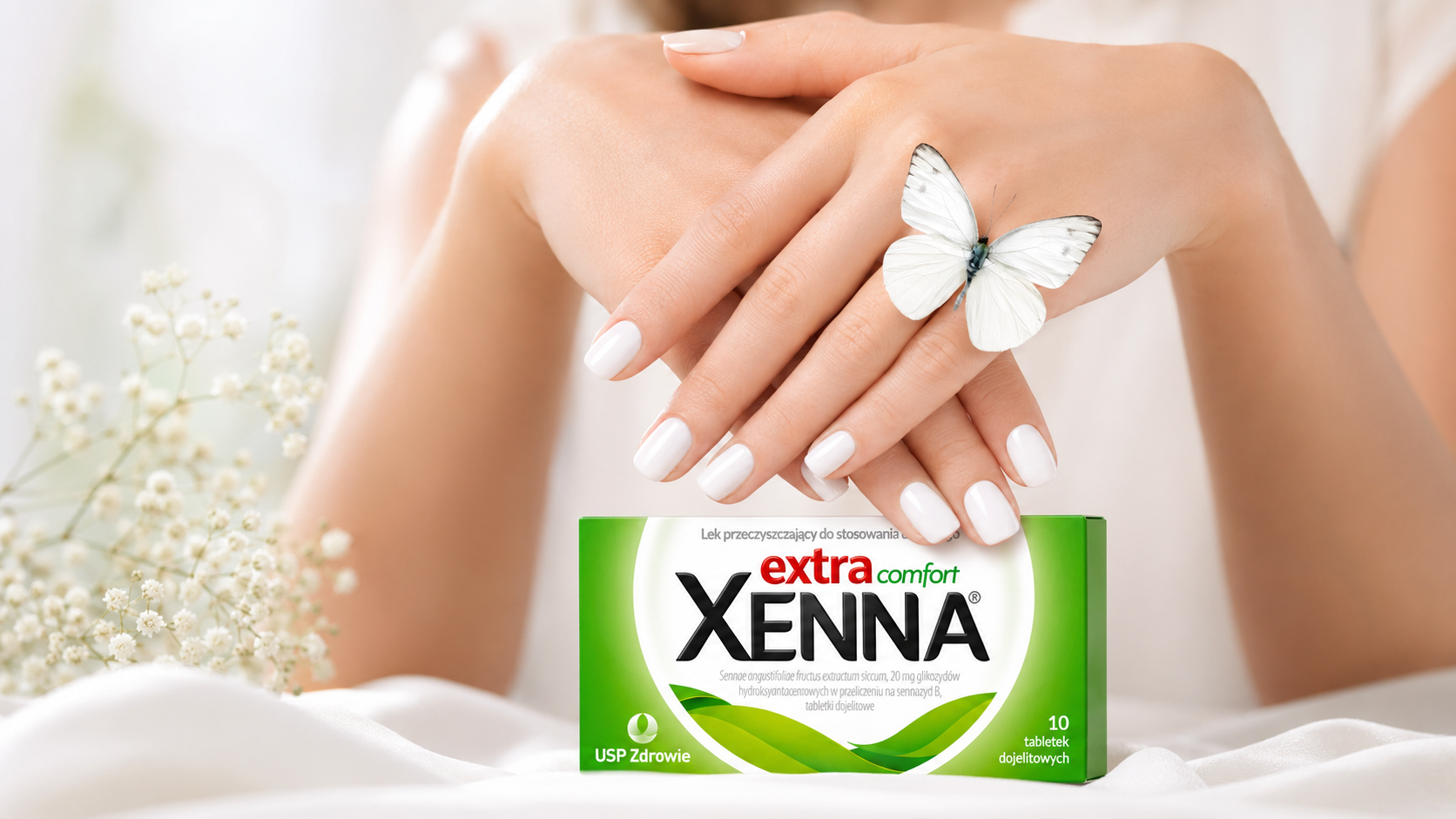
Working for Xenna, we redesigned the packaging of one of the most recognisable products in its category. The challenge was to modernise the image and reach younger audiences without losing the trust of existing consumers or the codes they know so well.
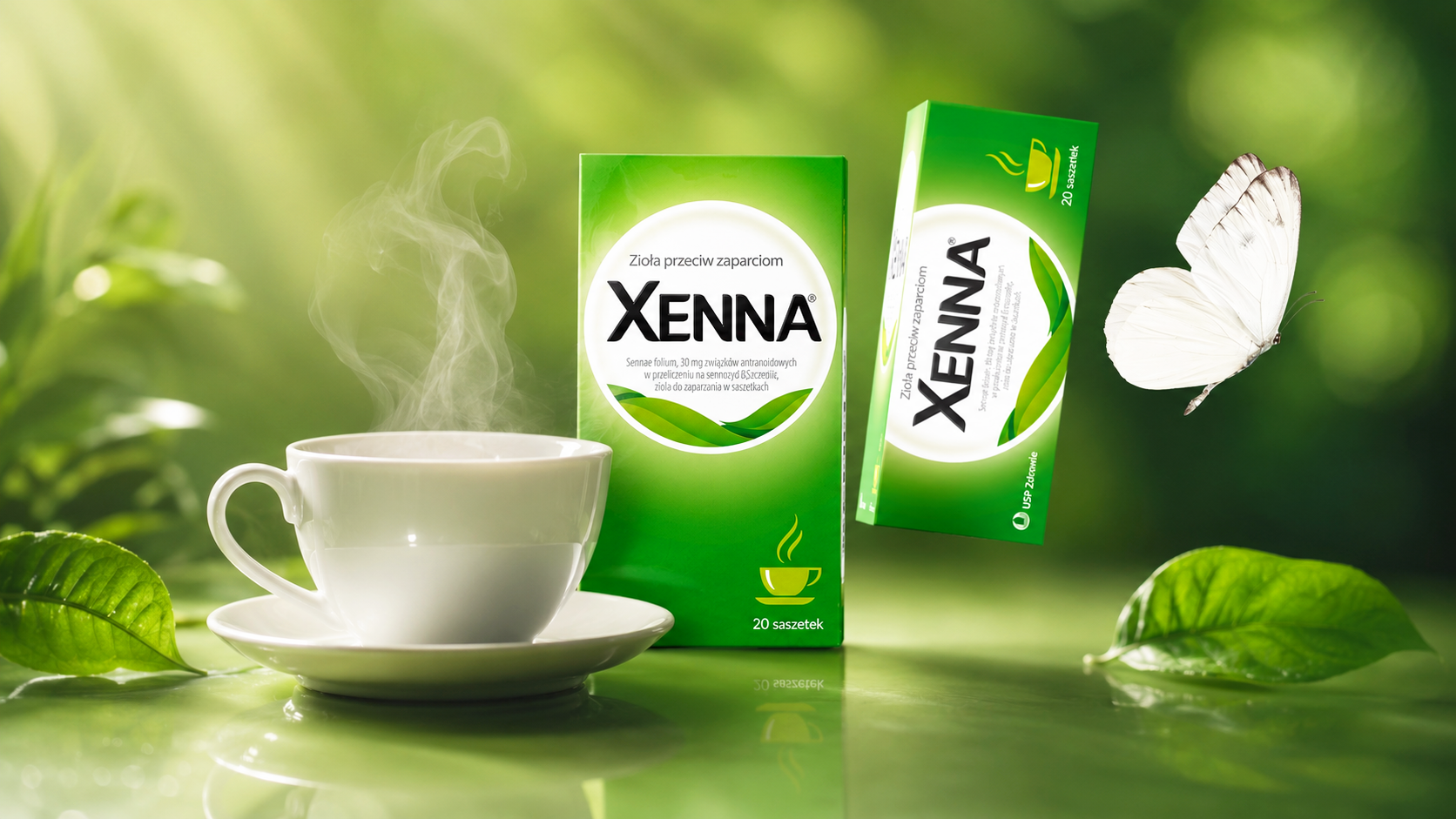
We kept the signature colours and the brand's key elements while simplifying the composition, the typography and the information hierarchy. A contemporary botanical motif underlines the product's natural origins, and the coherent architecture was extended to the tea variant as well.
The result is a lighter, more legible and more modern packaging system that strengthens the brand's expert character, improves its visibility on the pharmacy shelf and allows the portfolio to grow without any loss of recognisability.

Scholler
Premium-class design
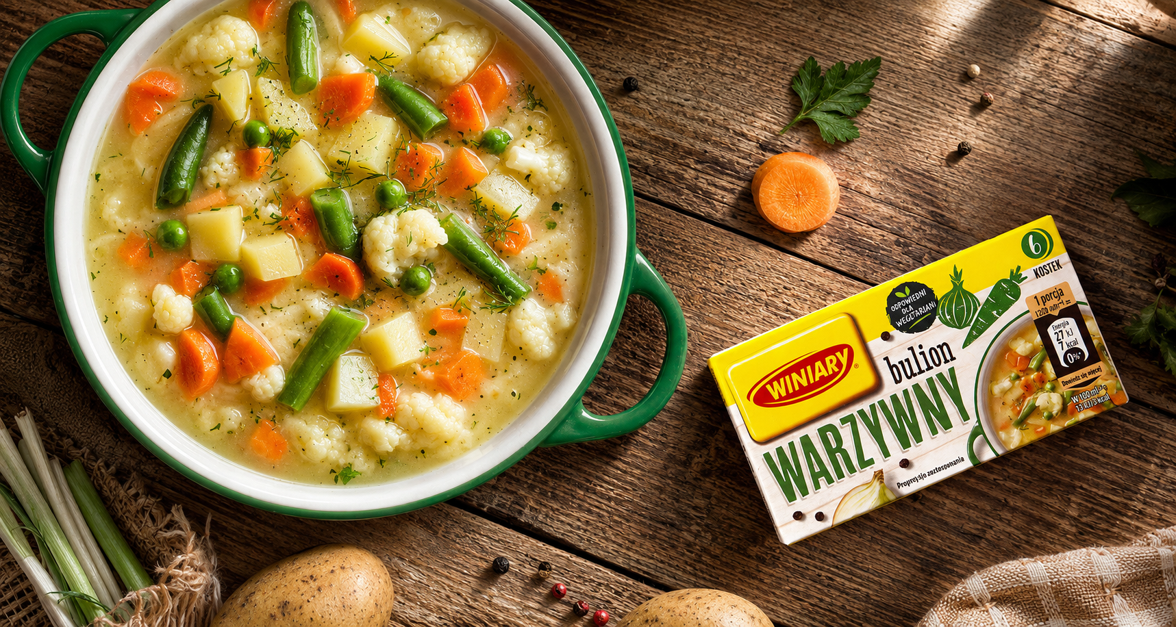
Winiary
We strengthen the brand’s flavour
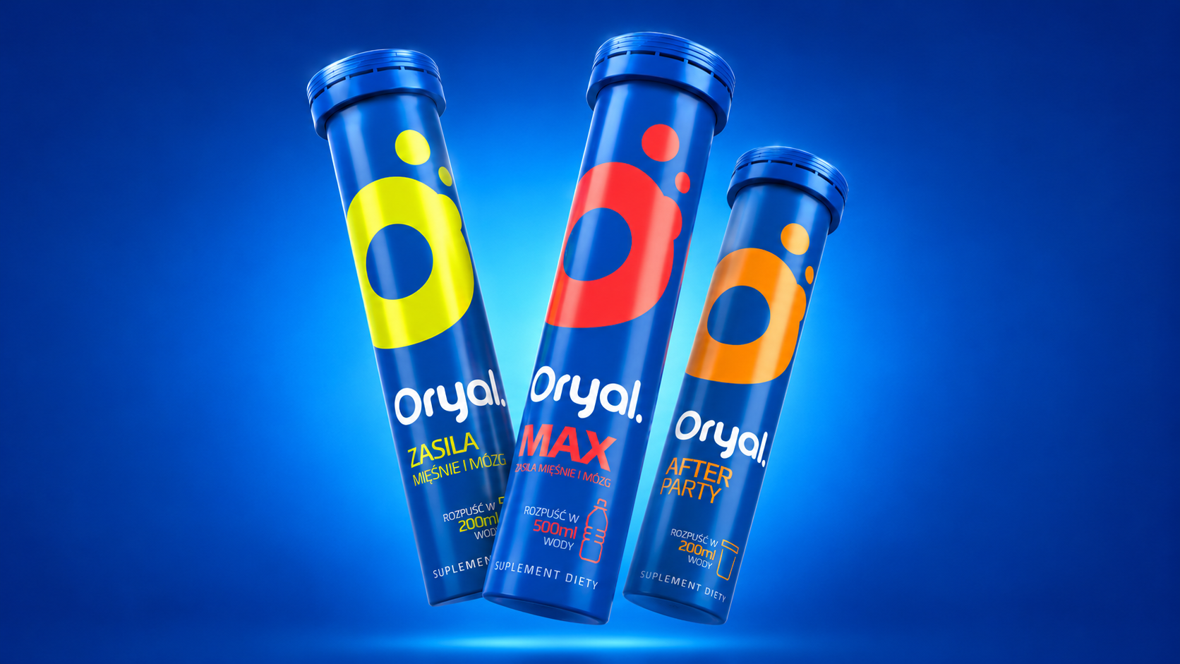
Orial
Maximum minimalism
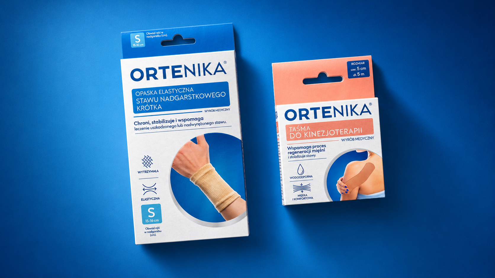
Ortenika
The anatomy of a medical brand

Hofstädter – Die Grillerei
We invite you to the barbecue
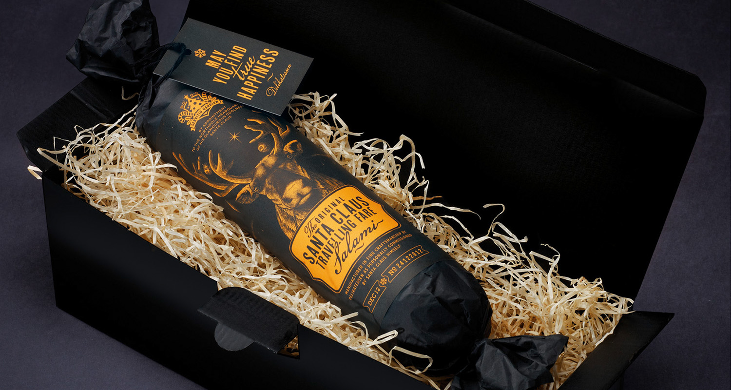
Santa Claus Travelling Fare Salami
Santa Claus Travelling Fare Salami
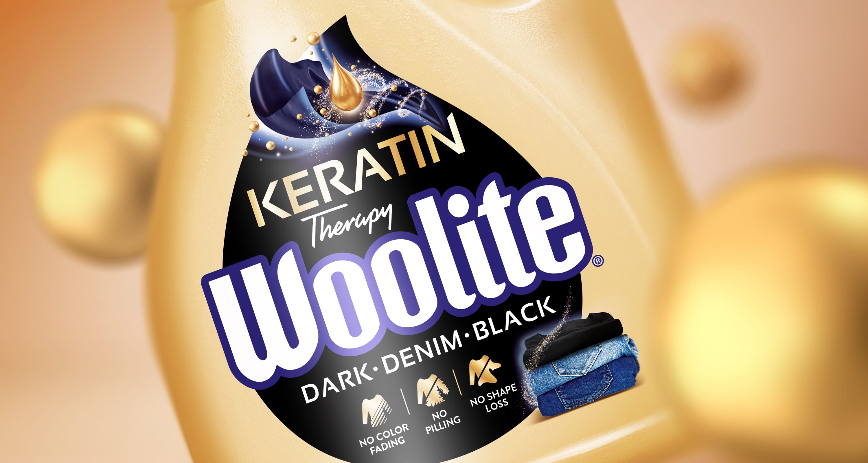
Woolite
We deliver the Woo effect!
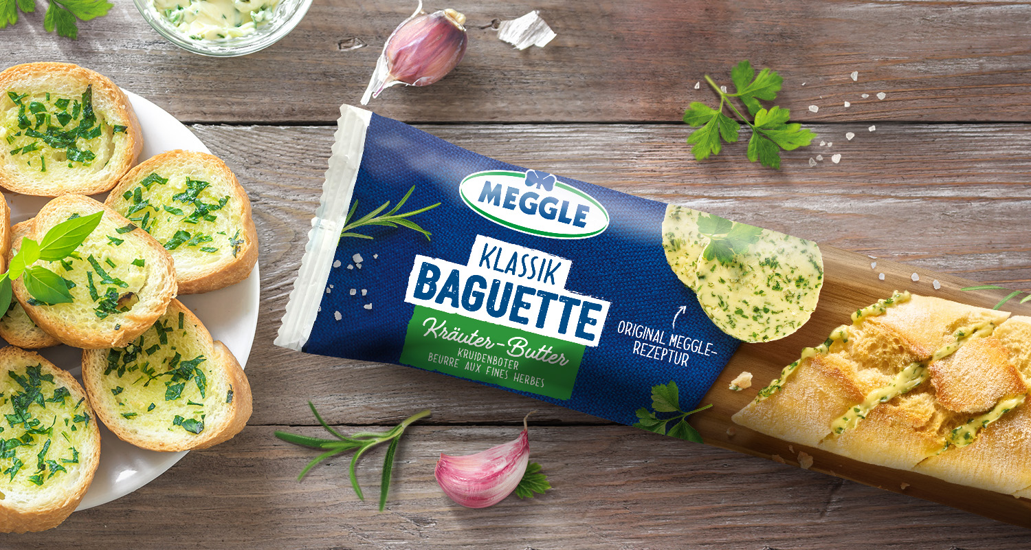
Meggle Kräuterbaguette
Meggle Kräuterbaguette
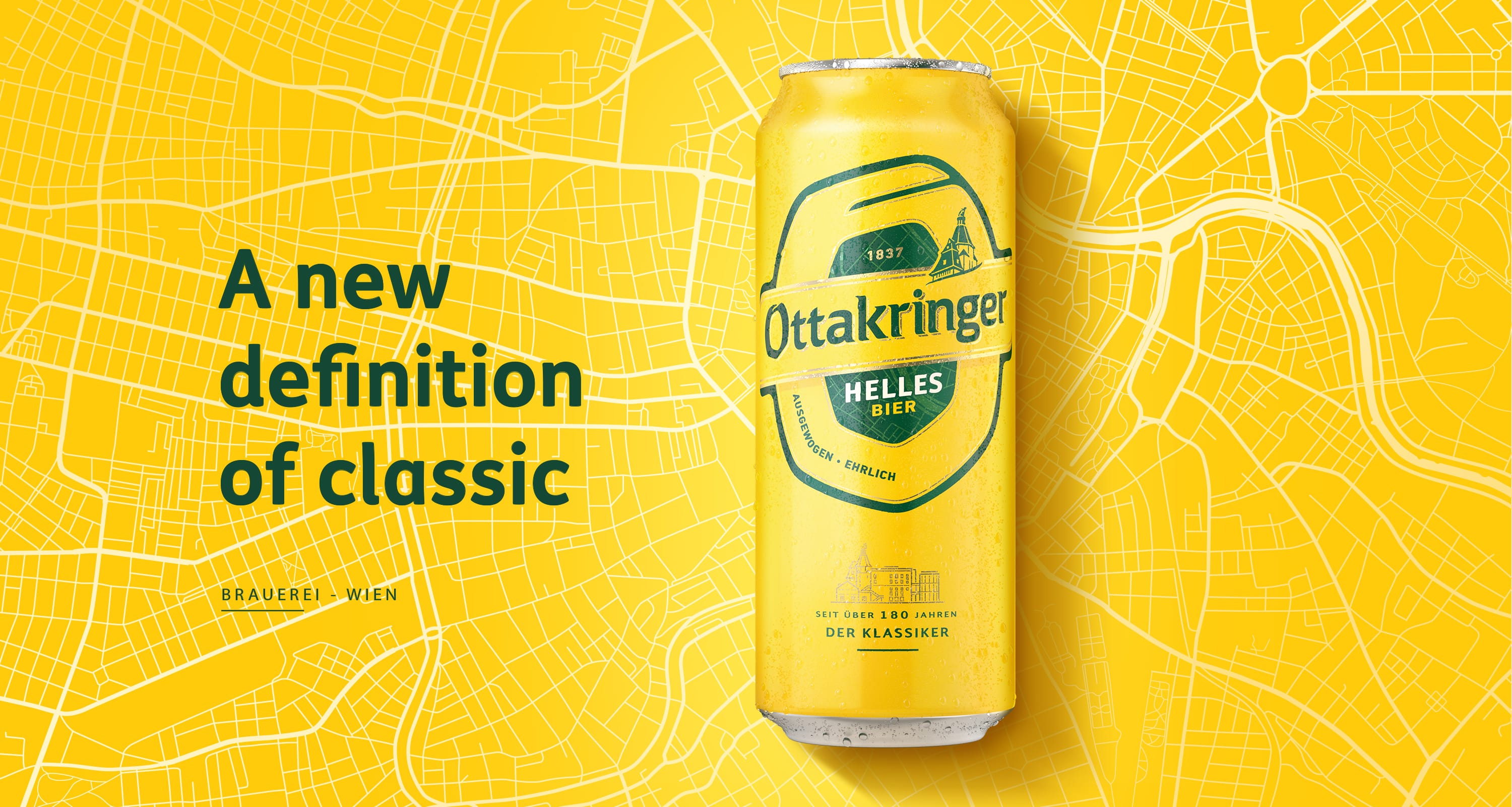
Ottakringer
Working on a cult brand