Soplica przepalana
A design journey back to the past
Soplica przepalana
A design journey back to the past
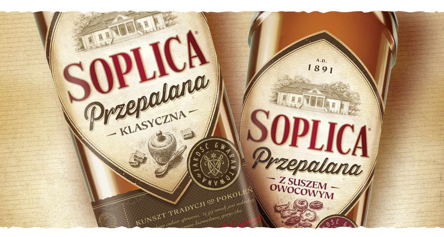
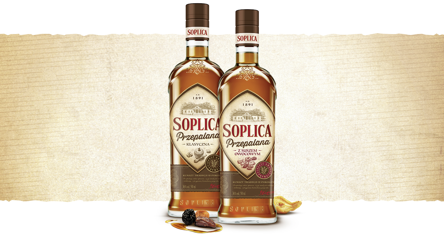
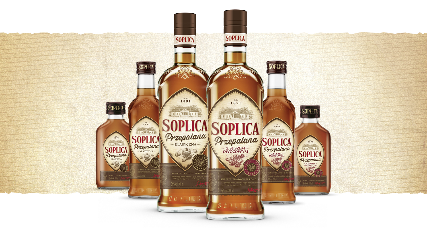
For Soplica we designed the packaging for Przepalana, a new line inspired by historic recipes using caramelised sugar. The aim was to introduce a bold product innovation while preserving the recognisable DNA of one of Poland's oldest spirits brands.
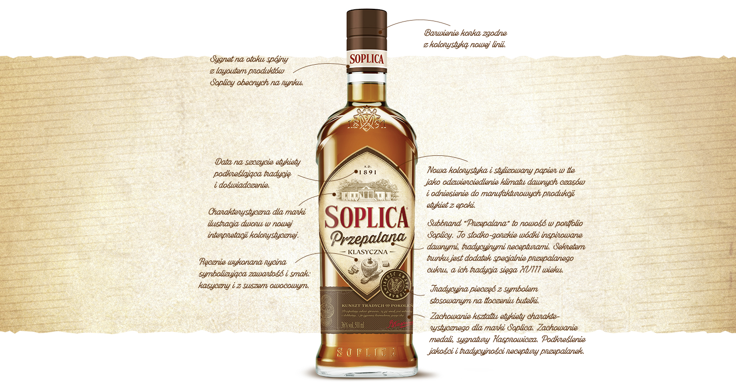
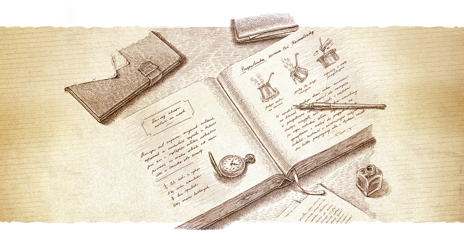
We kept the signature bottle shape, the typography and elements of the iconography, and redesigned the rest of the system from scratch. Saturated colours, textures, bespoke lettering and hand-made engravings build the line's authenticity and craft character. We completed the project with a key visual and storytelling.
The result is a coherent, premium and distinctive range that extends the Soplica portfolio, tells the product's story and provides a strong foundation for communication.

Zielona budka
A well-known and well-loved brand
Ortenika
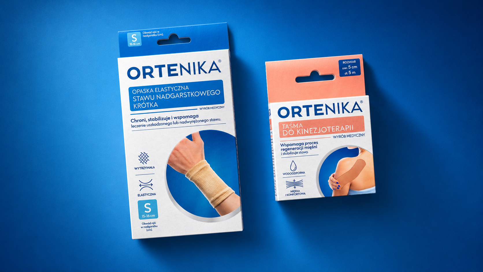
The anatomy of a medical brand
Caffreze
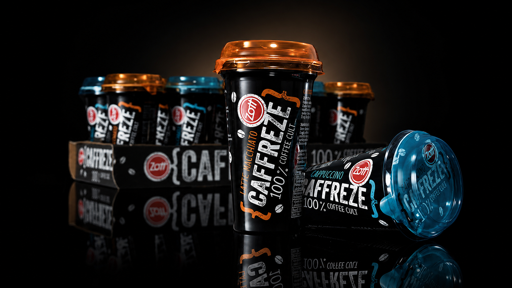
There's nothing like a good coffee

Iskial
Venturing into open waters

Hofstädter – Die Grillerei
We invite you to the barbecue
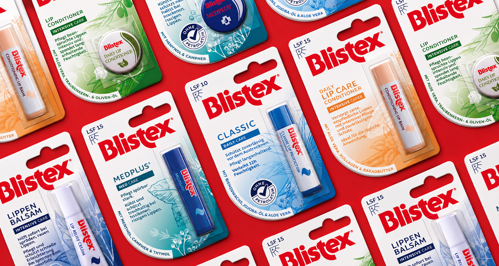
Blistex
Blistex
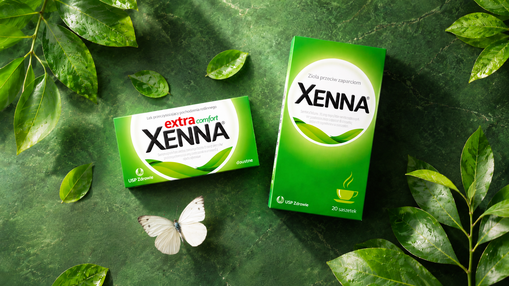
Xenna
Working on an iconic brand
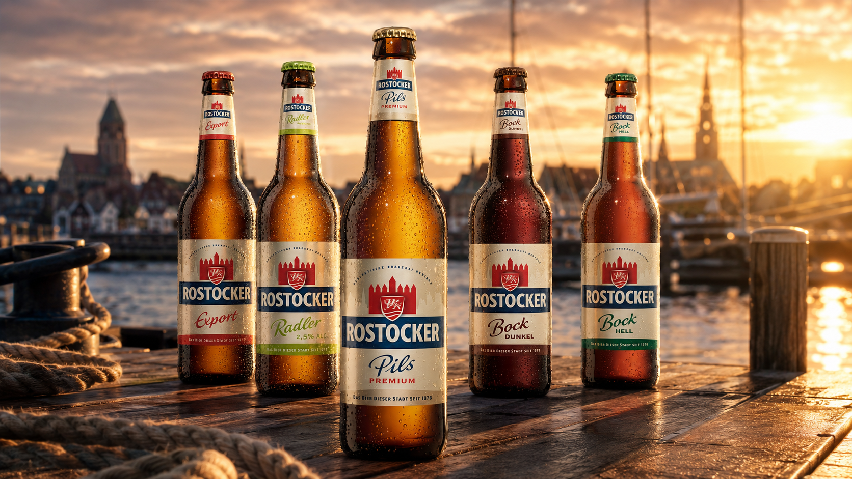
Rostocker
Rostocker