Ortenika
The anatomy of a medical brand
Ortenika
The anatomy of a medical brand
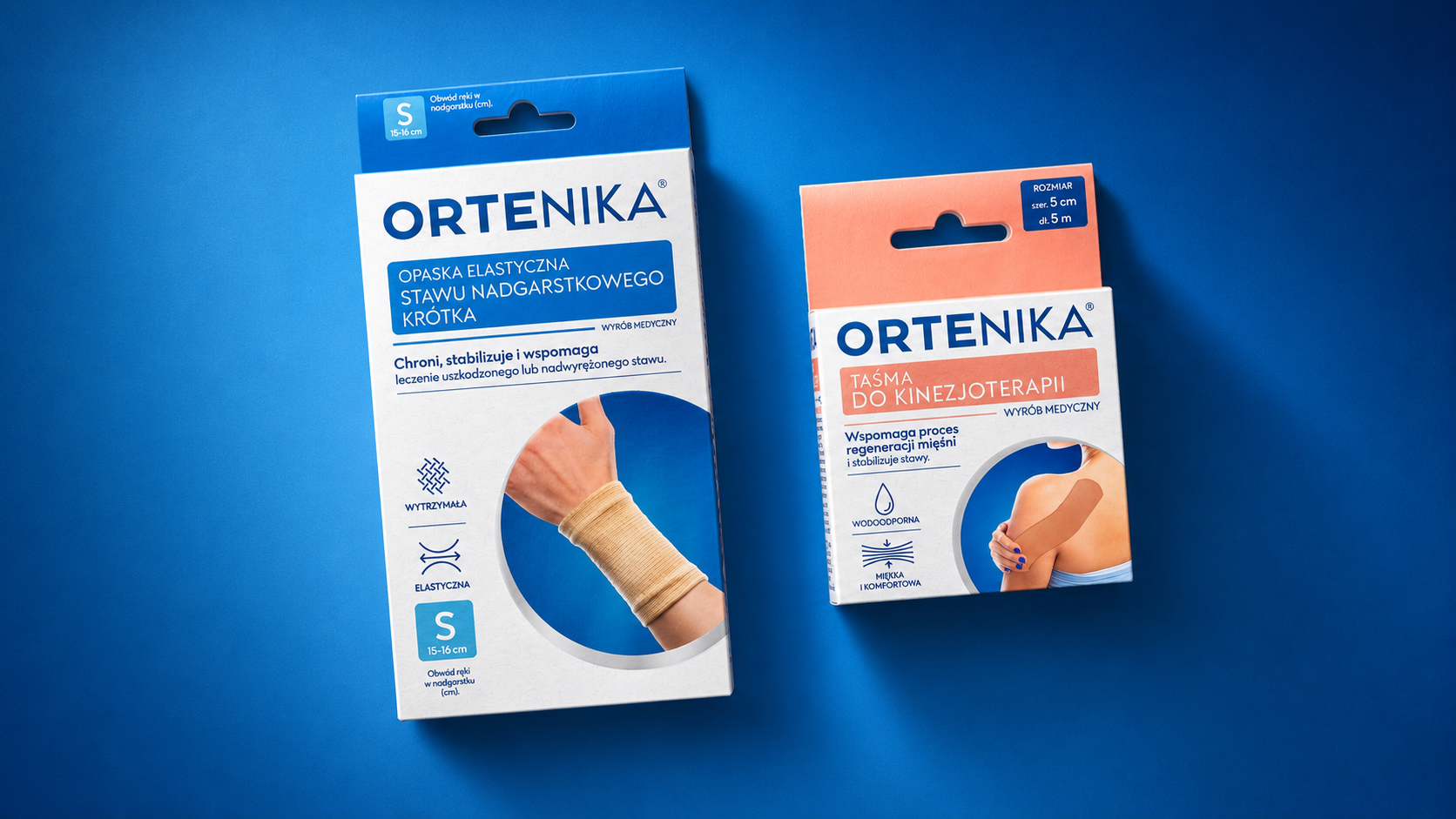
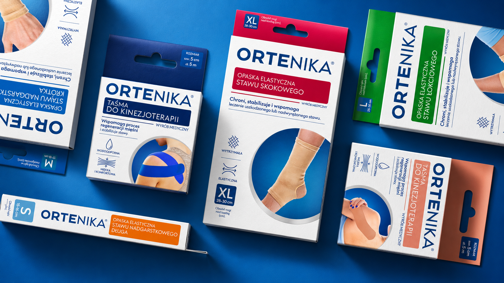
Commissioned by DOZ, we created the Ortenika brand from the ground up, covering a broad portfolio of orthopaedic and rehabilitation products. The scope covered strategy, expert positioning, visual identity, portfolio architecture and a packaging system meeting the needs of older people and of active users.
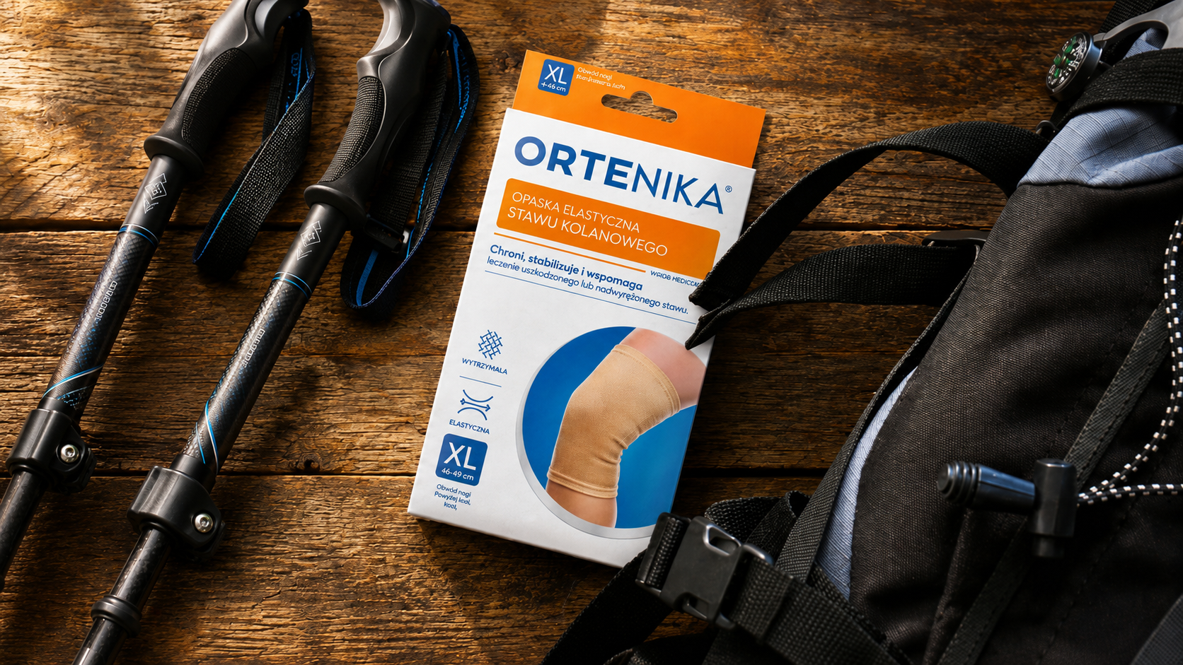
We designed a simple, highly visible logotype, a minimalist layout and legible variant codes. Large size markings, a system of icons and illustrations showing how the products are used make choosing the right item easier, while silver finishes reinforce the brand's professional character.
The result is a coherent, intuitive and scalable system that brings order to an extensive range, improves legibility on shelf and builds credibility for a private label in a medical category.
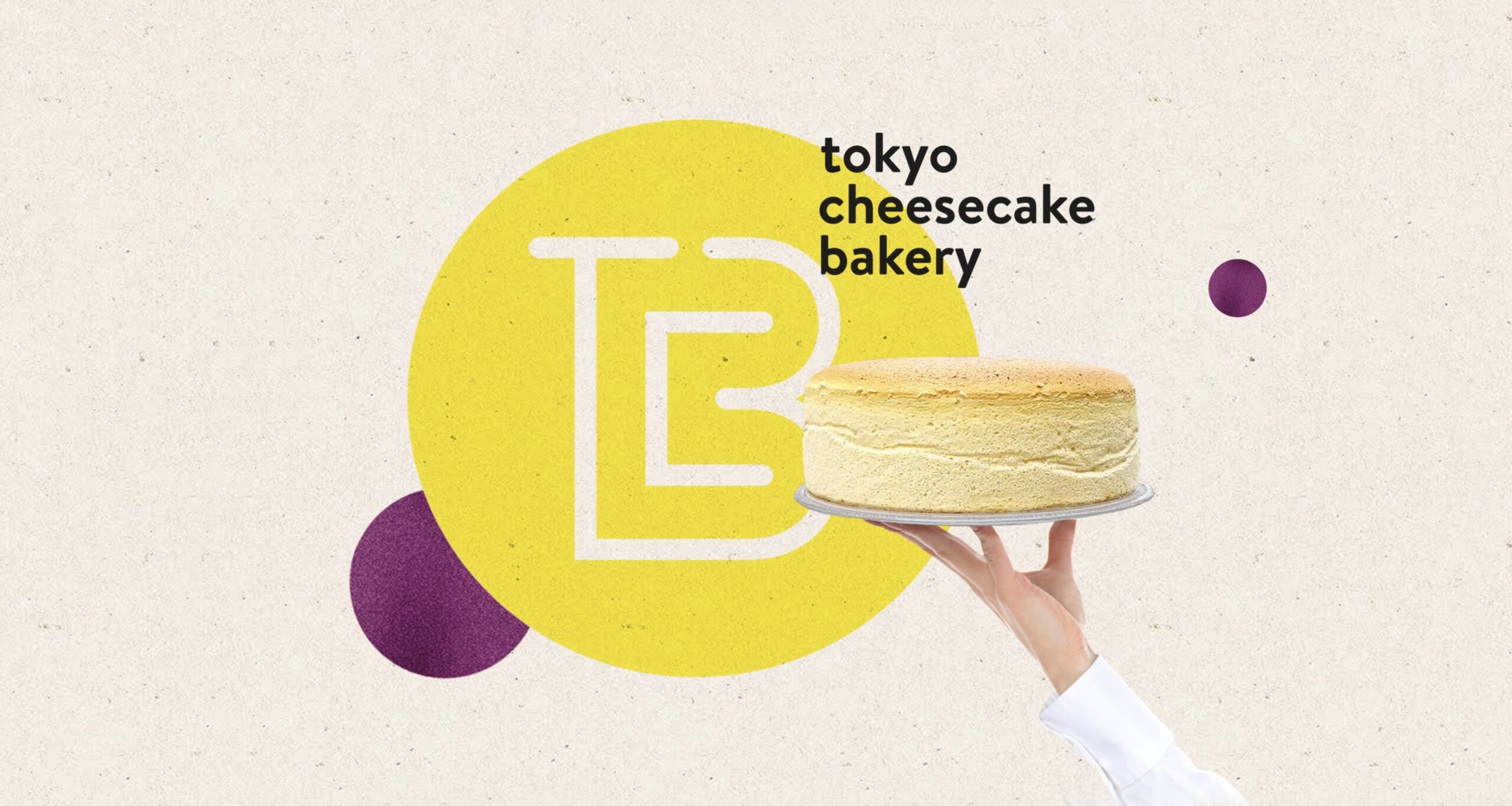
TCB Tokyo Cheesecake Bakery
An innovative gastro concept
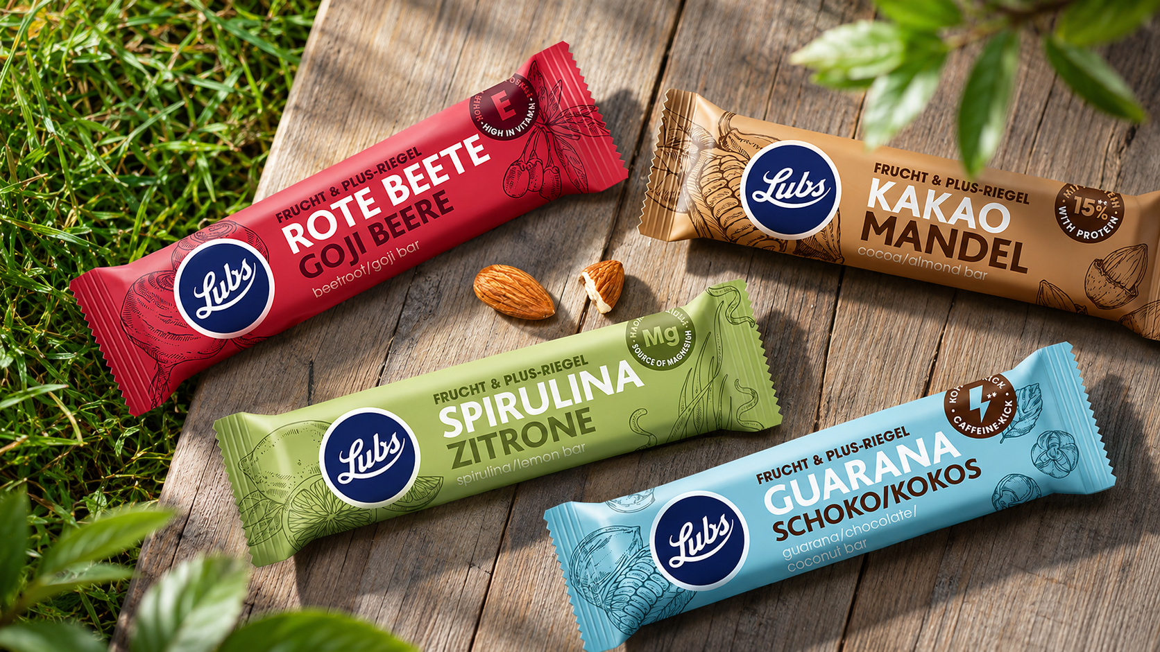
Lubs
Eco-friendly solutions for design

Iskial
Venturing into open waters

Viva con Agua
Water & Goldeimer
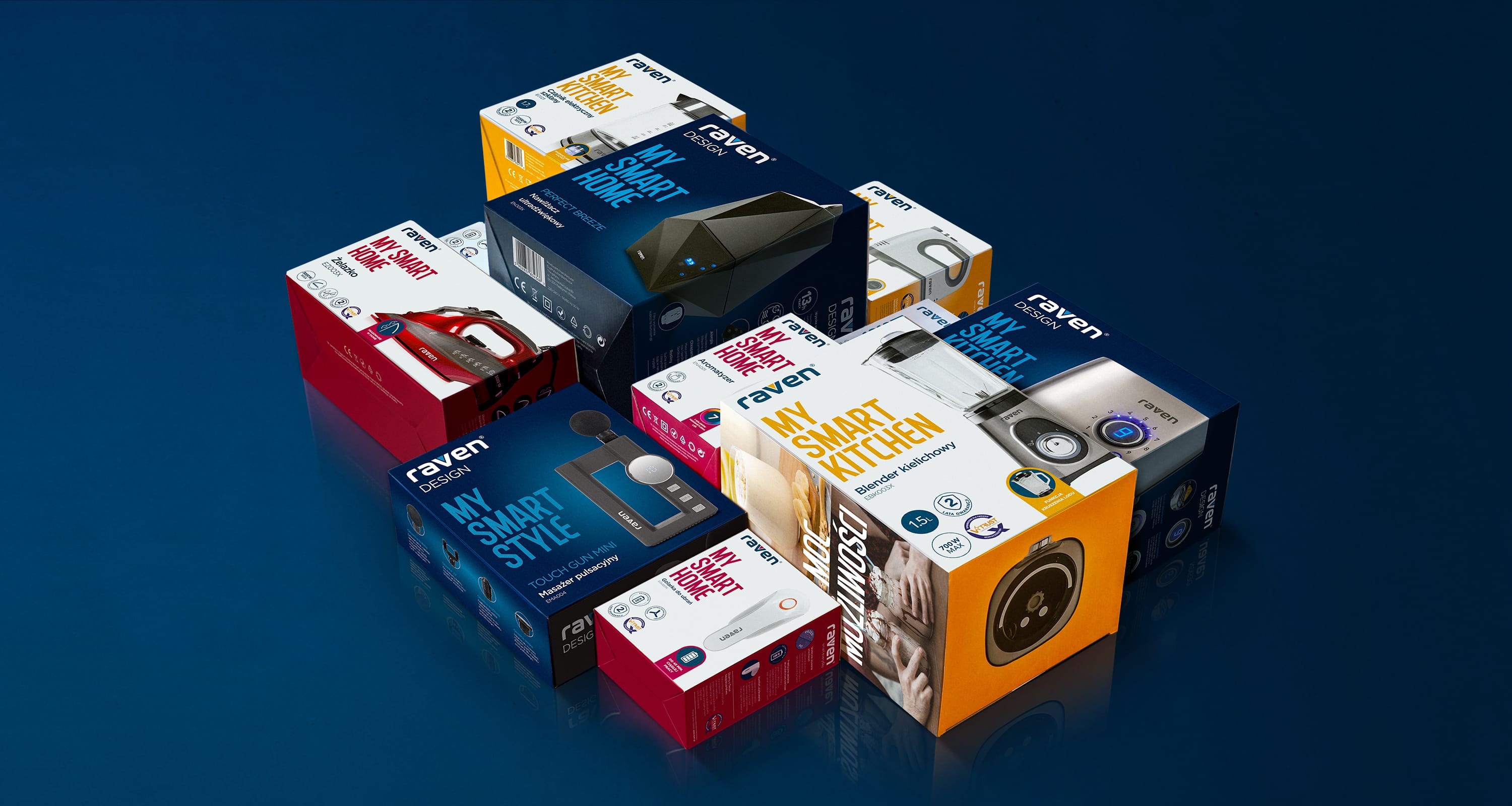
RAVEN
Smart brand, smart packaging :)
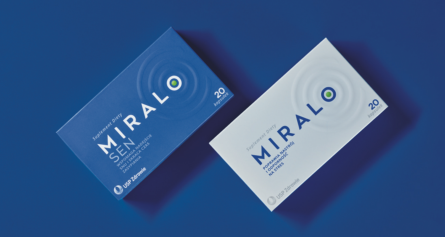
Miralo
A harmony of calm, sleep and design
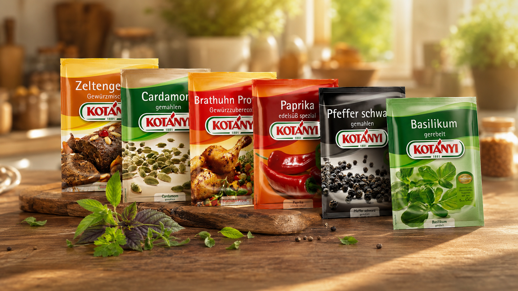
Kotányi
We season brands for success
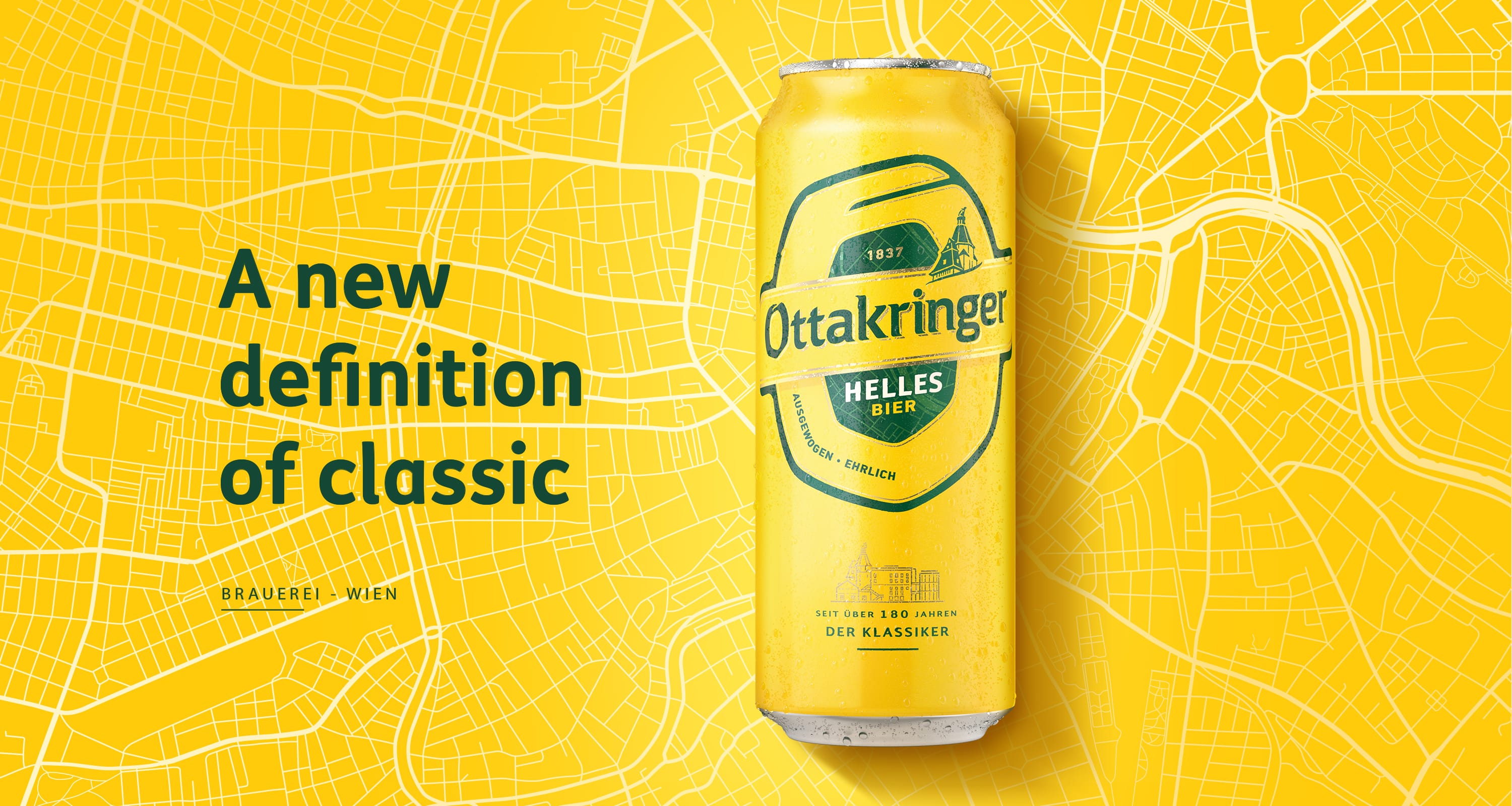
Ottakringer
Working on a cult brand