Orial
Maximum minimalism
Orial
Maximum minimalism
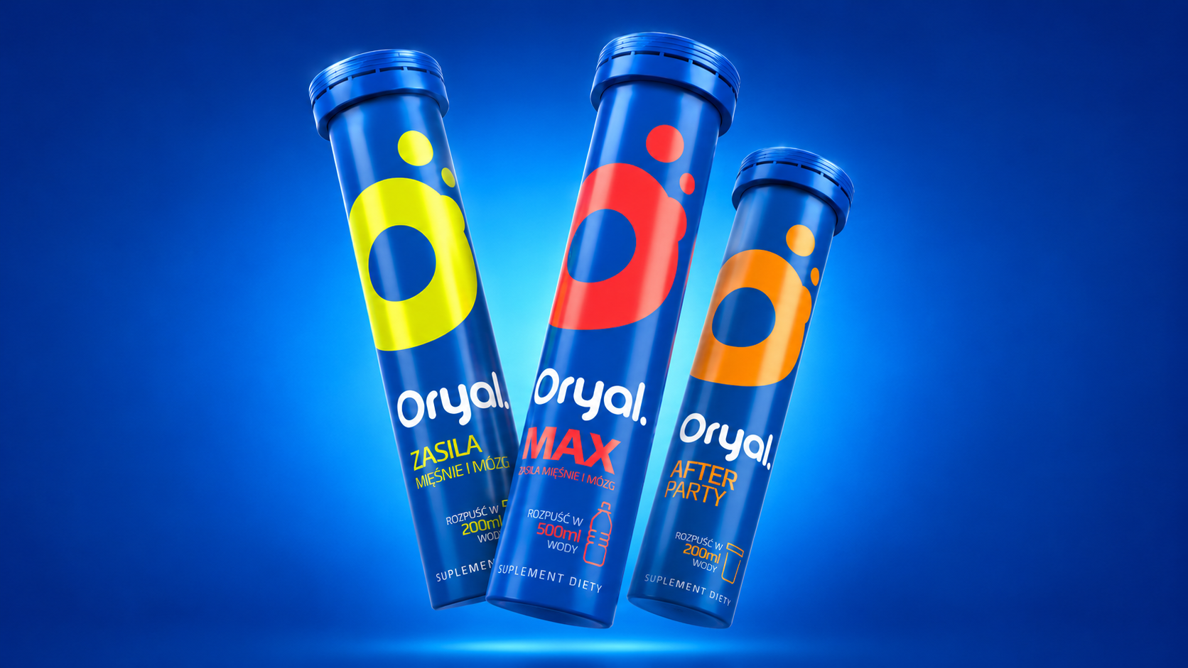
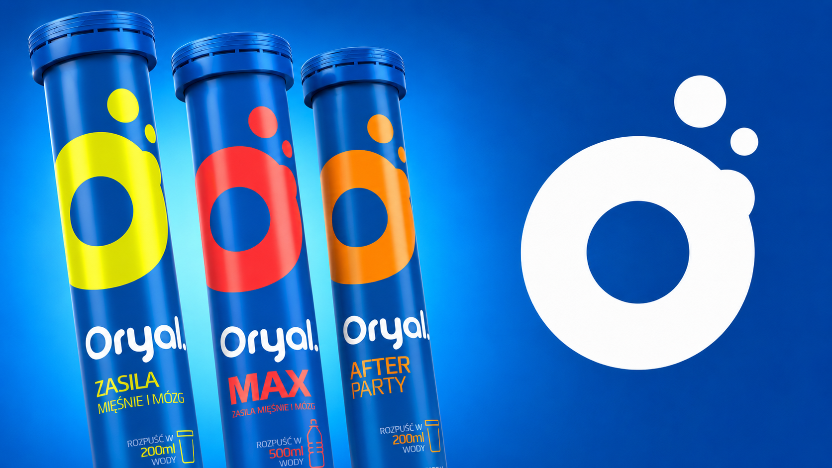
For Orial we created a visual identity and a packaging system for electrolytes sold through pharmacies from the ground up. The aim was to make a new product stand out in a saturated category, build credibility and create an architecture ready for further variants.
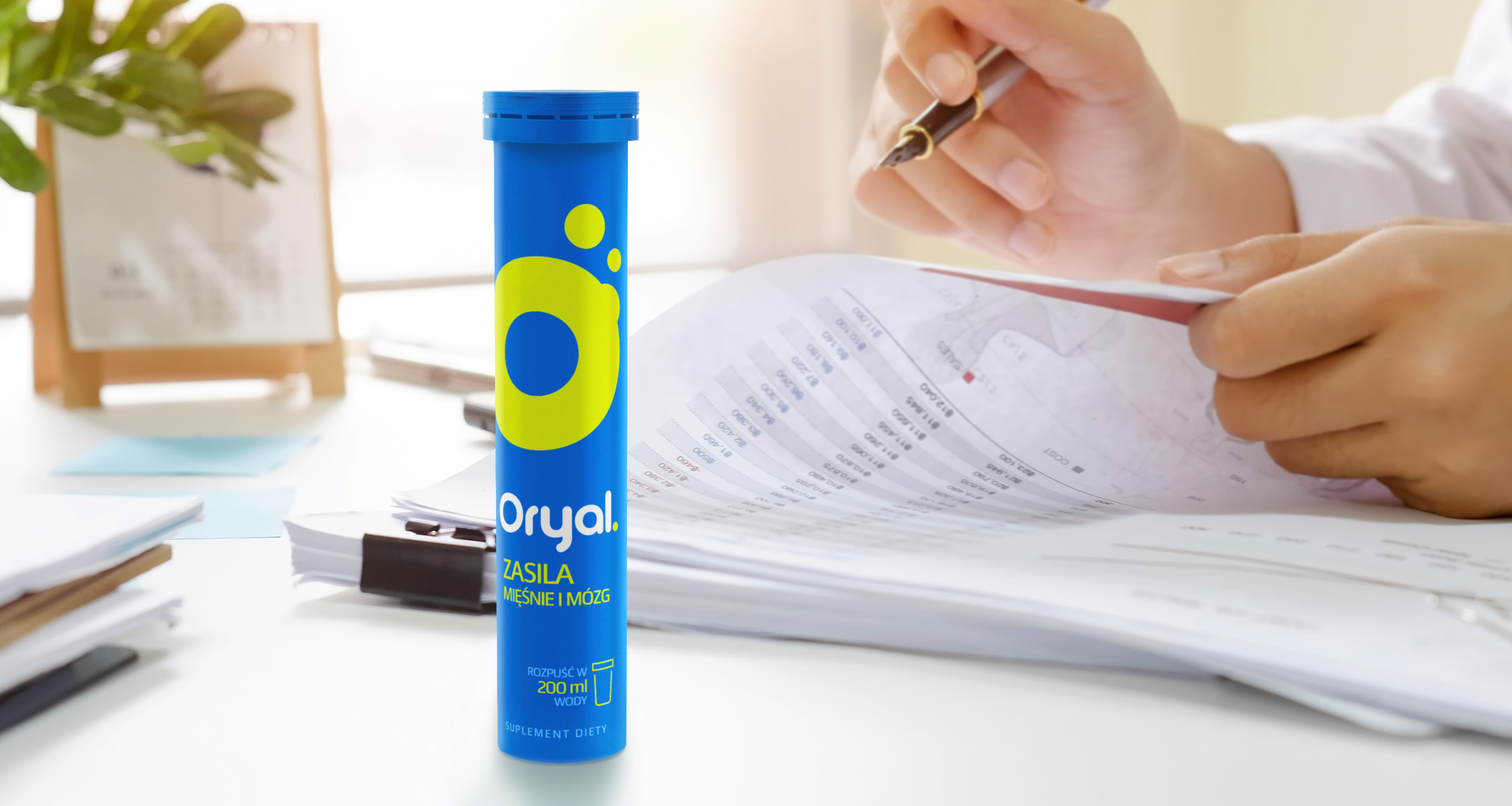
We combined a minimalist layout with a strong brand colour and contrasting flavour codes. Hand-drawn typography for the name gives the products a character of their own, while simple icons and a large logotype make the purpose immediately clear and ensure good visibility on shelf.
The final result is a modern, legible and scalable packaging system that combines the codes of a medical category with a friendlier visual language and establishes a distinctive position for a new brand.

Hofstädter – Die Grillerei
We invite you to the barbecue
Xenna
Working on an iconic brand
Vigor
Natural energy
Woolite
We deliver the Woo effect!
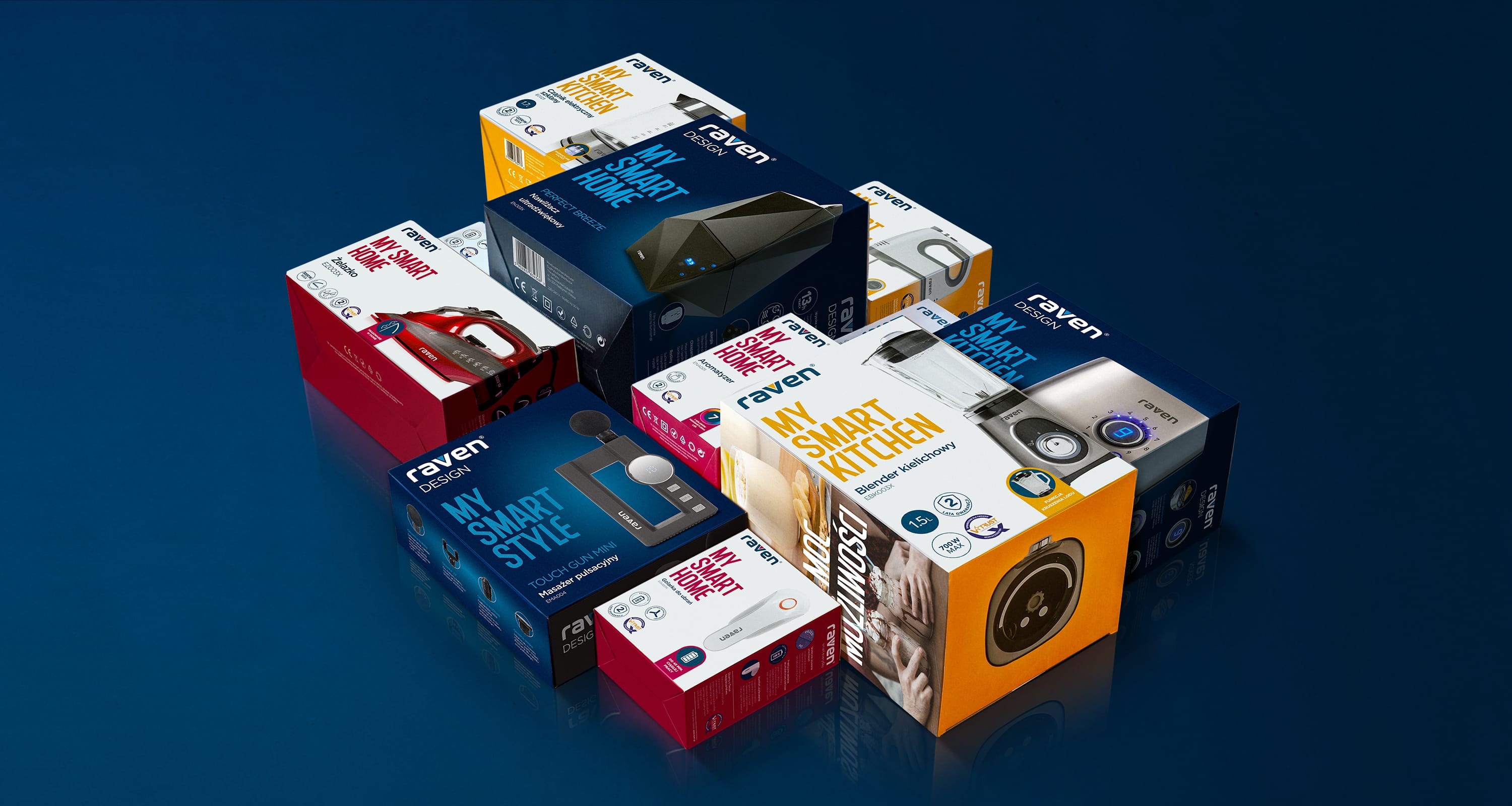
RAVEN
Smart brand, smart packaging :)
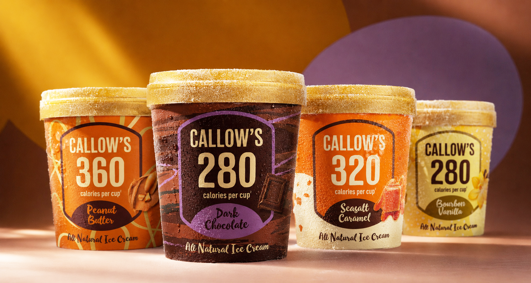
Callow’s
We tempt you. But don't feel guilty

Zielona budka
A well-known and well-loved brand

Scholler
Premium-class design
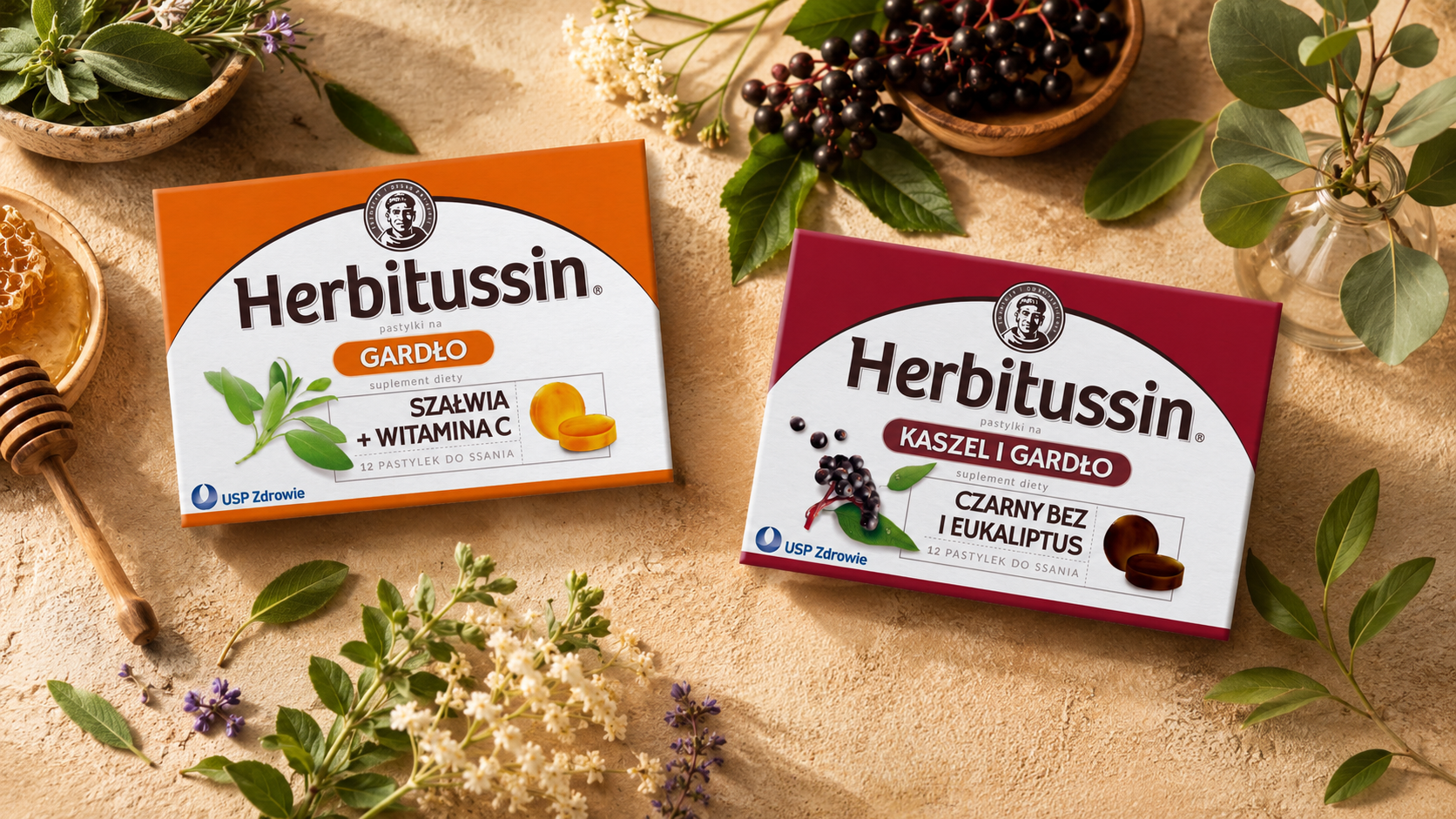
Herbitussin
Tradition in a new guise