Iskial
Venturing into open waters
Iskial
Venturing into open waters
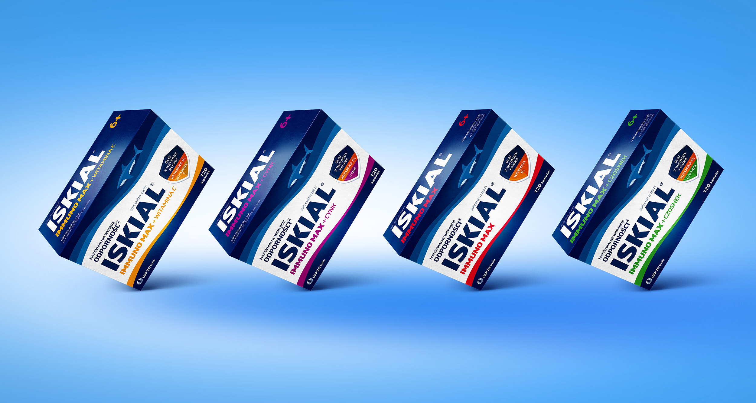
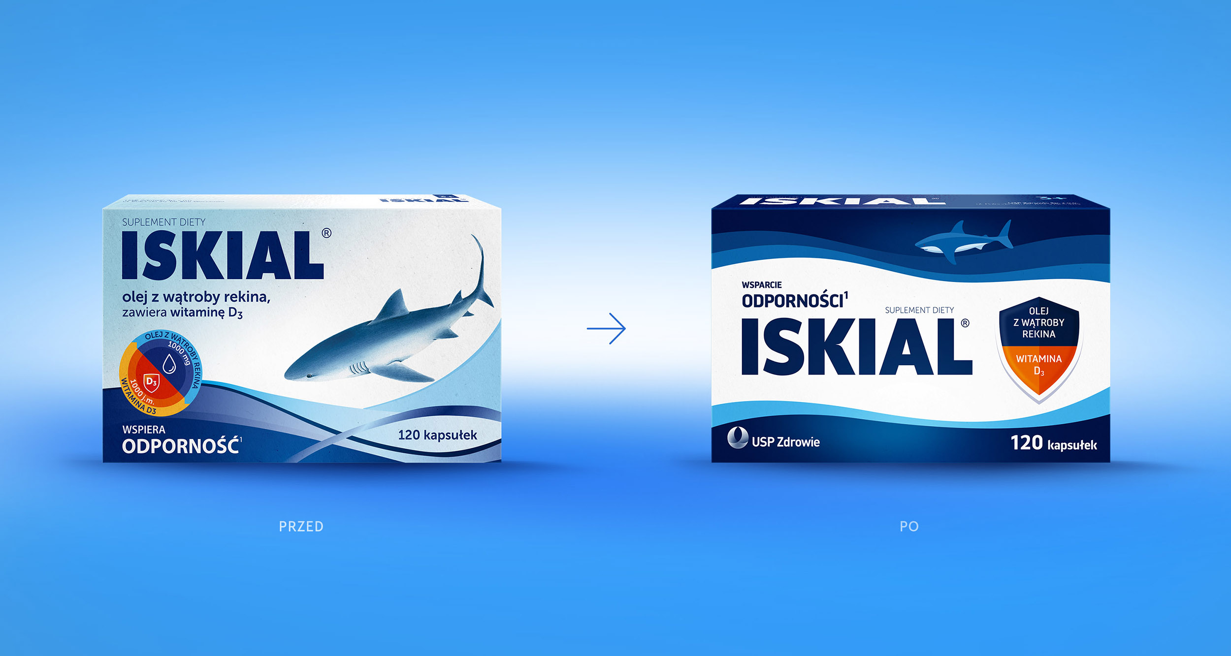
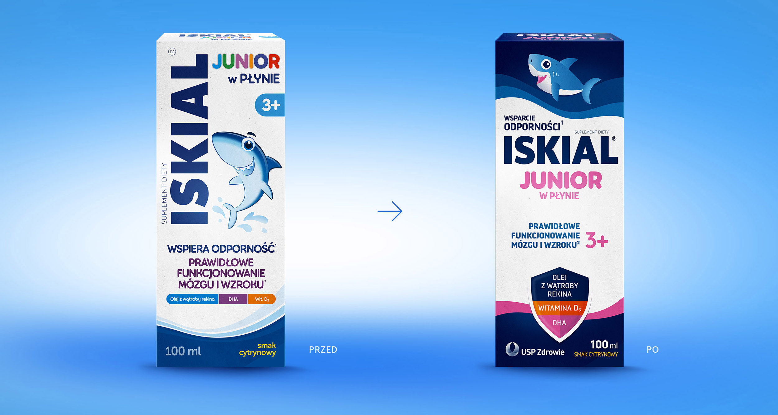
For Iskial we refreshed the visual identity and designed a new packaging system for a portfolio of immunity supplements. The aim was to strengthen the brand's expert character, make the variants easier to tell apart and increase its visibility on a competitive pharmacy shelf.
We simplified the logo, brought the shield symbol to the fore and put the hierarchy of messages in order. The brand's signature waves took on a new role – they now form a consistent brand code and help distinguish products within the portfolio.
The result is a modern, credible and easily extendable packaging system that retains Iskial's recognisable elements while communicating what the products are for, and their key benefits, far more effectively.
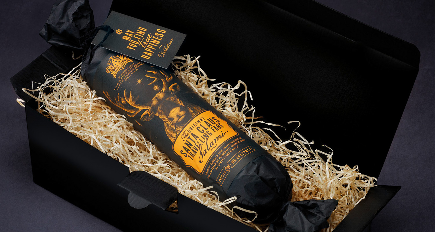
Santa Claus Travelling Fare Salami
Santa Claus Travelling Fare Salami

Dogway
Something for your furry friend

Zielona budka
A well-known and well-loved brand

Viva con Agua
Water & Goldeimer

Biomoji
Energy in harmony with nature
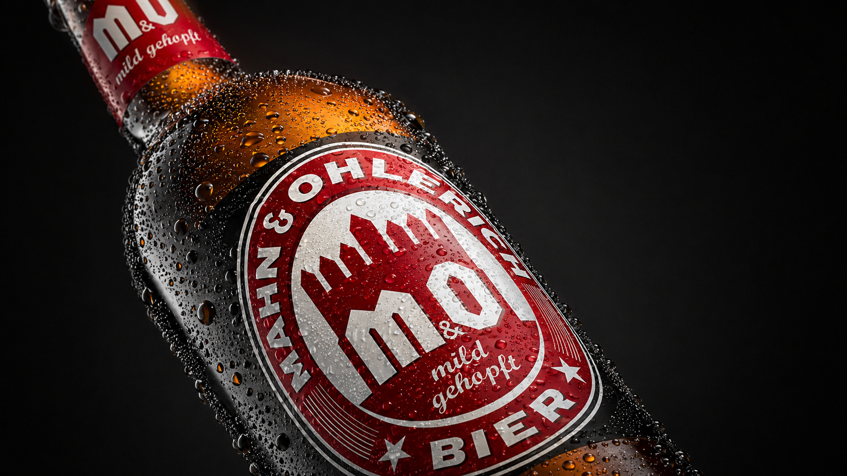
M&O
M&O
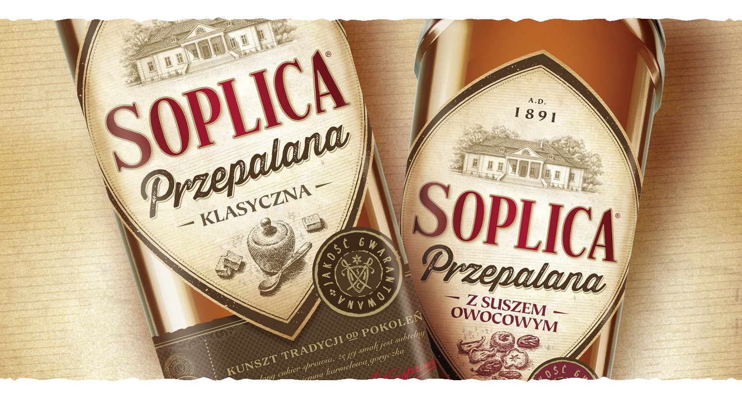
Soplica przepalana
A design journey back to the past
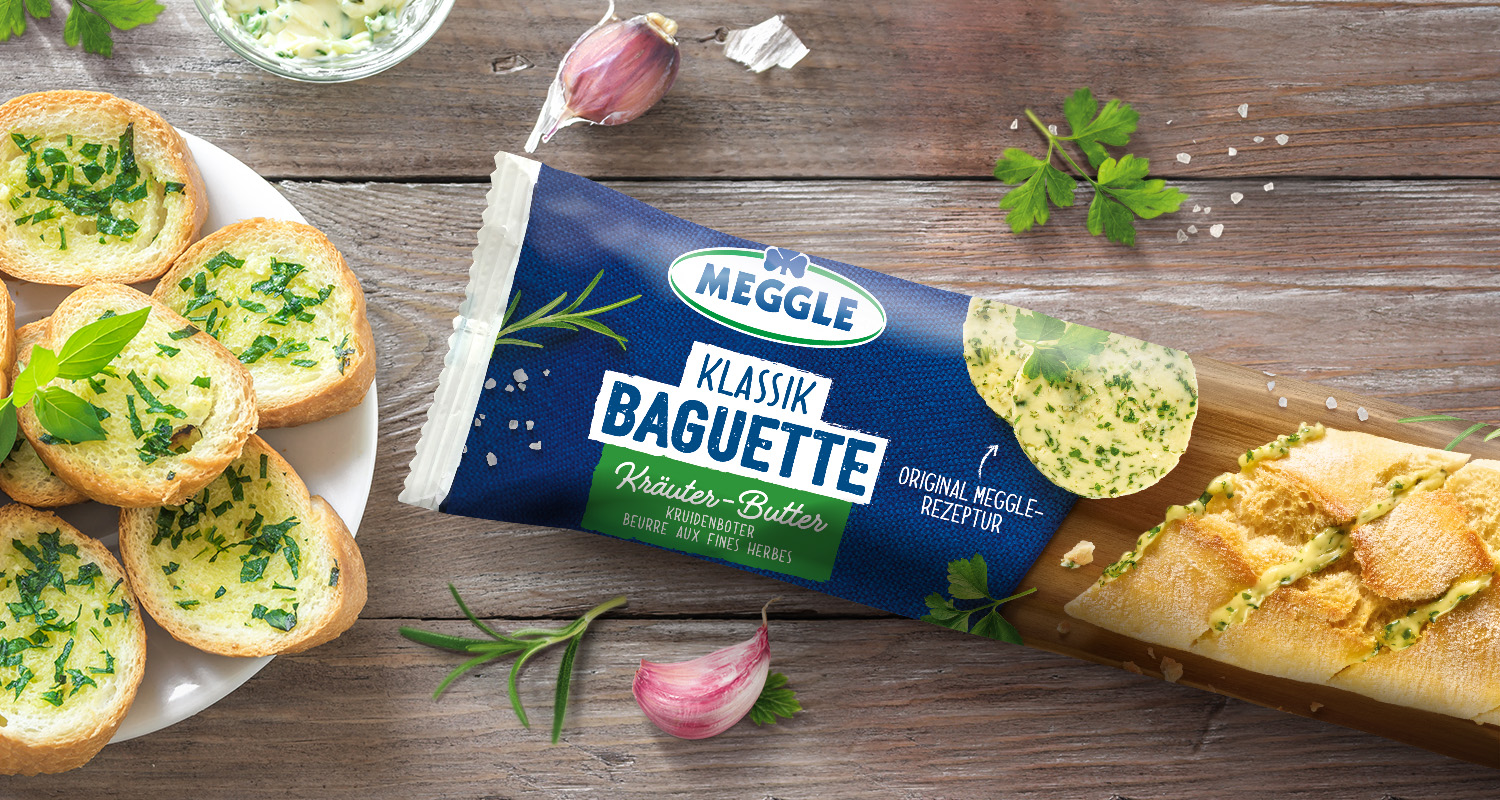
Meggle Kräuterbaguette
Meggle Kräuterbaguette