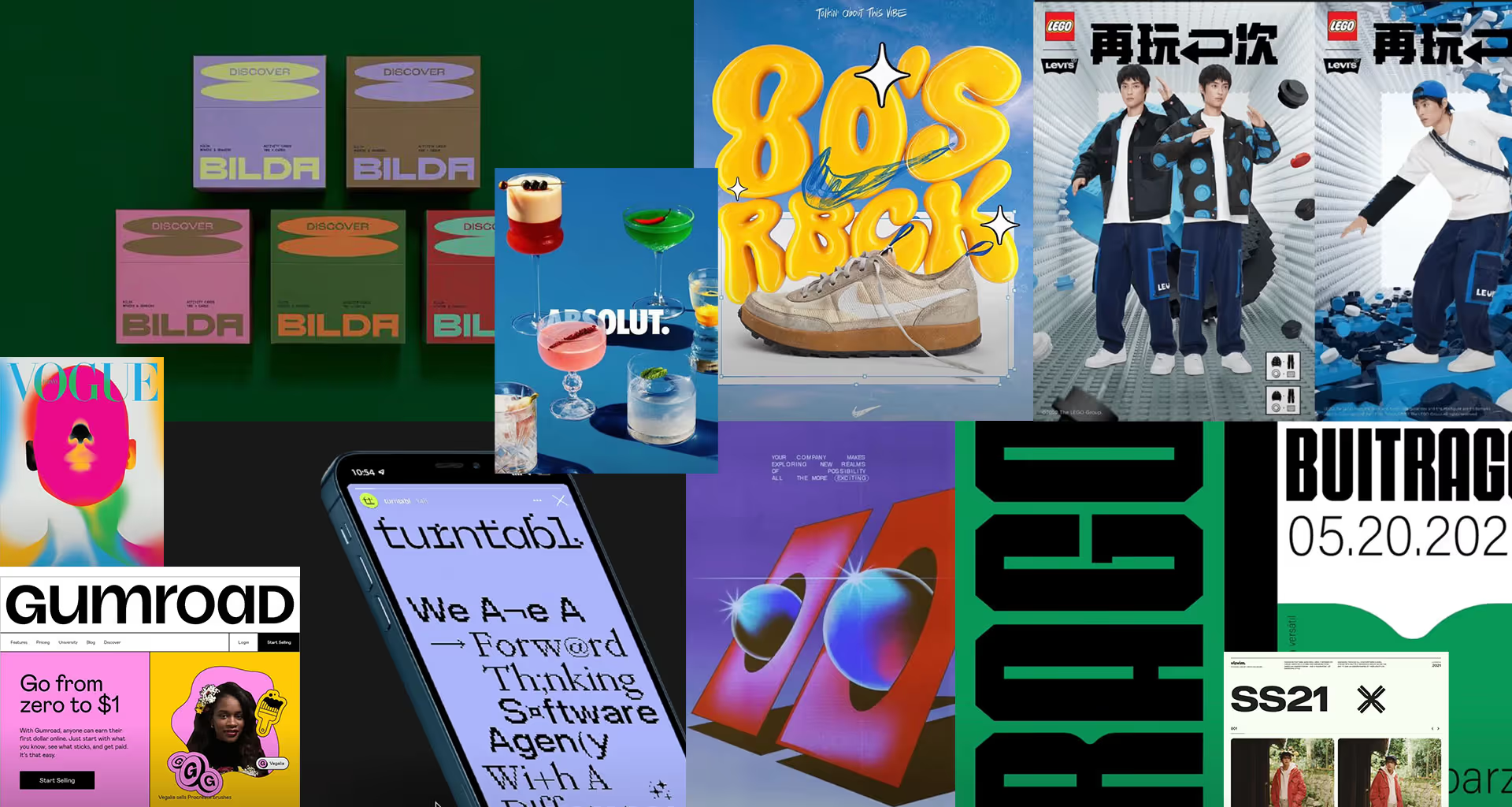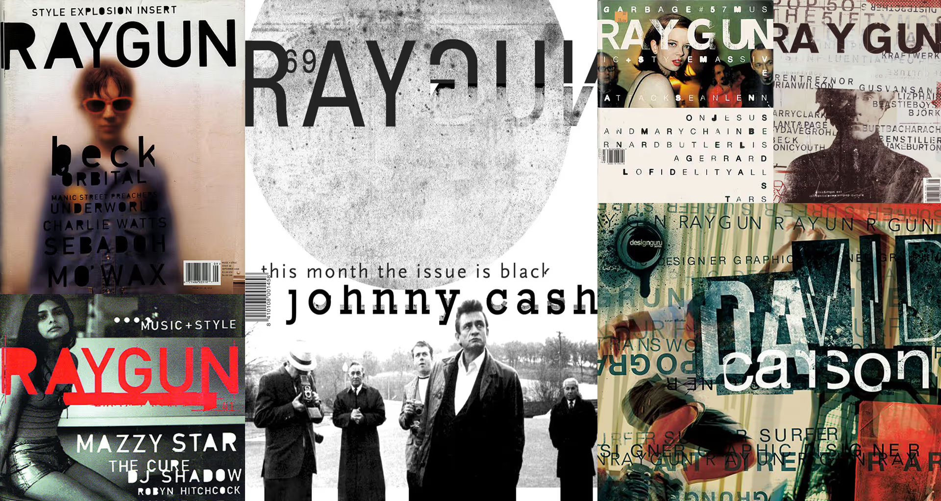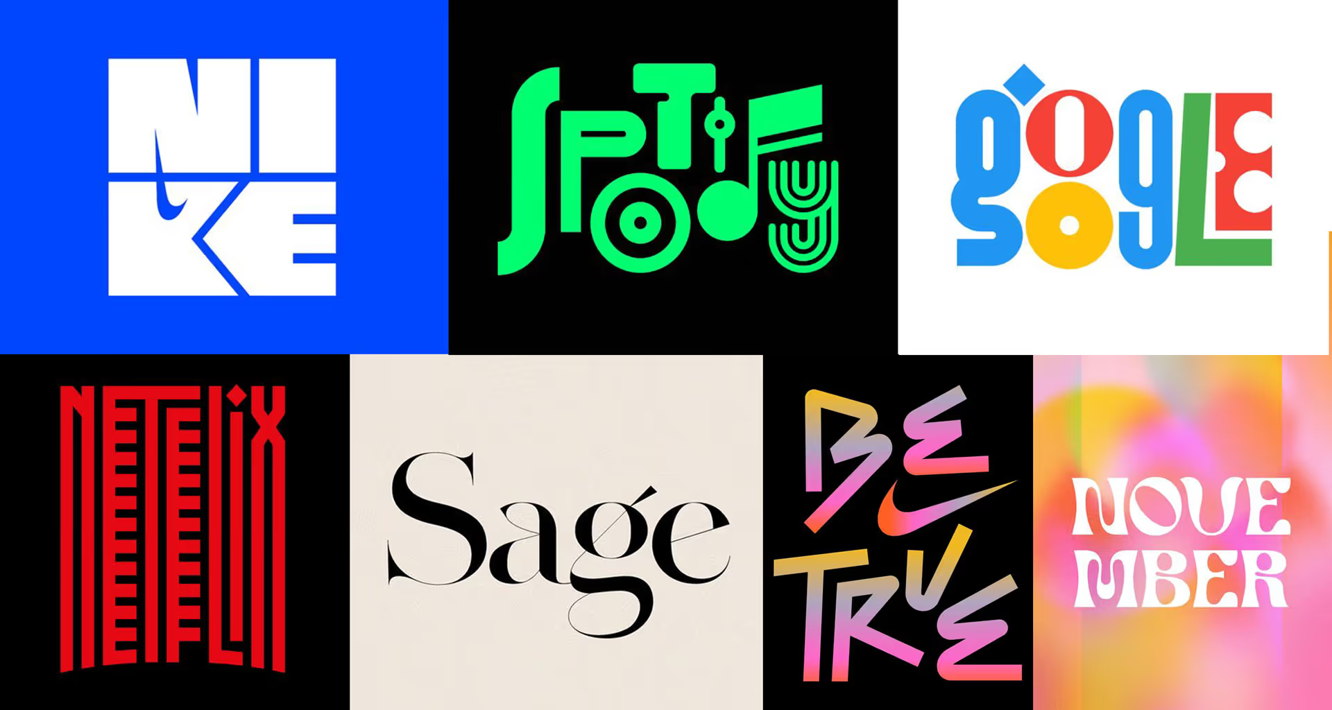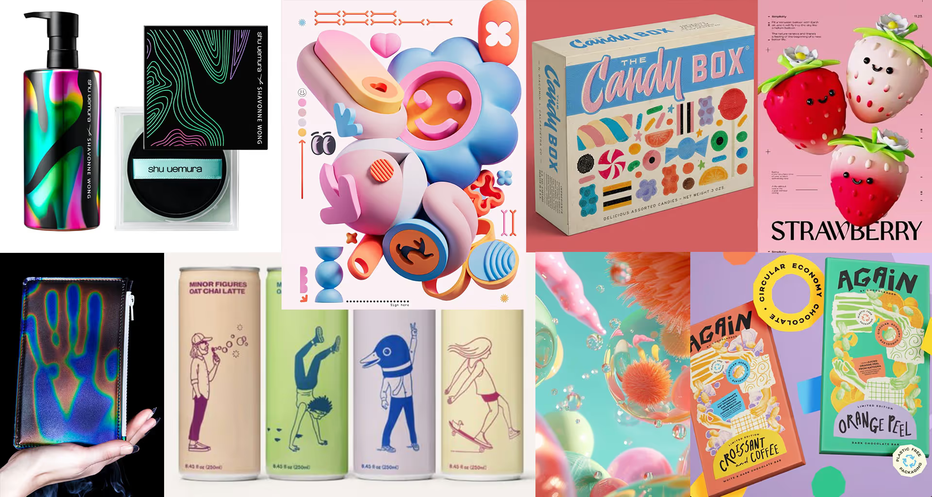
For some time now, the tension around us – linked to the development of artificial intelligence, geopolitical anxieties and the information noise that accompanies it all – has become increasingly palpable. And because design mirrors human moods and needs, in my view 2026 will see two main mega-trends emerge very clearly, clashing with each other.
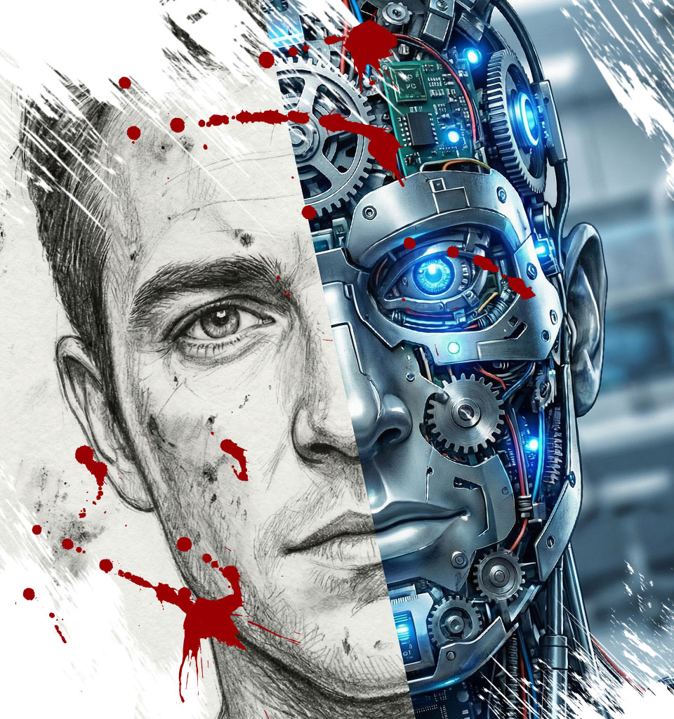
Humanism versus technology
The first brings warmth, closeness to nature and the craft of the human hand, while the second is inspired by technology and engineering precision. Each of these currents encompasses several smaller trends that flow organically from it.
HUMANISM
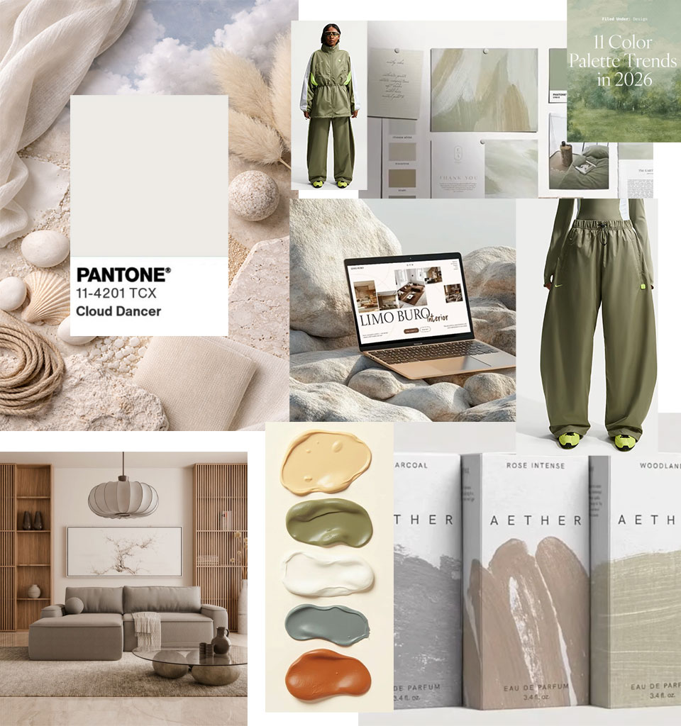
Colour palette
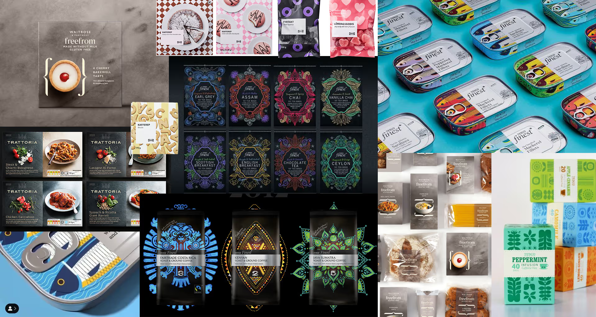
Natural, warm and muted. The Pantone Institute's Colour of the Year 2026 is Cloud Dancer (PANTONE 11-4201) – a delicate, broken shade of white, symbolising calm, harmony and the need for quiet in a chaotic world.
It's the first time in history that Pantone has chosen white, which clearly underlines the desire to return to simplicity, minimalism and ‘breathing space’. This palette is complemented by the colours proposed by leading fashion and interior designers. In any finishes, warm brown instead of cold gold.
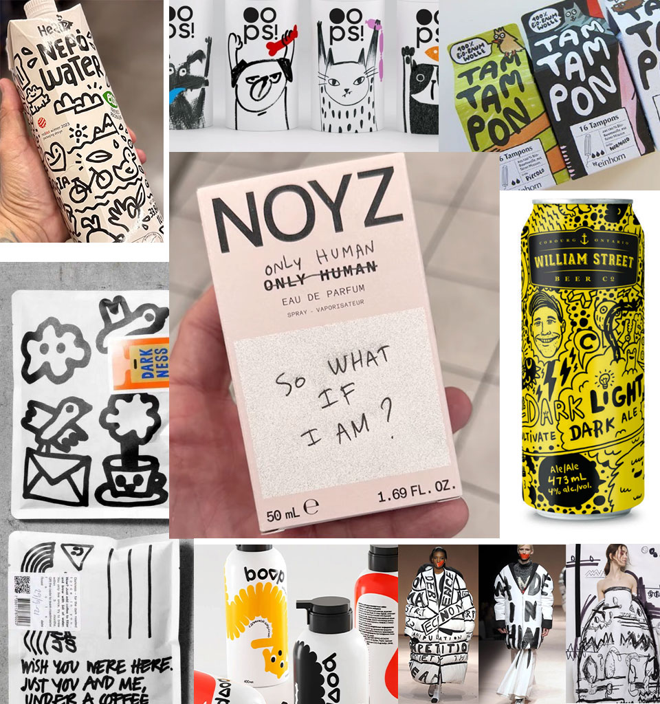
Naive design
This is one of the main trends hidden within the humanism current. Elements we spent years getting rid of – as we perfected our tools and craft – are returning to designs. Sketches, scribbles, handwritten notes, wrong proportions, raw textures and uneven lines are coming back – as proof that a design comes from someone, not from something.
It's worth remembering, though, that this imperfection should bring a touch of warmth to designs, not chaos. You shouldn't cross that line, and it's wise to keep the chaos in check, intervening cleverly only in selected elements of the packaging.
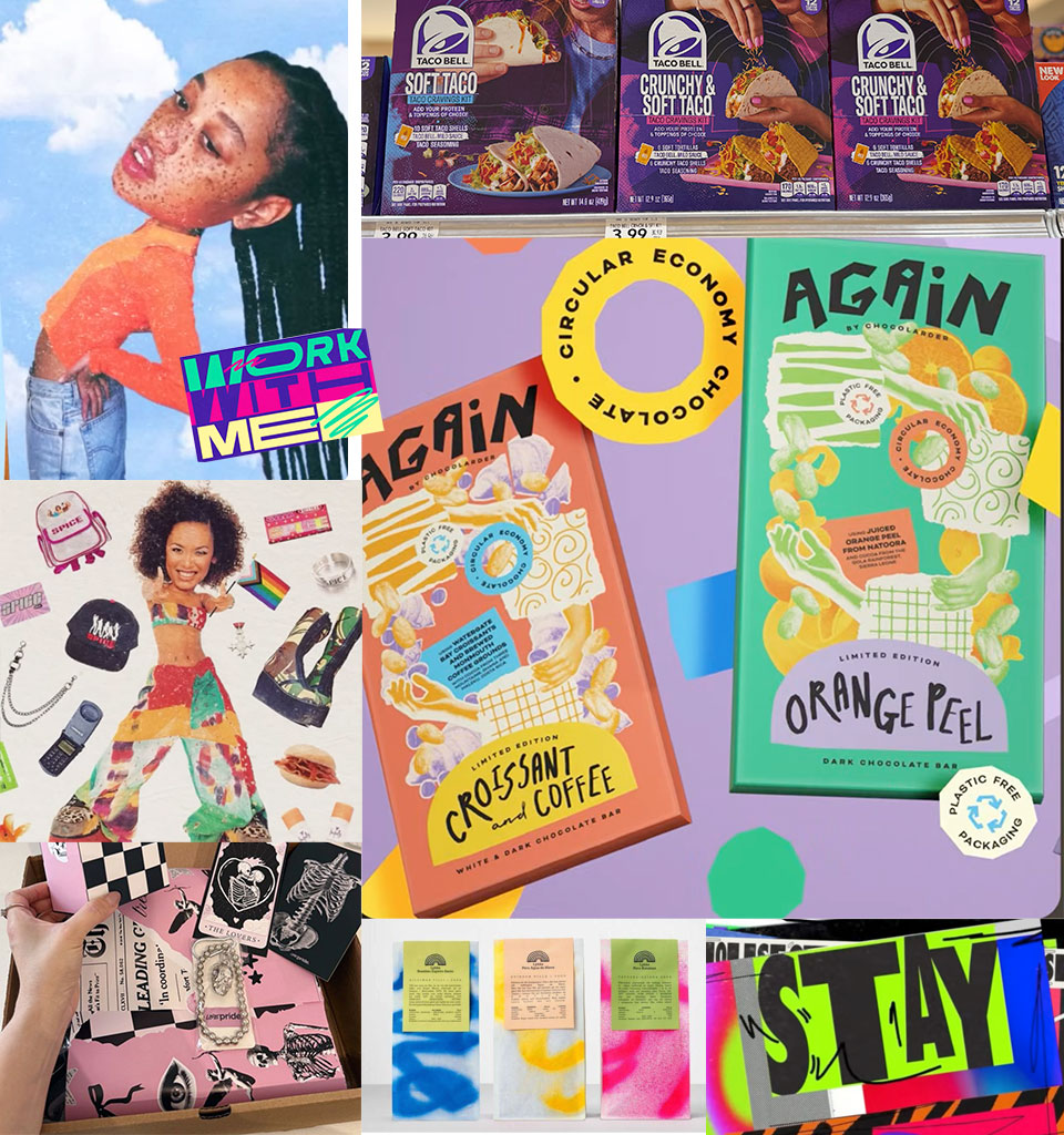
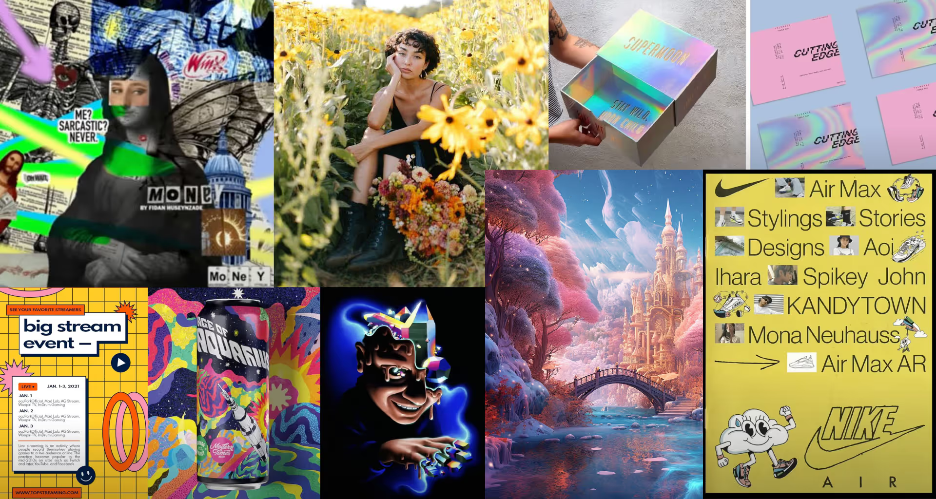
Post-Digital Collage
Younger designers increasingly look for inspiration in Generation D. Uneven edges appear, looking as if hand-cut with scissors, rescaled proportions, deliberate ugliness and imperfections of all kinds. Unusual combinations of colours, textures and fonts are also visible, as well as the mixing of different techniques.
These deliberate imperfections remind us that on the other side of the product stands a human being who created it. And even if the result isn't ‘gorgeous’, it's often enough to forge an authentic bond with the consumer.
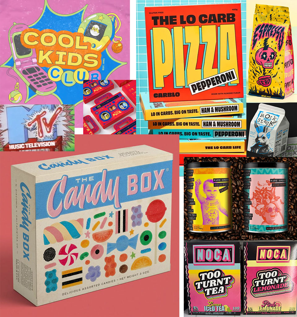
Retro Reboot
This is the recycling of trends from the 1980s and 90s and the aesthetics of various subcultures, such as punk (massive typography, black-and-white combined with bright colours). It only makes sense, however, when we reach for eras that actually mean something to our audience. It's not about staying stuck in the past, but about bouncing off it to create something new — cleaner and more modern. This trend also includes the combining of different eras (e.g. modern medieval), which makes it possible to achieve unique and unexpected effects.
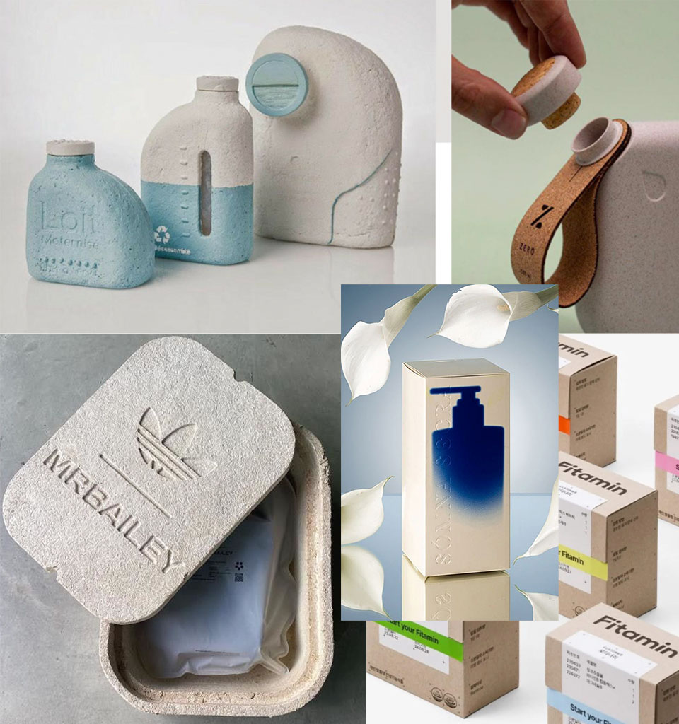
Natural minimalism
Earth tones, organic textures and natural materials, with finishes kept to a minimum. The role of graphics is reduced in favour of showcasing the material itself and the form of the packaging. This trend may feature ethereal botanical motifs.
Alternative materials are being used on an ever-larger scale – including those based on seaweed, regenerated fibres, paper pulp or agricultural waste. It will also be the time of mono-material pouches and compostable plastics. Sustainability is becoming the core of visual identity.
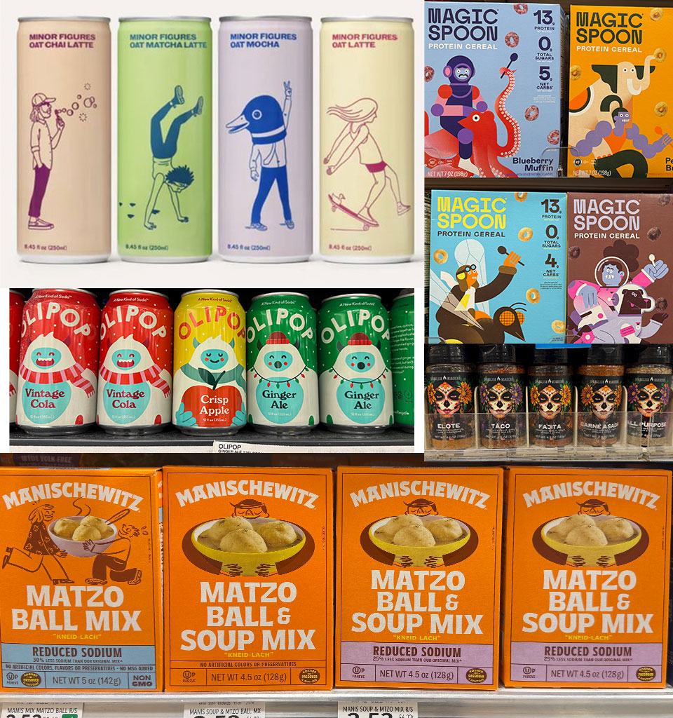
Character-Driven Design
Another expression of the need to build relationships. The characters present in packaging design appeal to emotions, which are increasingly becoming more important than information itself.
The character ‘smiles’, ‘cares’ or ‘invites’ – building a sense of security or fun. It reduces the distance to the product and catches the eye faster than typography. This is especially important in the categories of food, children's and everyday products.
TECHNOLOGY

Colour as action
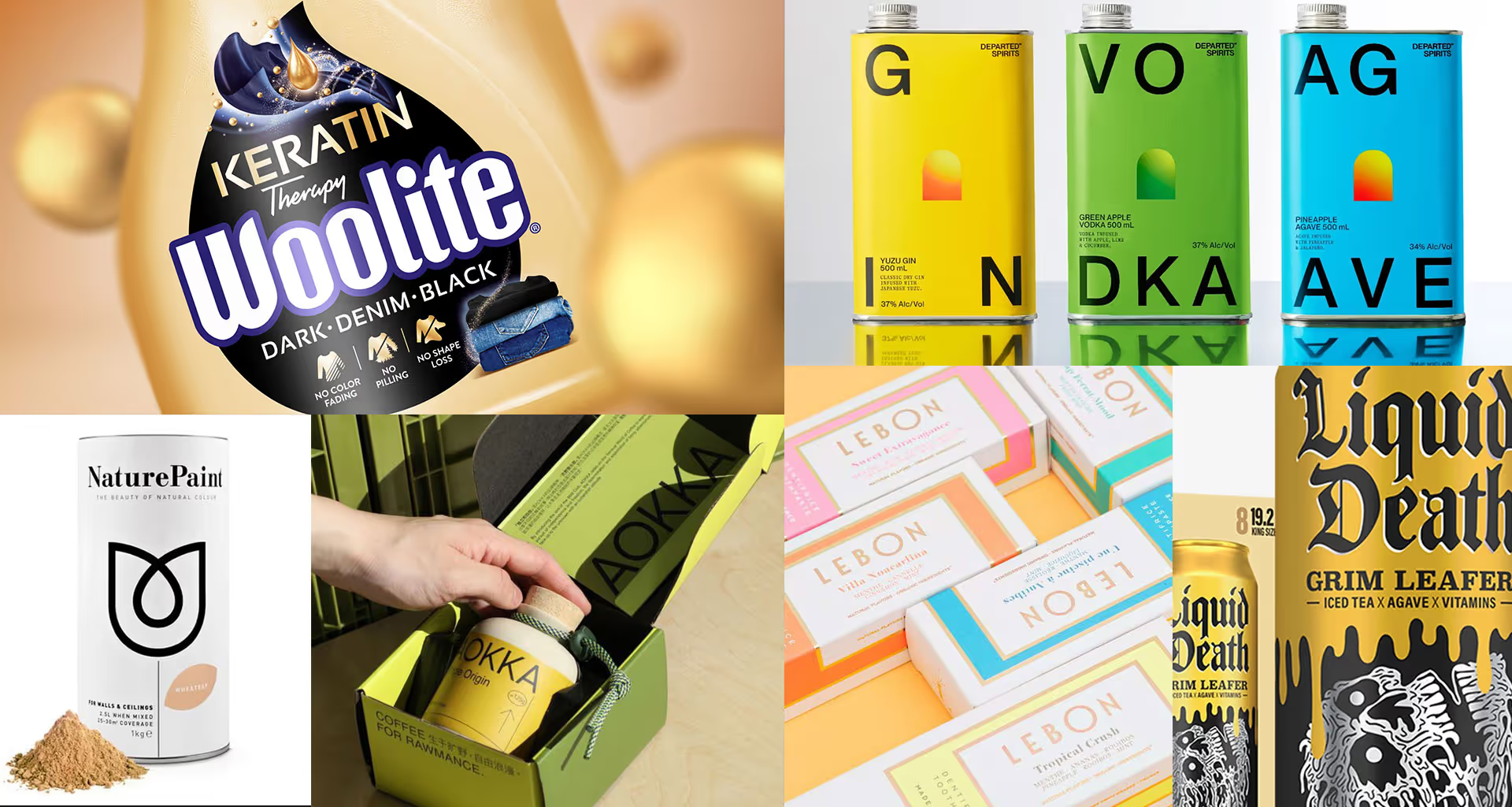
Vivid, almost ‘chemical’ colours. Strong colour contrasts and combinations that don't occur in nature. Radioactive gradients (red–yellow–purple–blue). Here, colour is meant to show action, not build a mood.
AI tools and new printing techniques make it possible to work with colour ever more boldly and experimentally. This aesthetic will work well, among other things, in packaging aimed at Generation Z. As a counter to this loudness, minimalist black-and-white combinations will appear more and more often, especially in higher-end products.

AI surrealism
New tools make it possible to create images of extraordinarily detailed styling, combining different styles with an incredible richness of form and texture, as well as to build surreal worlds full of enigmatic artefacts. Artists inspired by this aesthetic direction will experiment with juxtaposing flat typography with undefined forms simulating 3D.
Importantly, artificial creations should remain merely an element of, or an inspiration for, the design. An image that looks as though it was generated directly by AI is increasingly seen as a sign of bad taste and visual cheapness.
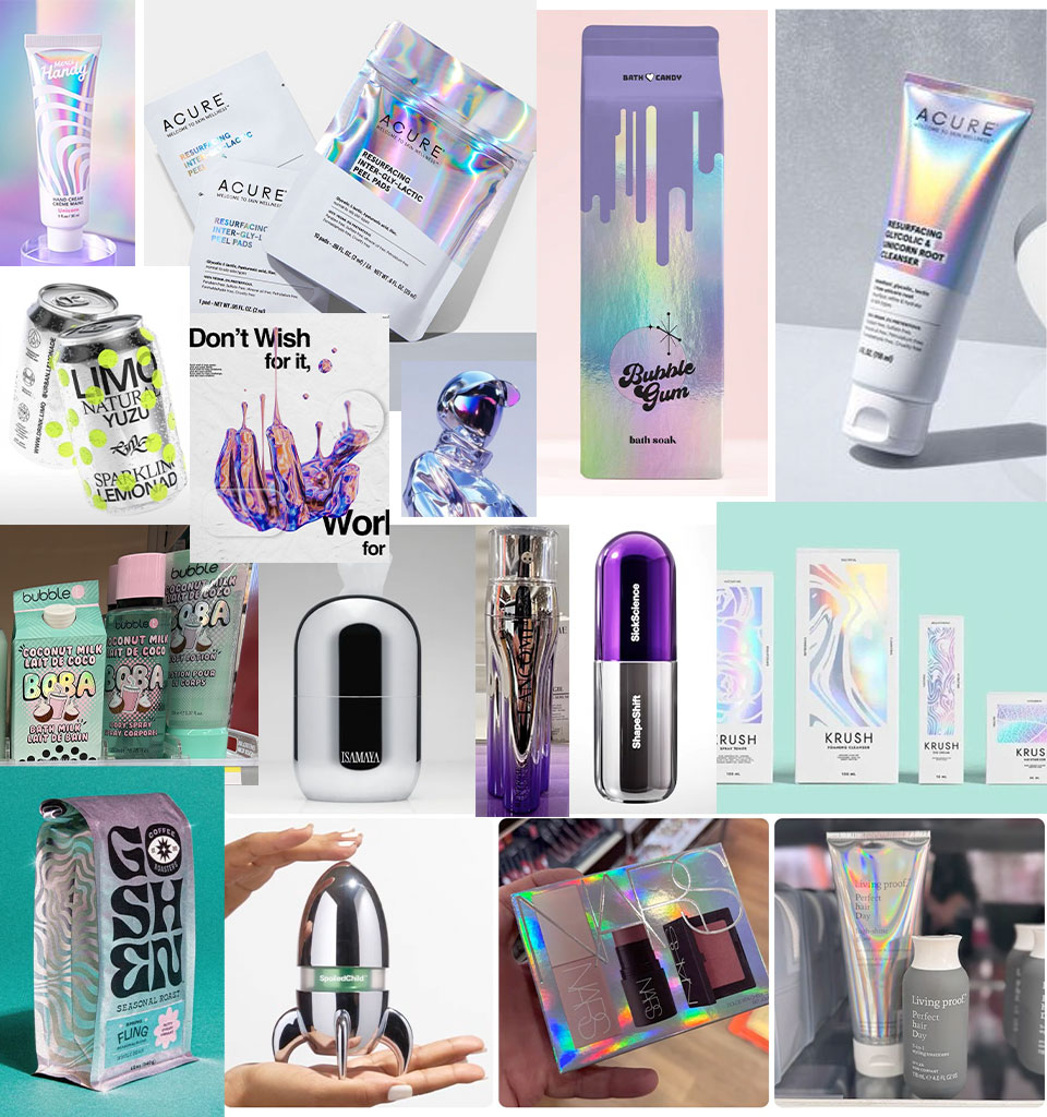
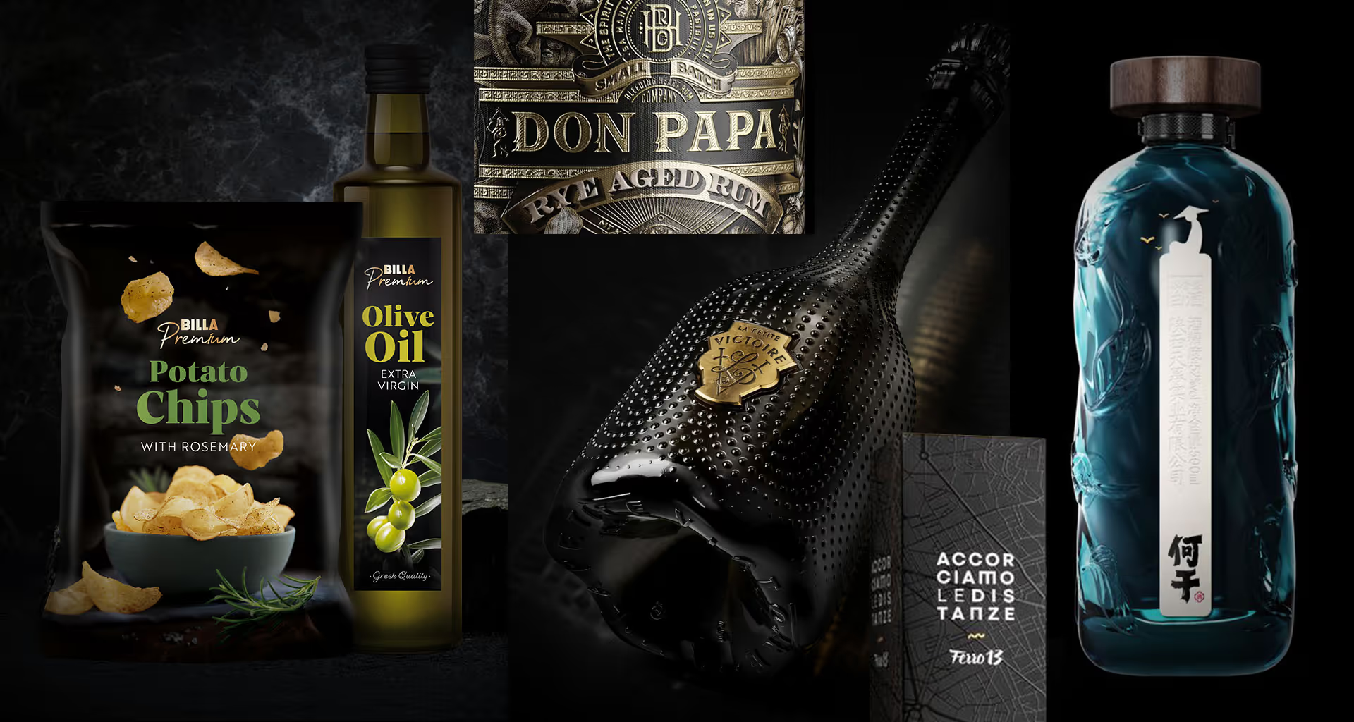
Soft metals
Liquid metals – easy to generate using AI tools. Metallic foils used as finishes and metal packaging with soft, rounded edges. Together they create a unique effect of technological silkiness.
This is an aesthetic aimed at an older target audience, working particularly well for cosmetics, which today have to compete visually with advanced beauty devices. It is also an attractive motif for limited editions.
Tech Spec
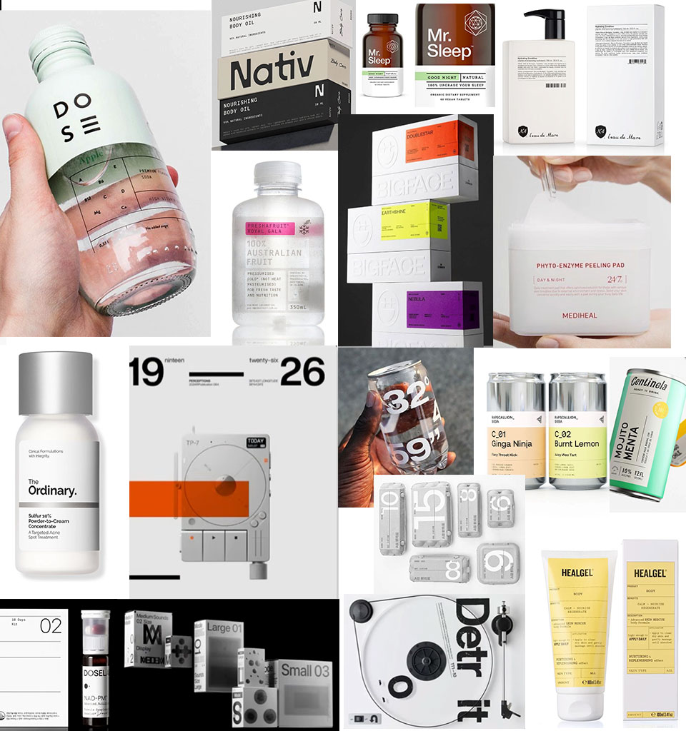
Packaging that looks like prototypes or even like samples taken straight from a laboratory. It relies on utilitarianism and clarity of design – a limited number of elements, colours and pieces of information. Tabular layouts and order dominate, and only the most important messages appear on the front of the pack.
This aesthetic is meant to be an expression of transparency and competence. It is orderly technology that offers respite from information noise and an excess of stimuli. It is often based on combining raw white with metallic black. Grids inspired by spreadsheets are also characteristic. This is a style typical of higher-end packaging.
Data aesthetics
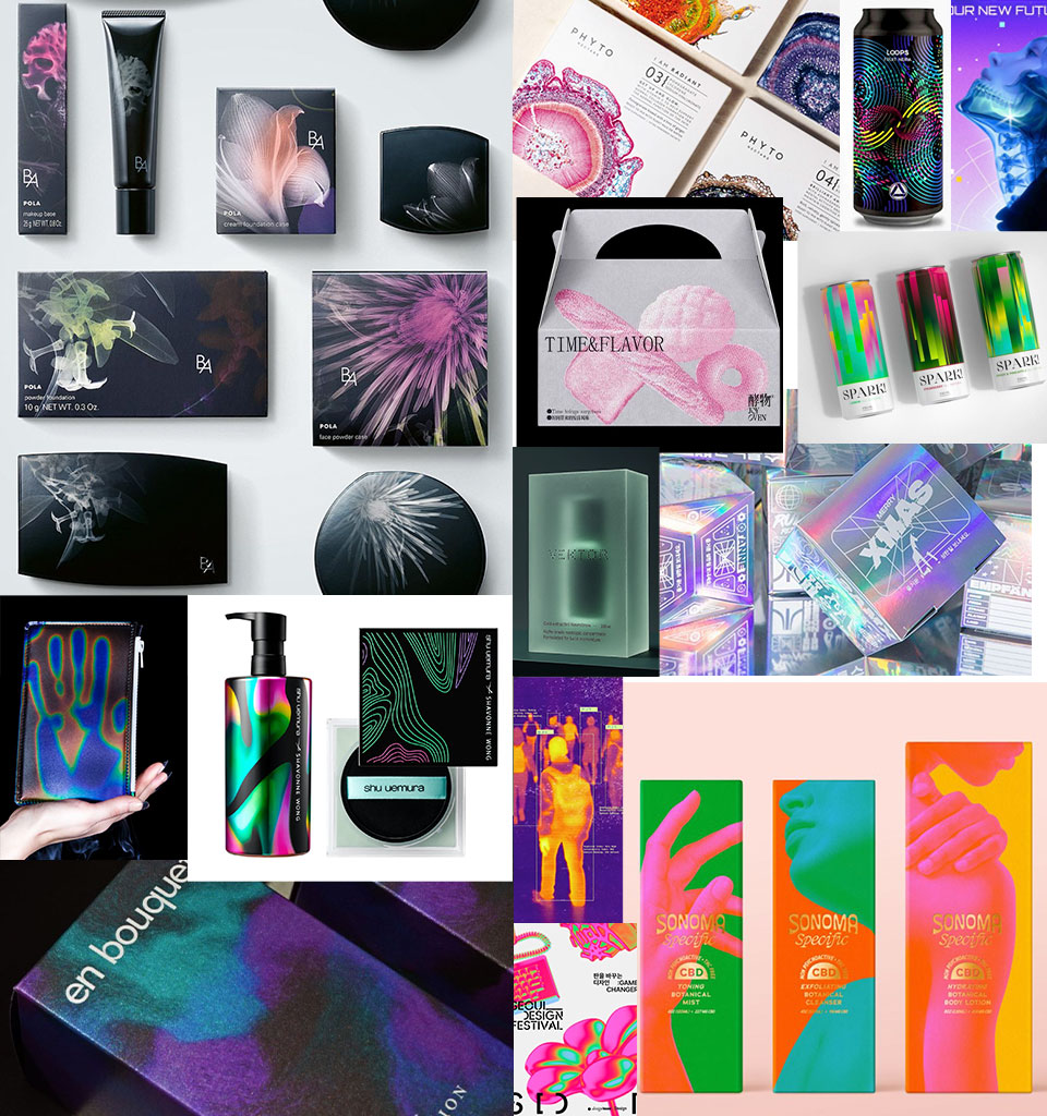
This is a broad trend inspired by the way machines ‘see’. It includes, among others, X-ray vision – showing the inside of a body, luggage or machines; biometric vision, focused on the distances between points and mathematical patterns rather than faces; mesh vision, in which shape is perceived as a set of nodes; thermal vision, revealing the temperature of objects in the form of characteristic gradients; and also radar and lidar vision, based on radio waves and laser pulses.
It's a non-human perspective, shifted colour channels, the disintegration of text and image, graphic damage imitating (glitch, error). Charts instead of illustrations, and data treated like ornament.
These influences are particularly visible in the world of music – on album covers and festival posters – as well as in tech branding. Increasingly, however, they are also finding application in packaging design for wellness and medical-beauty products, electronic equipment, specialist products, medicines and supplements.