Stand out or die
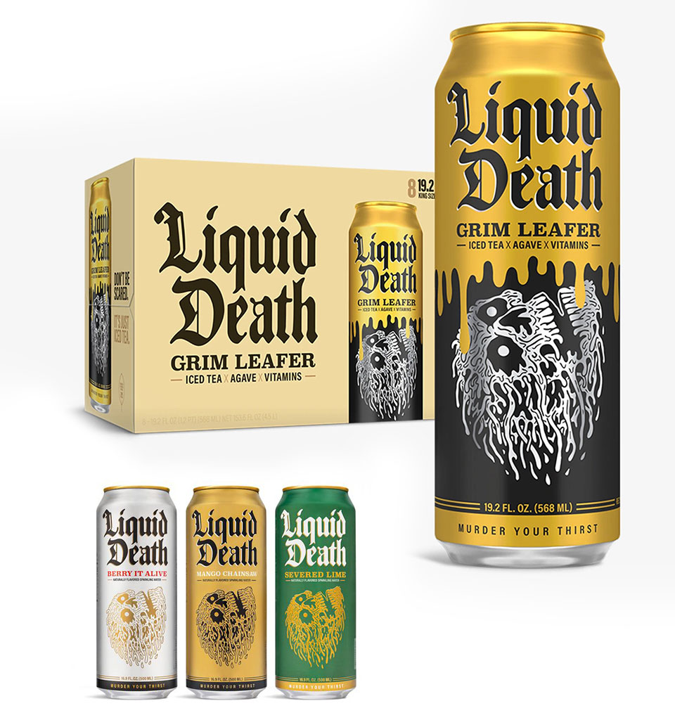
When designing packaging, we usually move within the visual codes of a given category. If it's water, then a bottle with a white-and-blue label. But is that always the right path? I believe in the slogan ‘Stand out or die’. The creators of the ‘Liquid Death’ water concept believed in it too – and took it literally. Water that borrows wholesale from the beer category.
The brand's target audience is teenagers. Using this kind of packaging is consistent with its strategy. The brand breaks the taboo of death and many others, but it also strongly champions ecology (#DeathToPlastic). A can is more eco-friendly than plastic, and a teenager looks cool holding one – even though they aren't drinking alcohol.
Borrowing from another category's codes
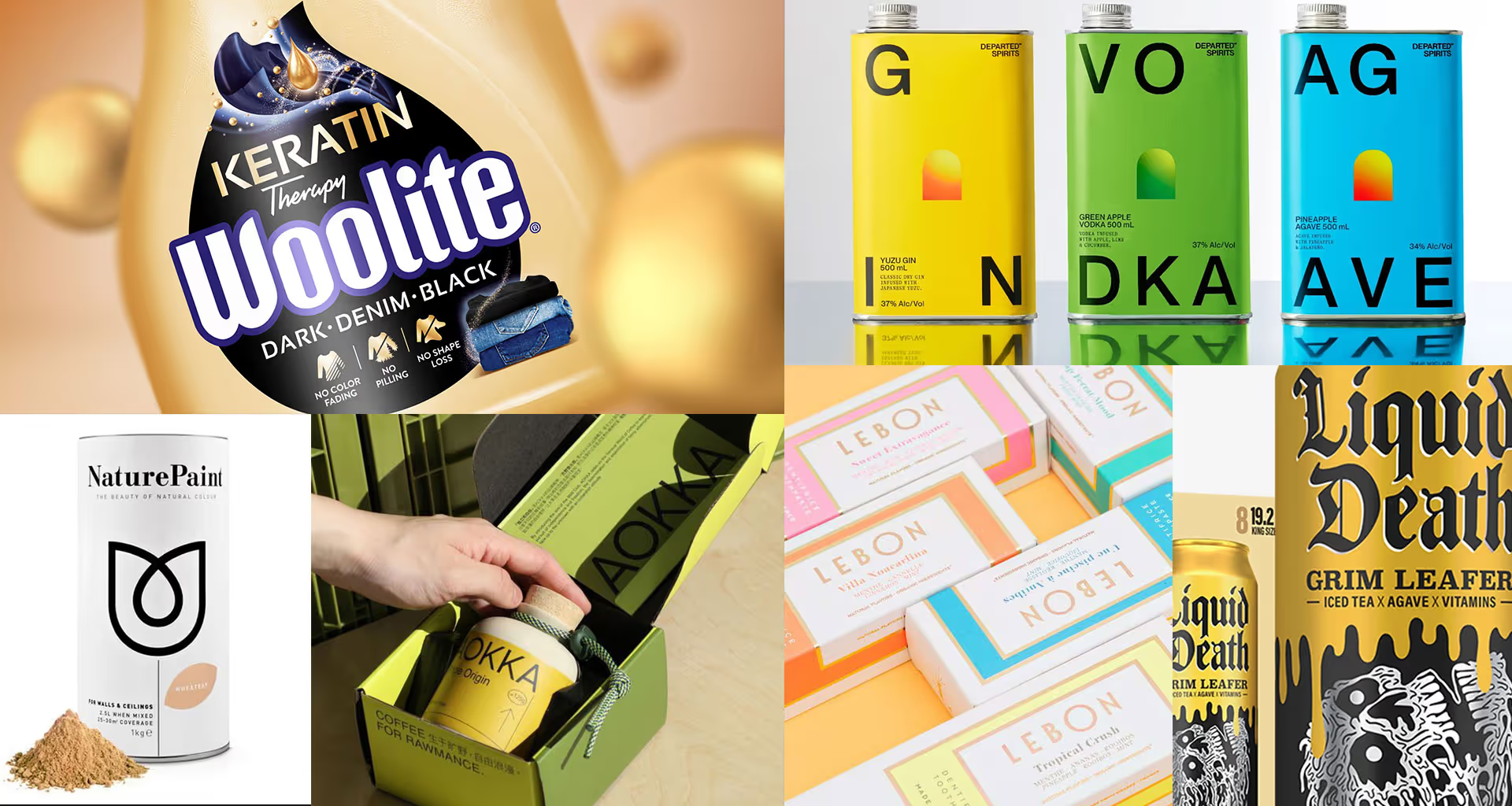
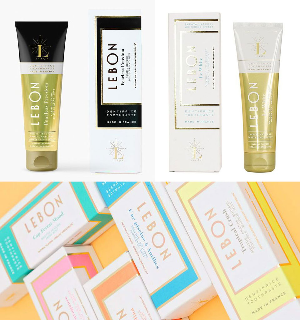
How do you stand out on today's overcrowded shelf? A simple solution that guarantees leaving the competition far behind is to borrow from the codes of other categories. Here's an example: Lebon toothpaste, whose packaging is inspired by luxury cosmetics.
Spirits too good to be saved
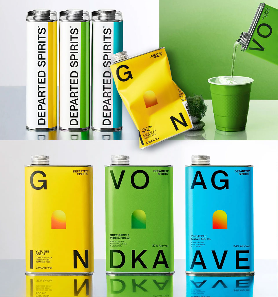
This brand was created to make premium spirits fun. One of its main claims is: ‘Top-shelf spirits for bottom-shelf people’. It explains its unusual packaging by pointing out that surgical-steel hip flasks are more convenient to use and, on top of that, 100% more durable than glass. So you can take the party with you – wherever you like.
NaturePaint
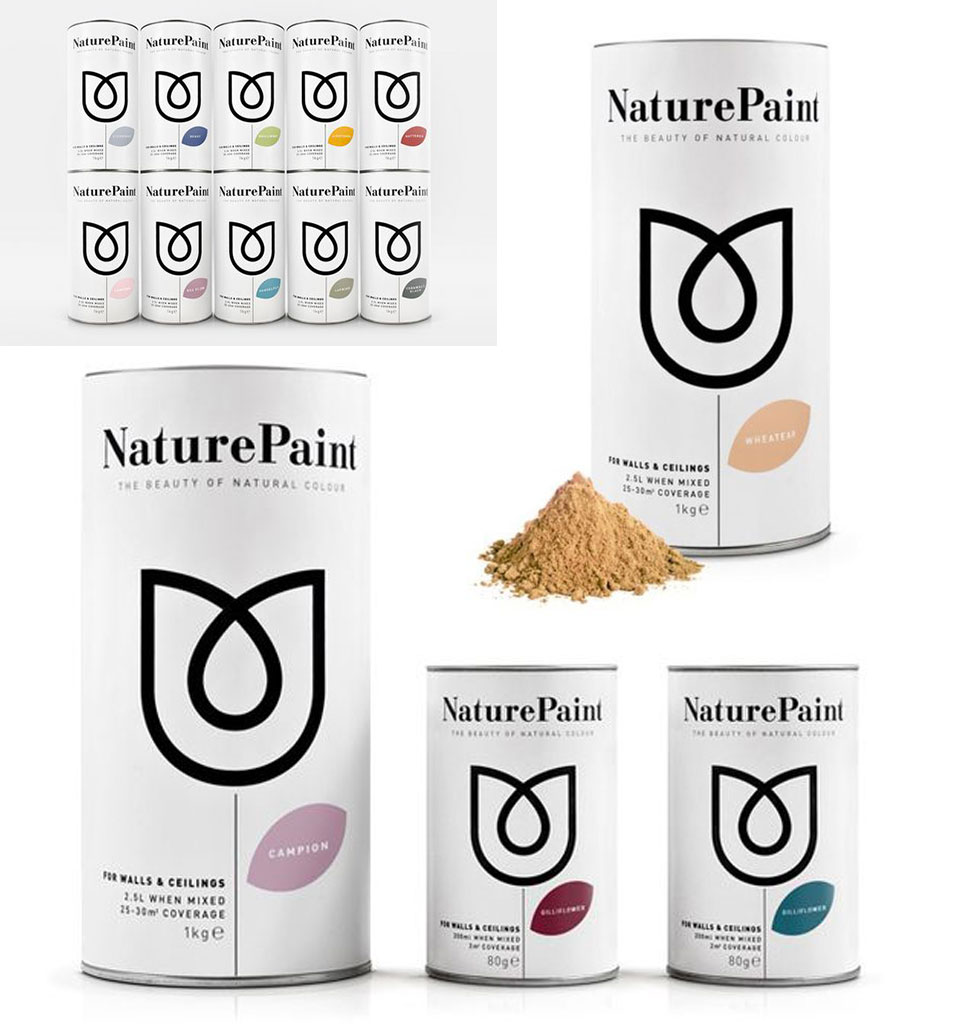
This paint packaging strongly resembles eco-friendly porridge oats. That's because the brand champions ethics and naturalness. NaturePaint products are made exclusively from natural ingredients. They're so safe you could eat them 😉
The product and the label clearly reach beyond their category. The paints, however, still come in cans – but not ordinary ones: they're made of special, recyclable cardboard.
Aokka Coffee
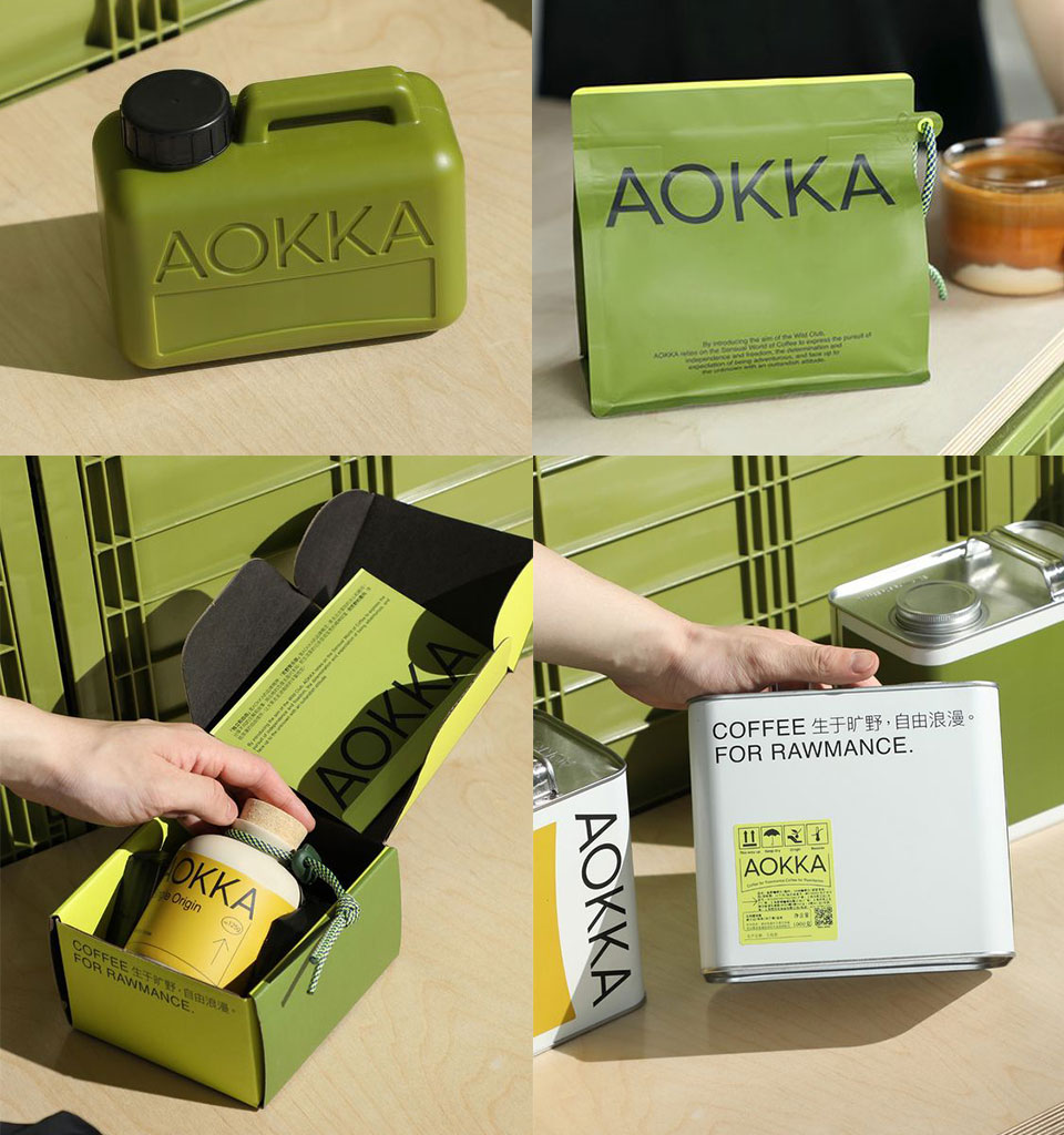
This coffee definitely stands out against the crowded coffee industry. Aokka is a coffee brand that has not only a sense of purpose but also a taste for adventure. It crosses borders and breaks rules. All the packaging designed for the brand is inspired by objects essential to far-flung, exotic journeys.
The Polish market
You might think that the stiff and conservative Polish market has no room for such bold moves. The example of Woolite, however, shows that it's worth trying.
Although the company couldn't afford to change the structural packaging, by playing with the bottle colour and the label design alone, they radically transformed their image.
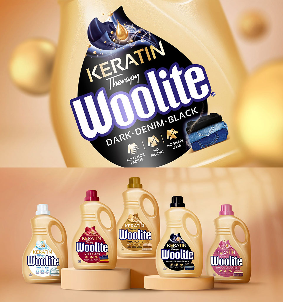
When designing Woolite's new packaging, we drew on codes from keratin hair shampoos. This strategy stemmed from the concept of a product that contains keratin, so it cares for the fabric's fibres like the best shampoo. And since the target audience is women, the rebranding proved a bullseye, taking the brand to a new level.