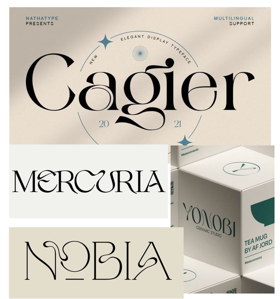
Modern Art Deco
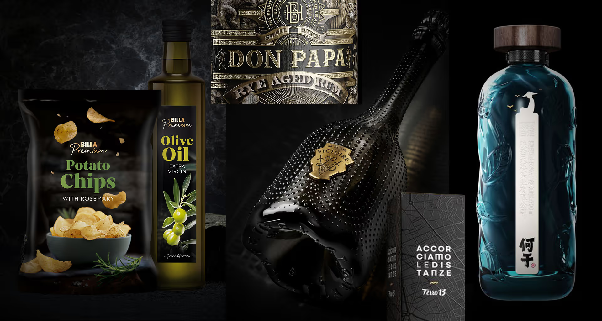
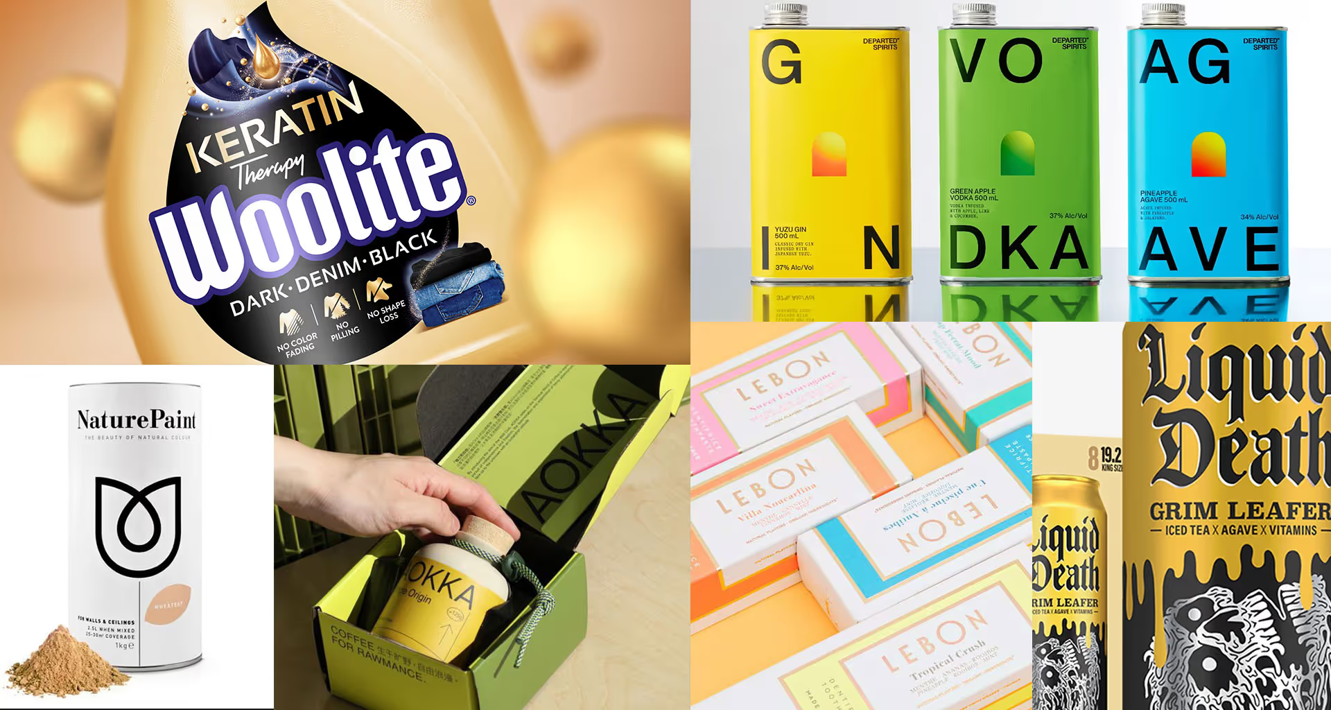
In the premium and upper-mainstream categories, serif fonts with refined, intricate forms reign supreme. Created almost as if after a glass of absinthe 😉
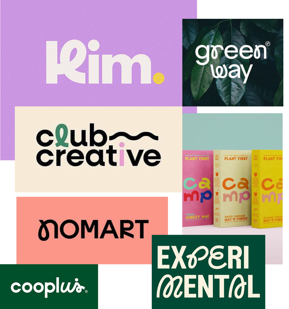
Quirky monoline fonts
Monoline fonts that combine a modern sans-serif with a script face. This is my favourite trend 🙂
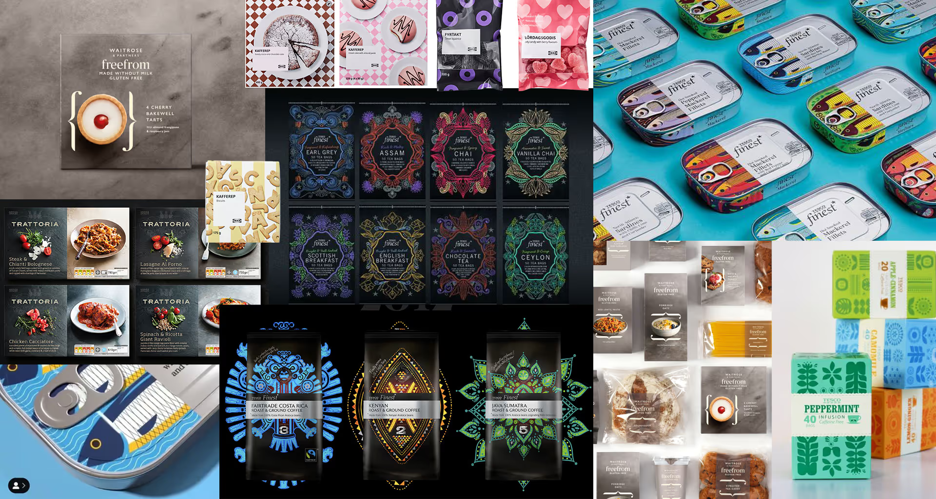
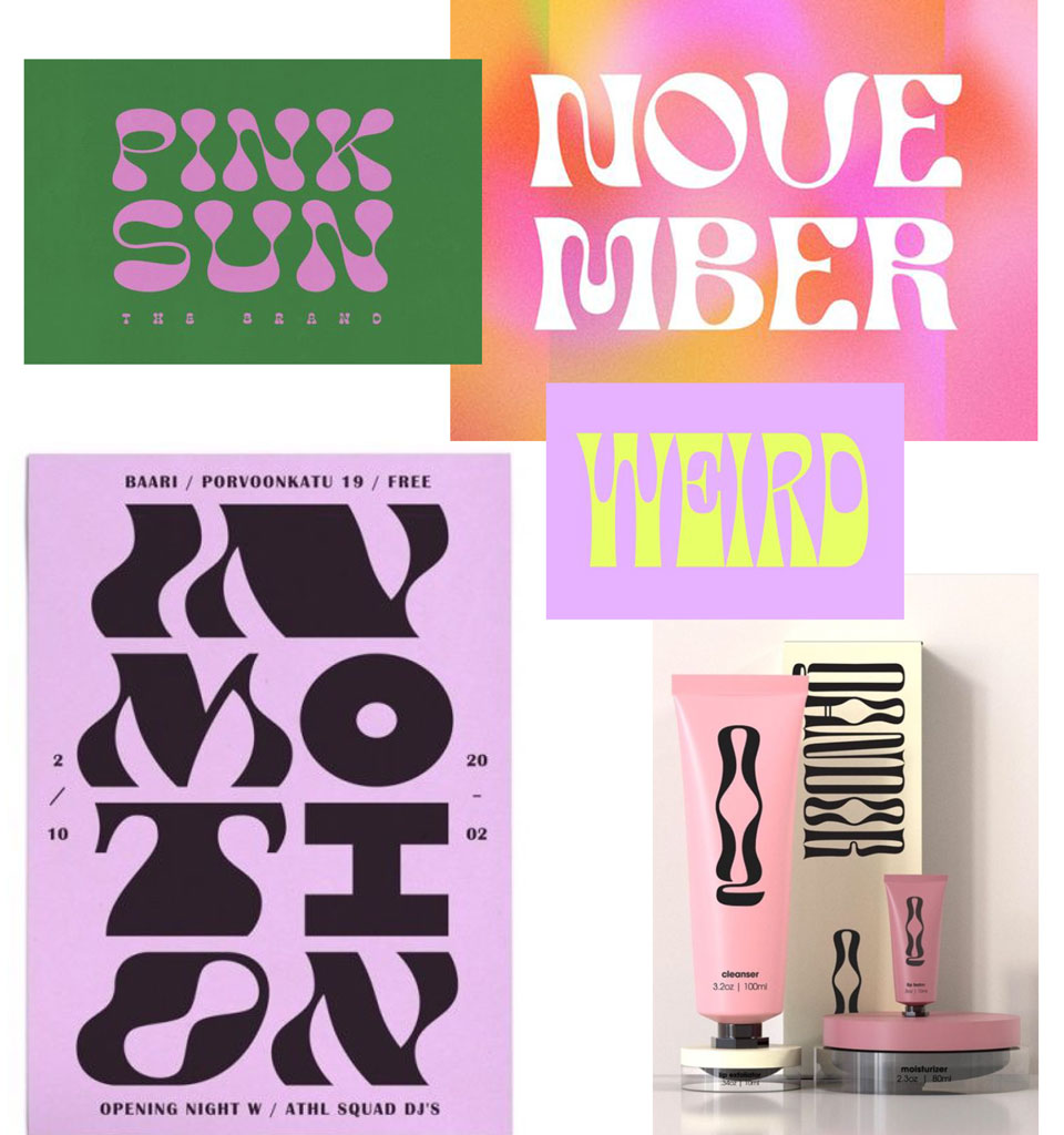
Retro
Right at the start of the year, a trend inspired by the 1970s appeared in typography. We'll see how long it lasts 😉
Mixes
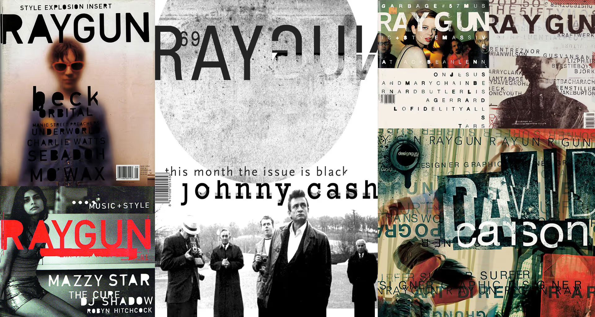
Mixing different fonts or reworking individual letters. It demands a strong typographic instinct from the designer, but what results! 🙂
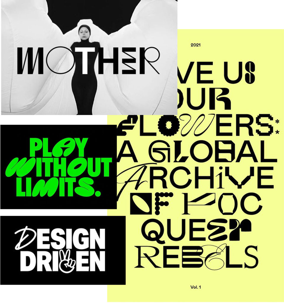
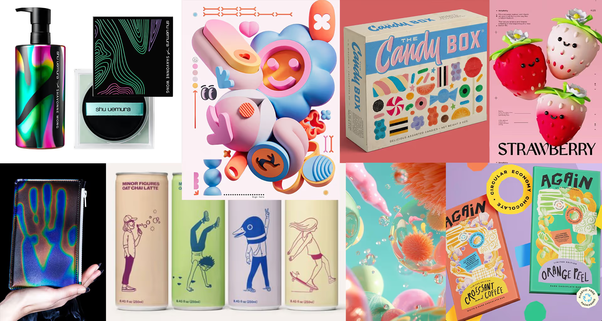
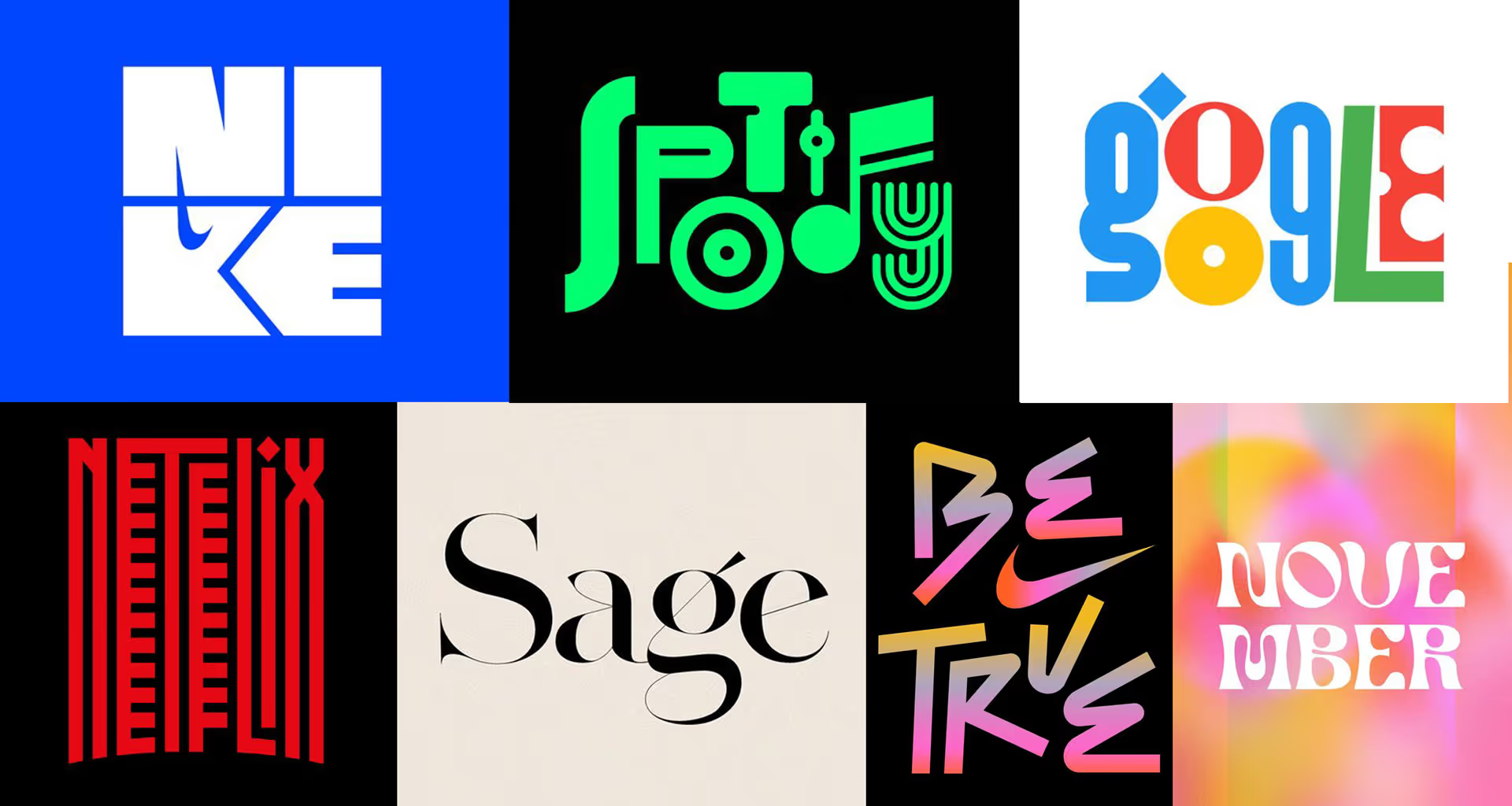
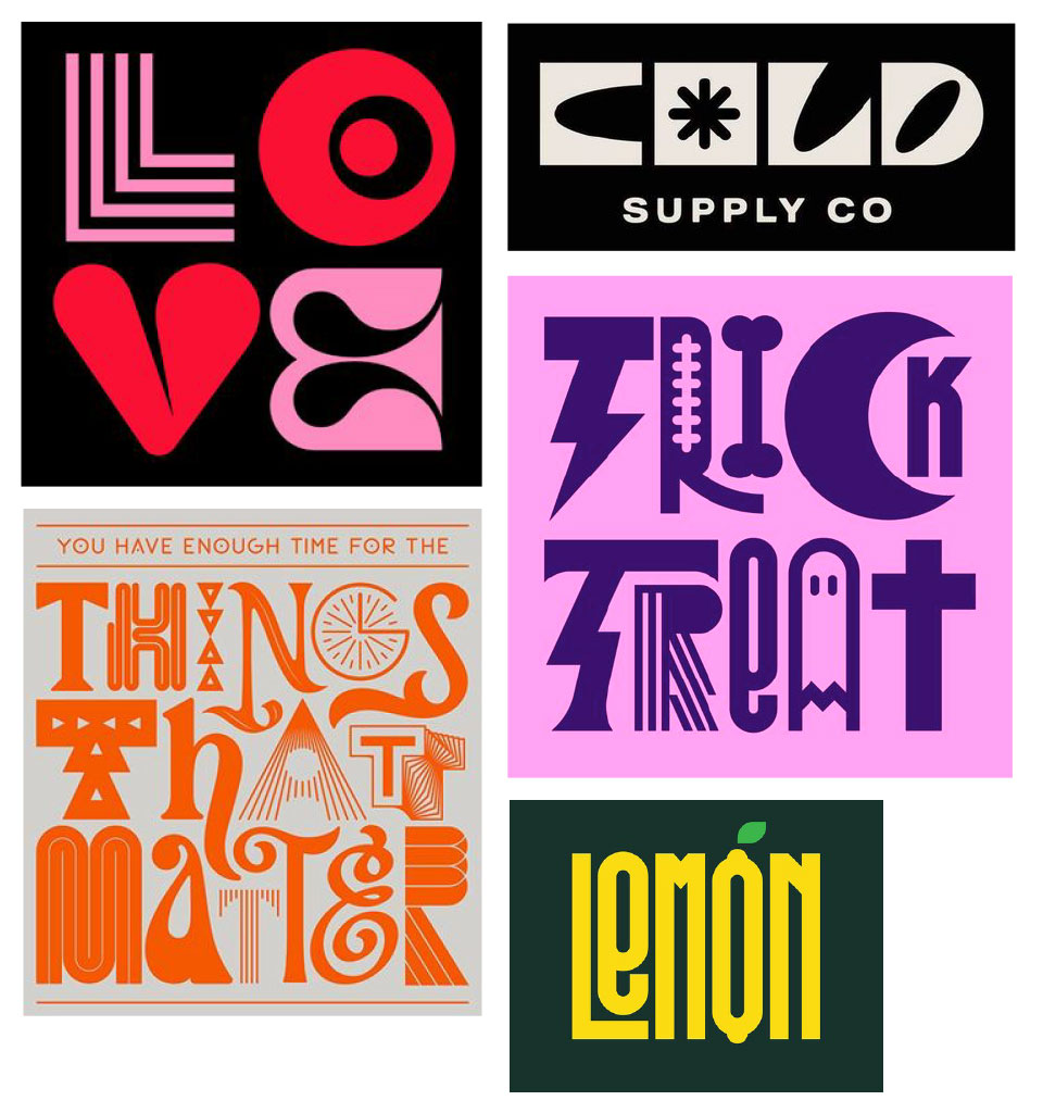
Letter = Illustration
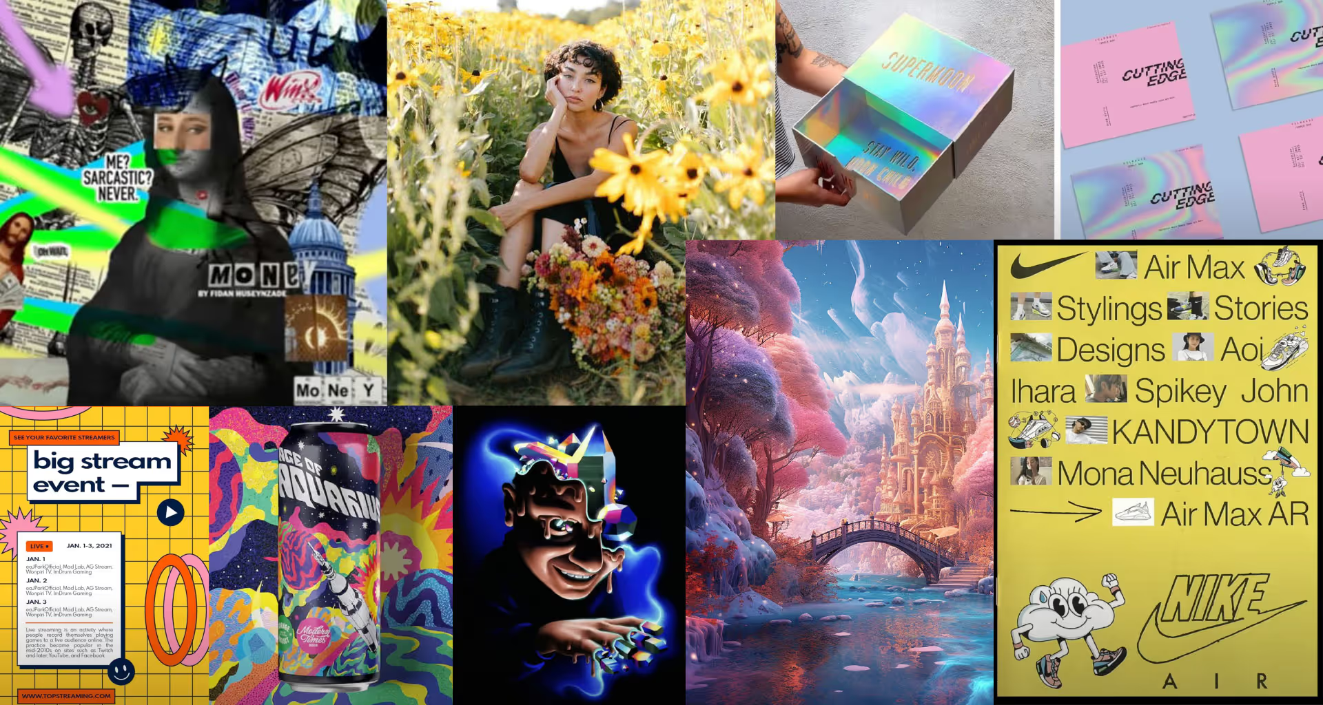
A beautiful trend of building letters from scratch as illustrations of the content, or simply to enrich the variety of form.
Simple, but with a twist
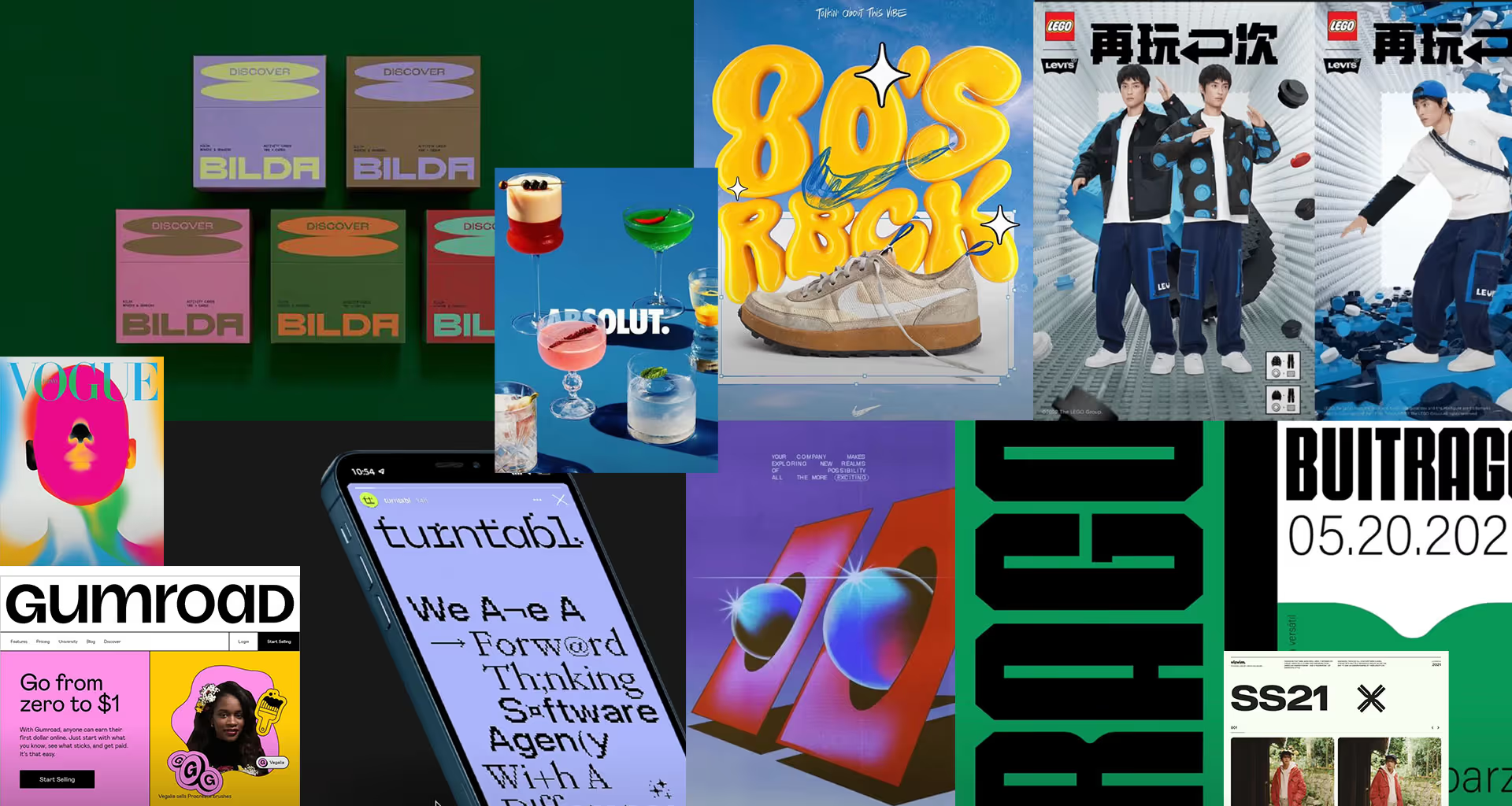
Even the simplest, classic fonts are now cleverly reworked so that they keep their legible character but gain a certain ‘edge’.
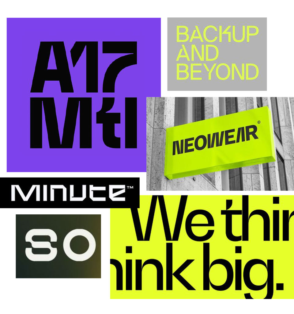
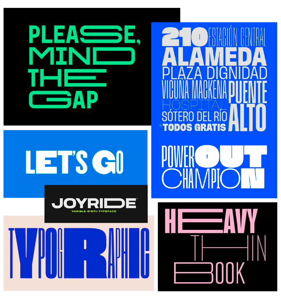
Playing with width
Another way to find fun in simple, sans-serif typography is to play with different letter widths. Recently, plenty of ready-made fonts of this kind have appeared.