Premium, full of contradictions
In the design world, the word ‘premium’ is thrown around like confetti on New Year's Eve. This beloved skeleton-key word opens no doors, though. All the more so because it is often used in the context of brands and products that aren't premium at all. What's more, it can mean completely different things depending on the category, the target audience or the geographic latitude. It is a concept full of extremes and even opposing meanings.
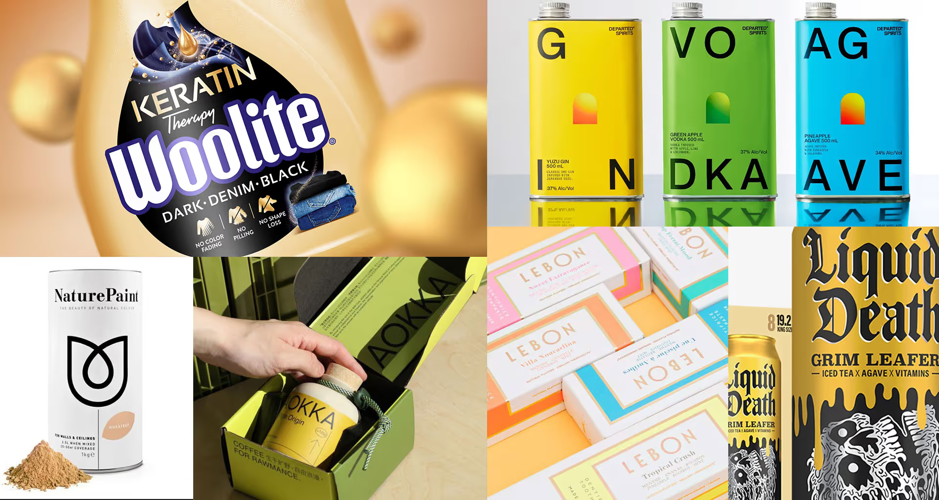
Minimalism vs. richness of form
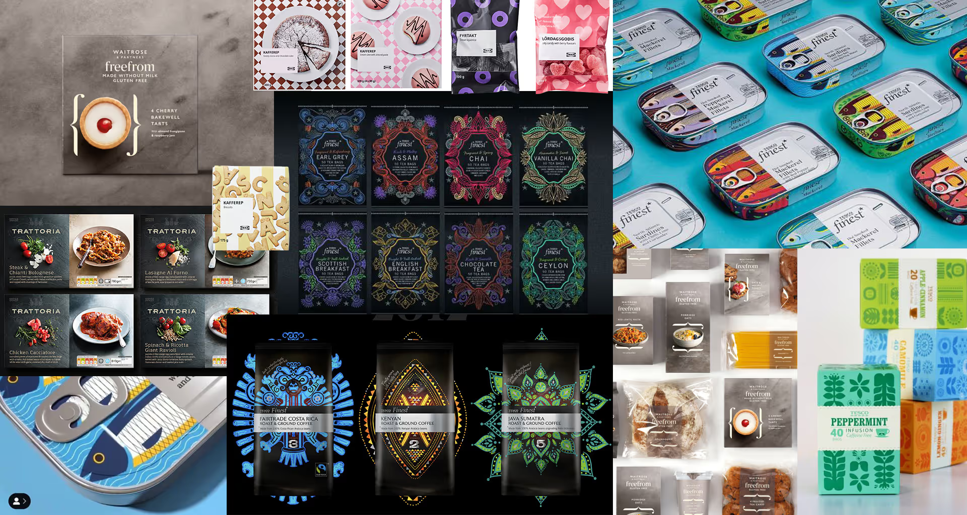
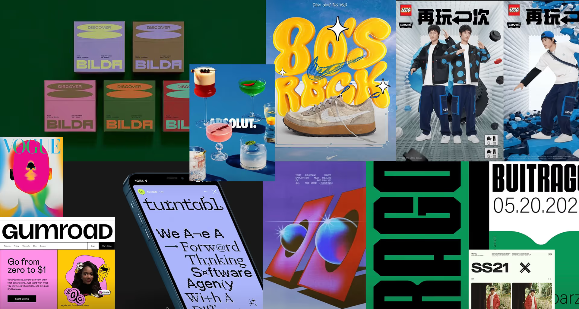
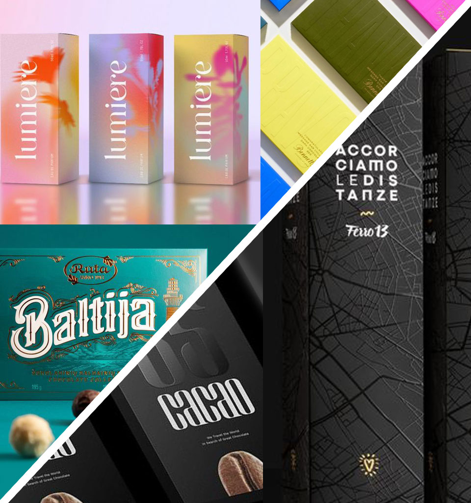
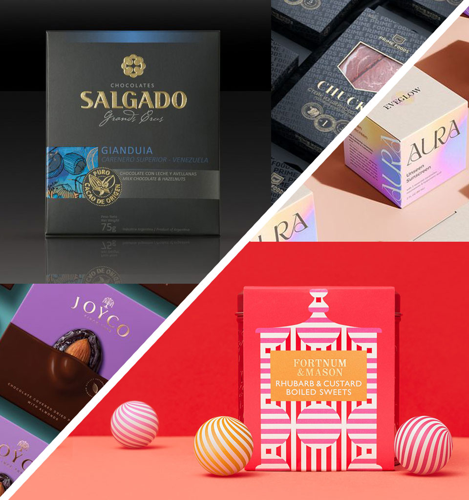
On the one hand, premium can mean minimalism, simplicity and muted colours. On the other, a richness of textures and a multitude of details. And although it might seem that certain tendencies exist – for example minimalism on the British market or horror vacui in Arab countries – this is only one piece of the puzzle.
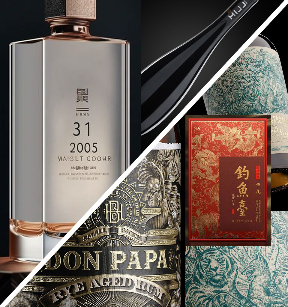
Black vs. intense colours
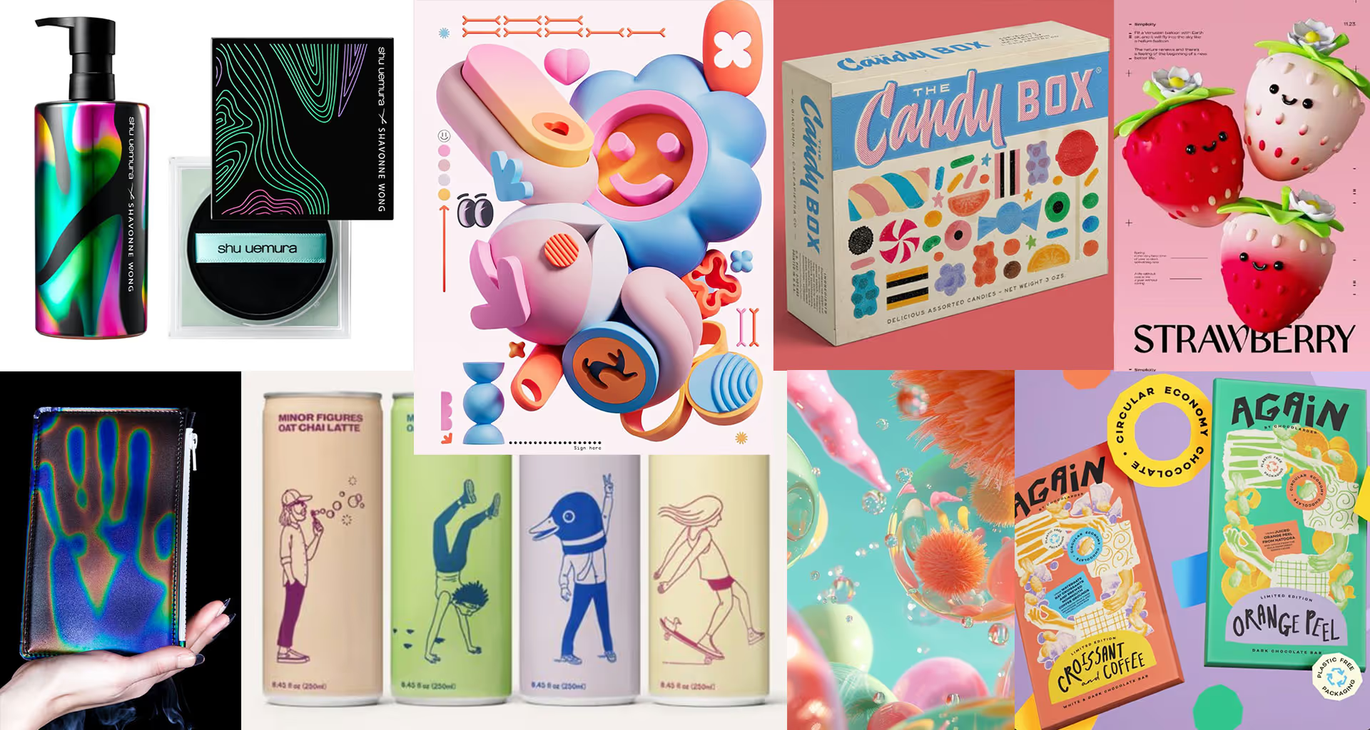
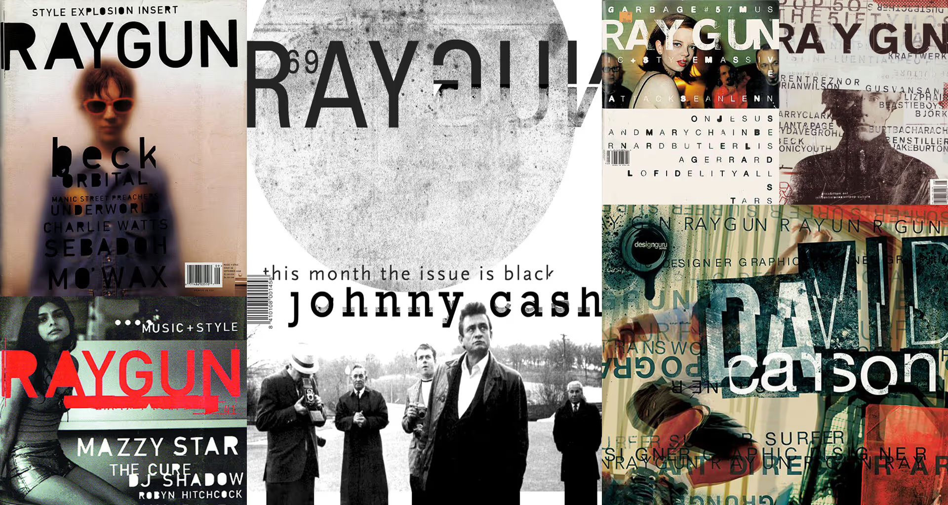
This is one of the main trends hidden within the humanism movement. Elements we spent years getting rid of – as we perfected our tools and craft – are returning to designs. Sketches, scribbles, handwritten notes, wrong proportions, raw textures and uneven lines are coming back – as proof that a design comes from someone, not from something.
It's worth remembering, though, that this imperfection should bring a touch of warmth to designs, not chaos. You shouldn't cross that line, and it's wise to keep the chaos in check, intervening cleverly only in selected elements of the packaging.
Ecology vs. exclusivity
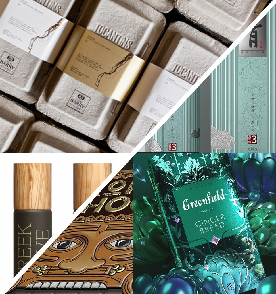
Another contrast in premium packaging design is ecology. It's a trend visible especially in Western Europe: recycled packaging, biodegradable materials, a raw and natural look. At the opposite pole, we have the combining of different materials and the use of many print finishes (here, for instance, Russia and Eastern Europe take the lead).
Classic vs. modern
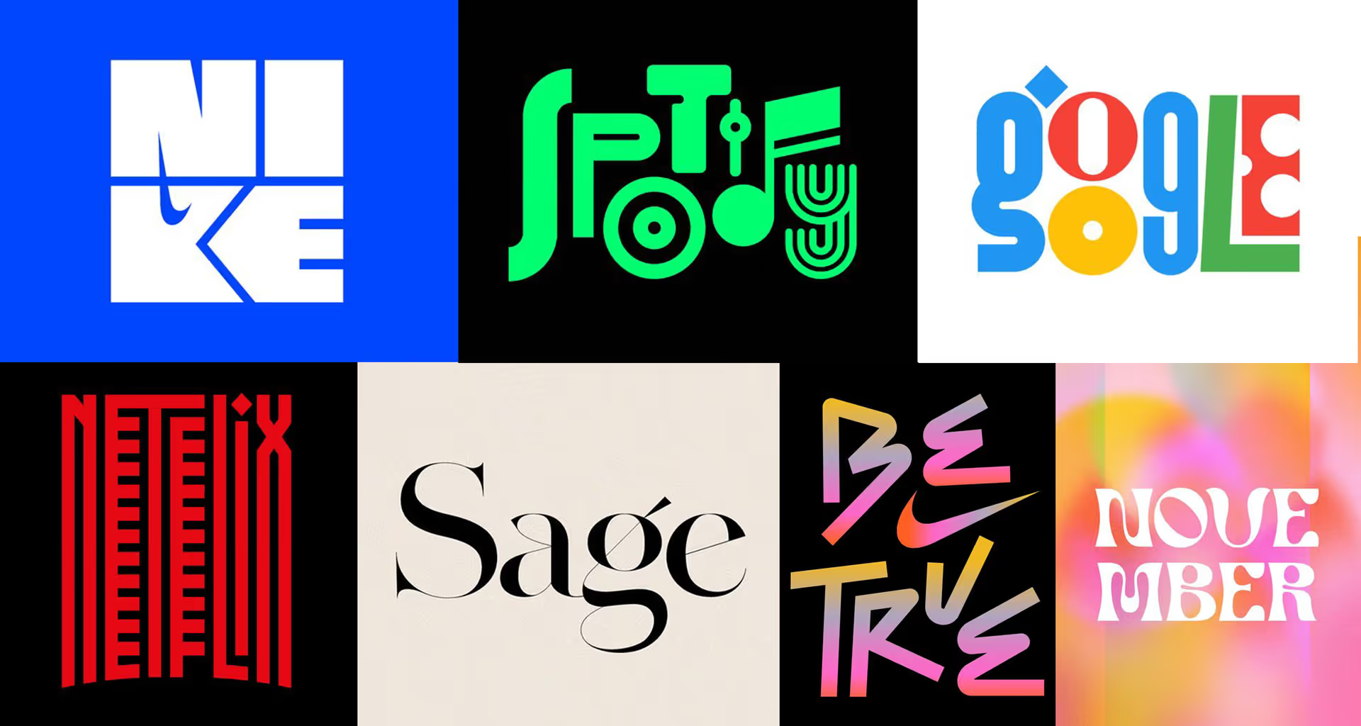
Here, the classic – serif fonts, timeless patterns and proven compositional layouts – collides with the modern, that is, designs that boldly follow the latest trends, creating an impression of quality through the use of the newest fonts and the colour combinations and materials that are fashionable at the moment.
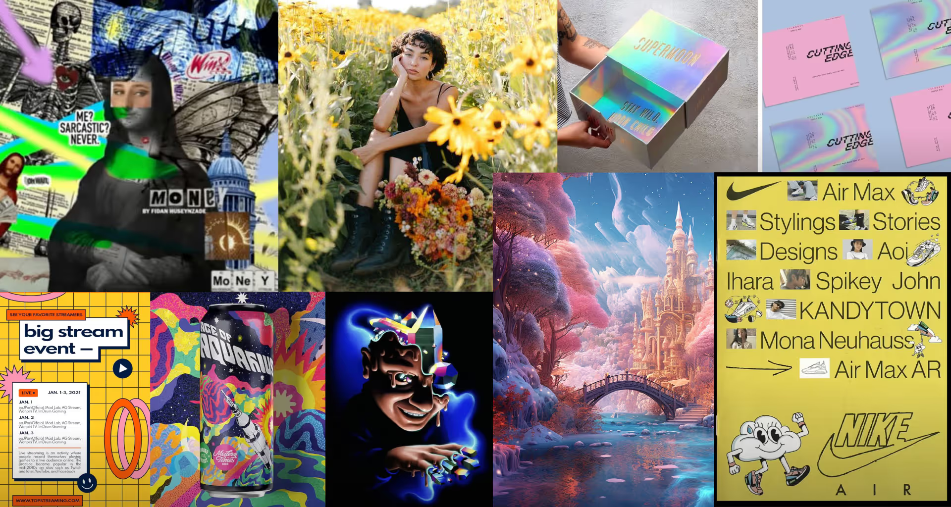
Tradition vs. innovation
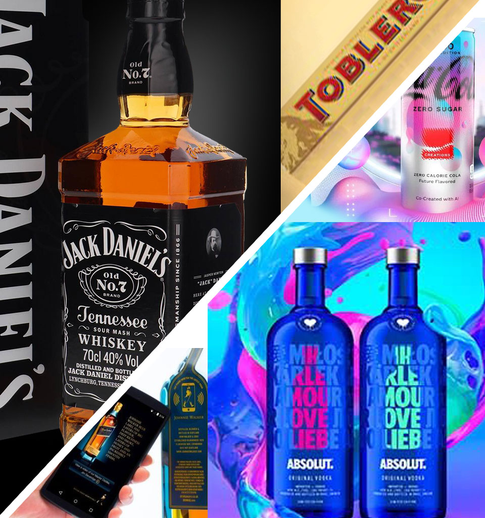
Following this thread further, it's impossible not to notice that for some brands ‘premium’ means a brand's long-standing heritage and remaining unchanged for years. Whereas for others it means the constant search for new styles in design, limited editions and technological innovations, QR codes, augmented reality or futuristic materials.
Premium in private label
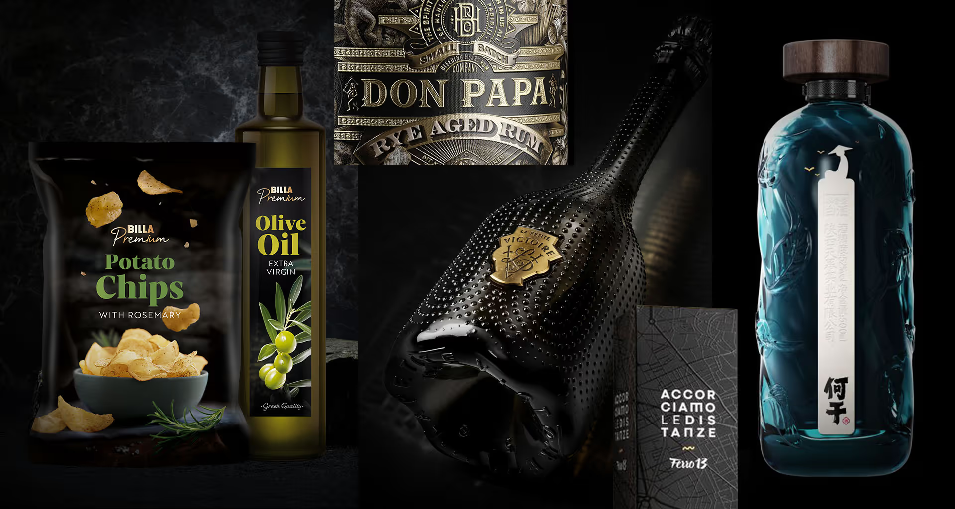
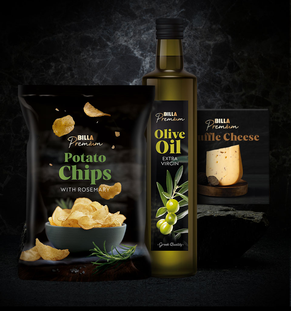
Two years ago, we were asked to design a premium line for a private label in the food category. Now that's a paradox! As always, we preceded the design work with an in-depth analysis of the target audience, the price-shelf level and trends in Eastern Europe. Above, the result of our work, set in turn against Billa Premium, released for Western Europe.
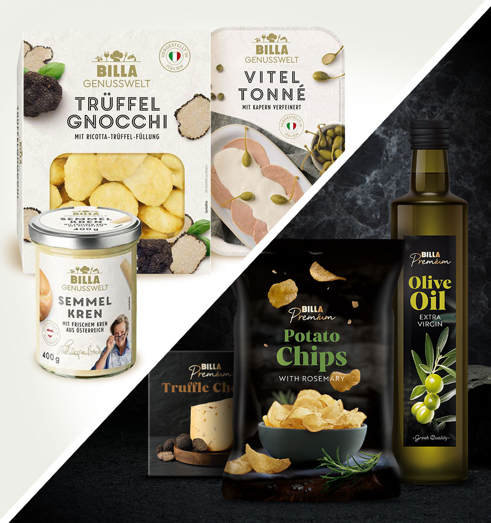
These designs differ significantly from each other, because they are meant to function on different markets and speak to different consumers. There isn't a single accidental element here. Perhaps that's exactly why Billa Premium sells brilliantly and recently also won an award at the European Private Label Awards, where the judges praised the ‘stylish design and photography’ used on the packaging, as well as the ‘effective use of storytelling’ to emphasise the product's origin.
Let's remember that our task is to design packaging that speaks to the hearts of the audience and perfectly achieves the intended goals – whatever ‘premium’ that might be 😉