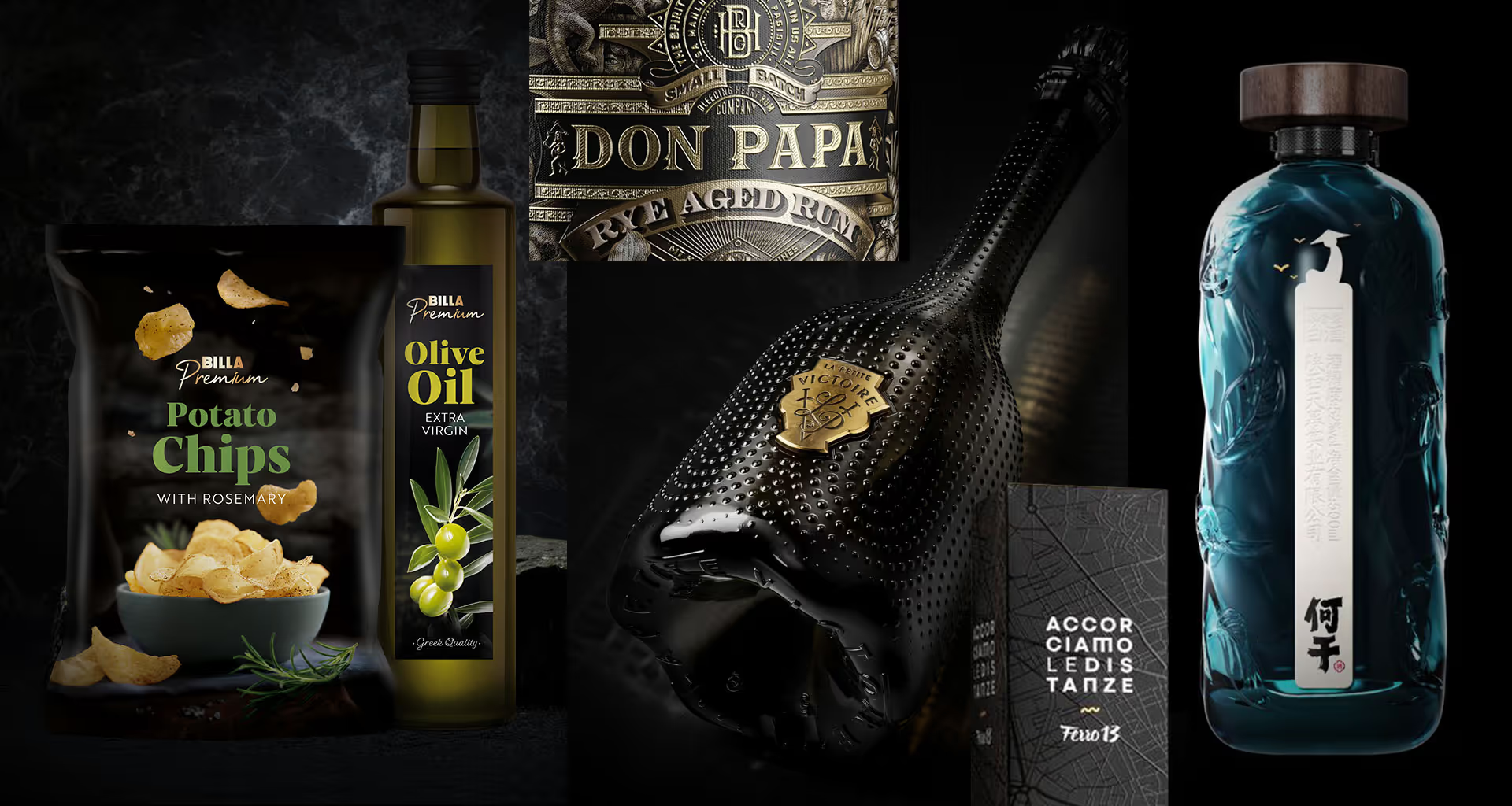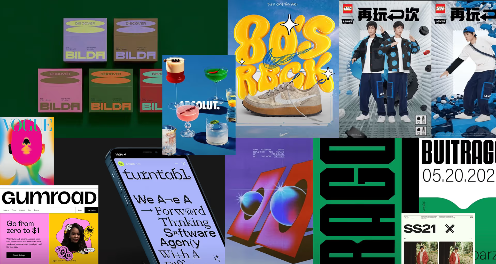
Neo-Brutalism
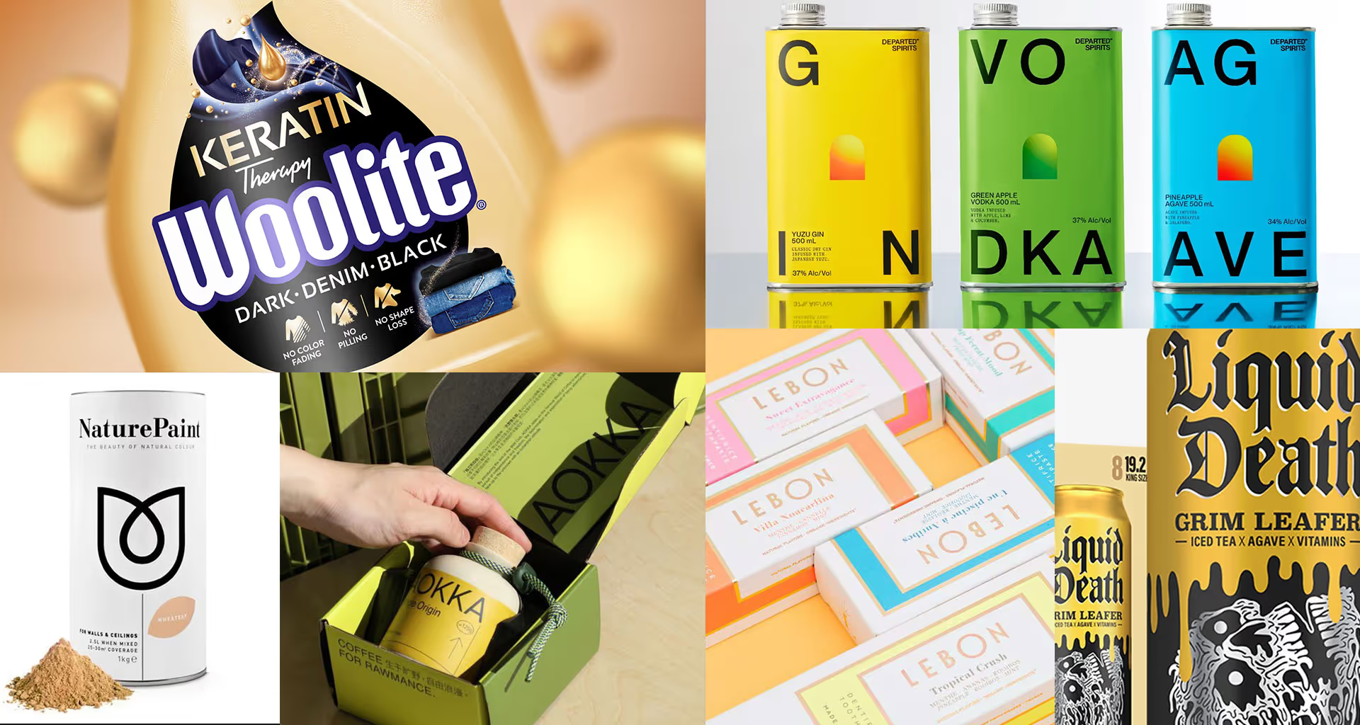
It is characterised by raw minimalism and strong contrasts. The pure black of bold typography and text blocks is set against vivid design colours.
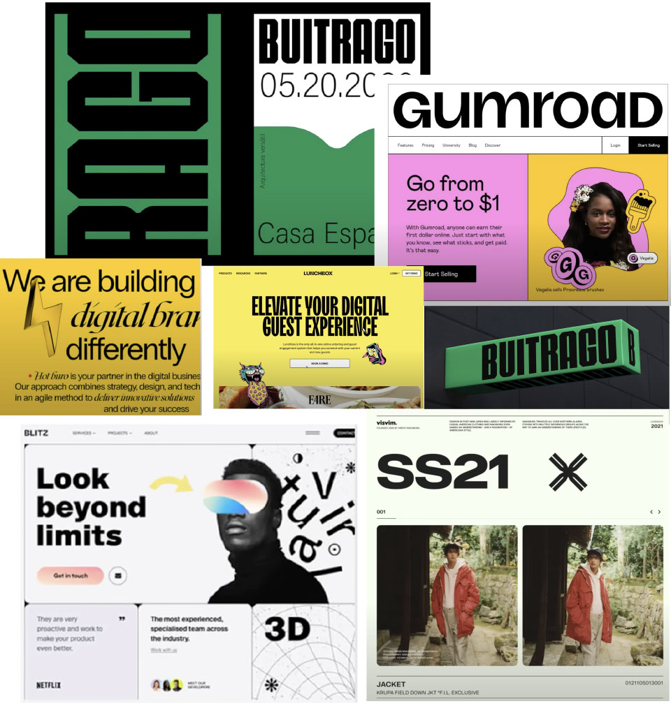
Illustration à la the 90s
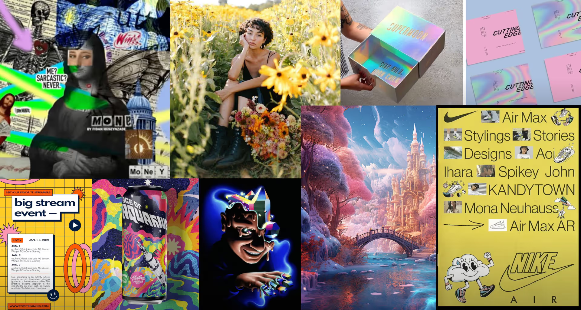
A nostalgic illustration trend inspired by the 1990s. Simple forms, plenty of flat planes, a characteristic grain texture and the muted colour palette typical of that era.
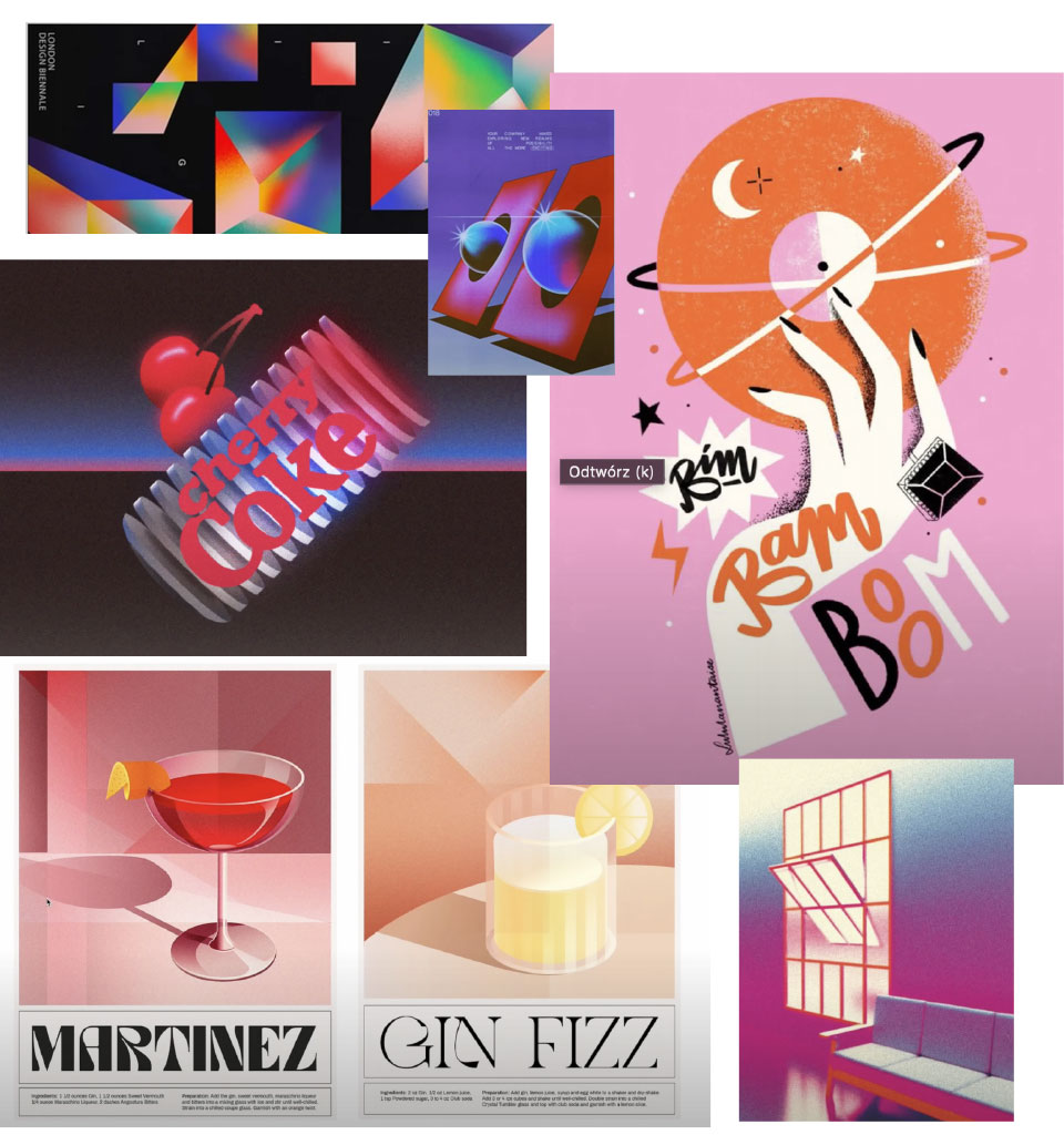
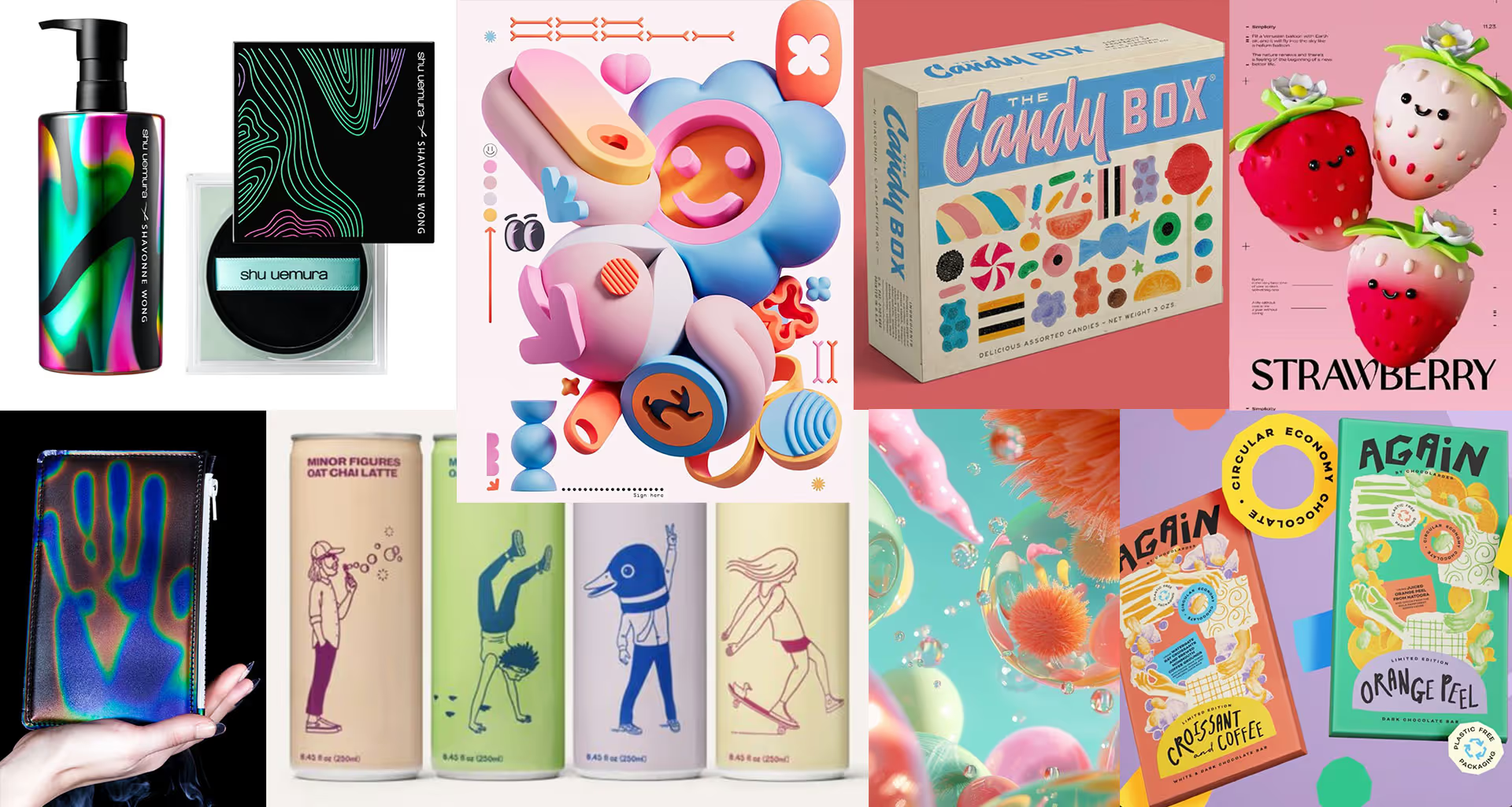
Geometric shapes
Simple geometric shapes plus bold colour combinations. Packaging designs where a distinctive form takes up most of the front stand out brilliantly on the shelf.
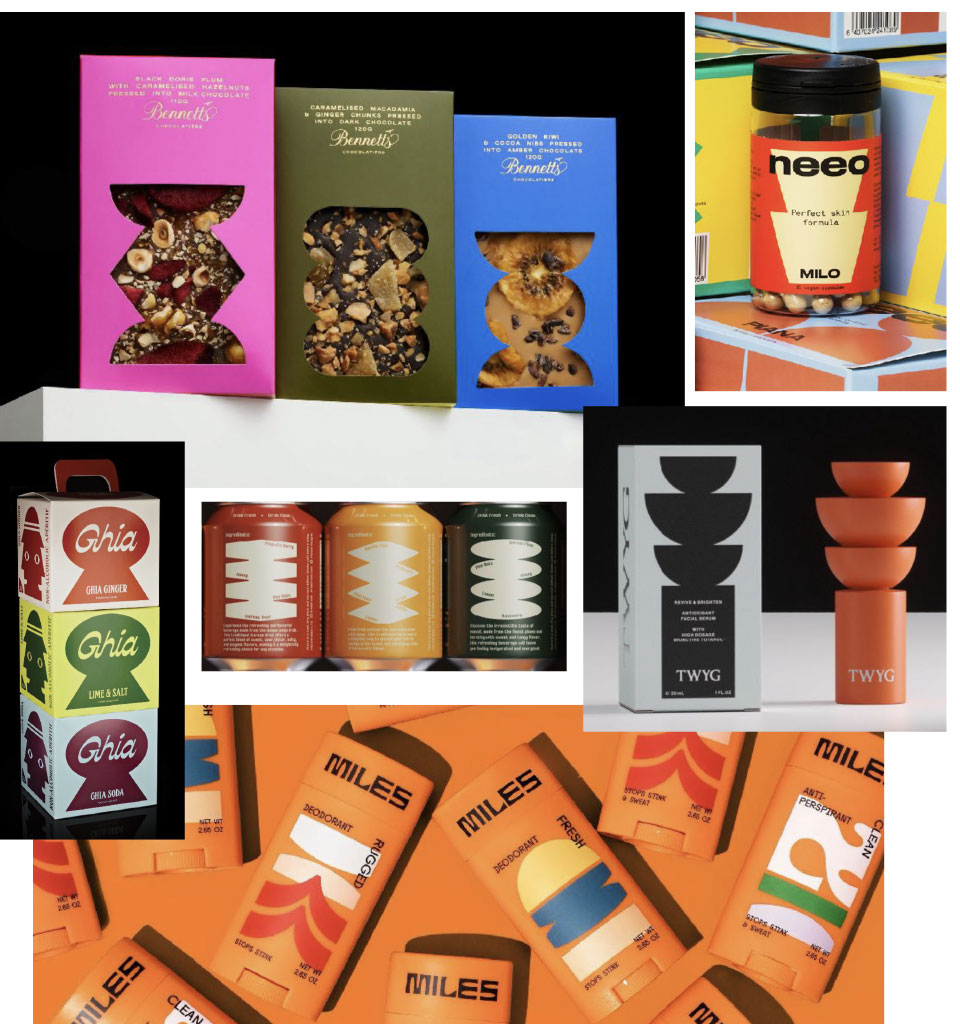
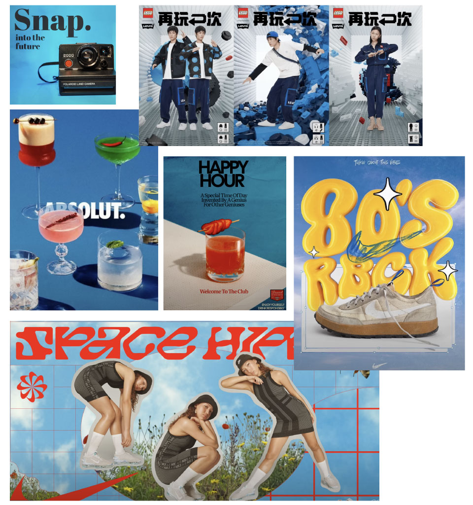
Nostalgia of the 80s / 70s
Large, expressive typography paired with photography. Less contrasty than before, with simple shots, less stylised, more realistic (in line with social-media trends).
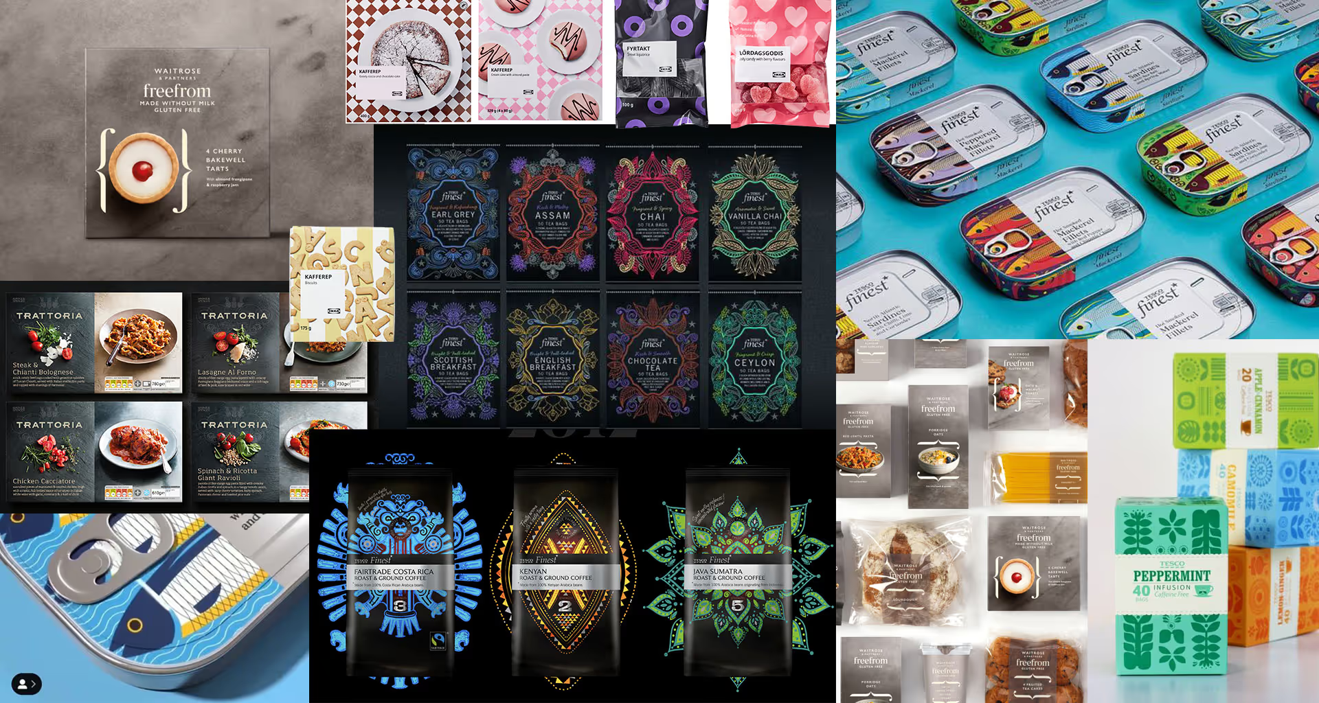
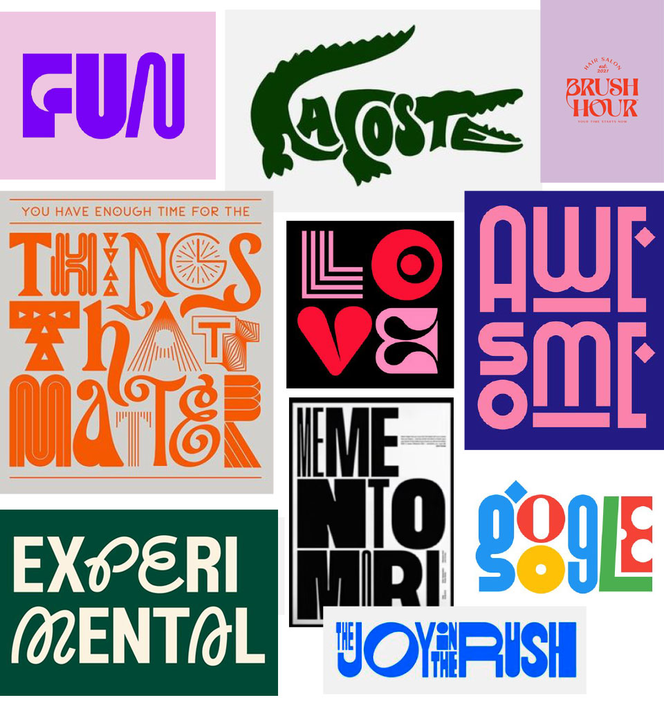
Playing with typography
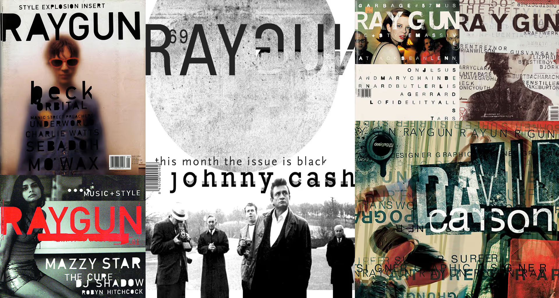
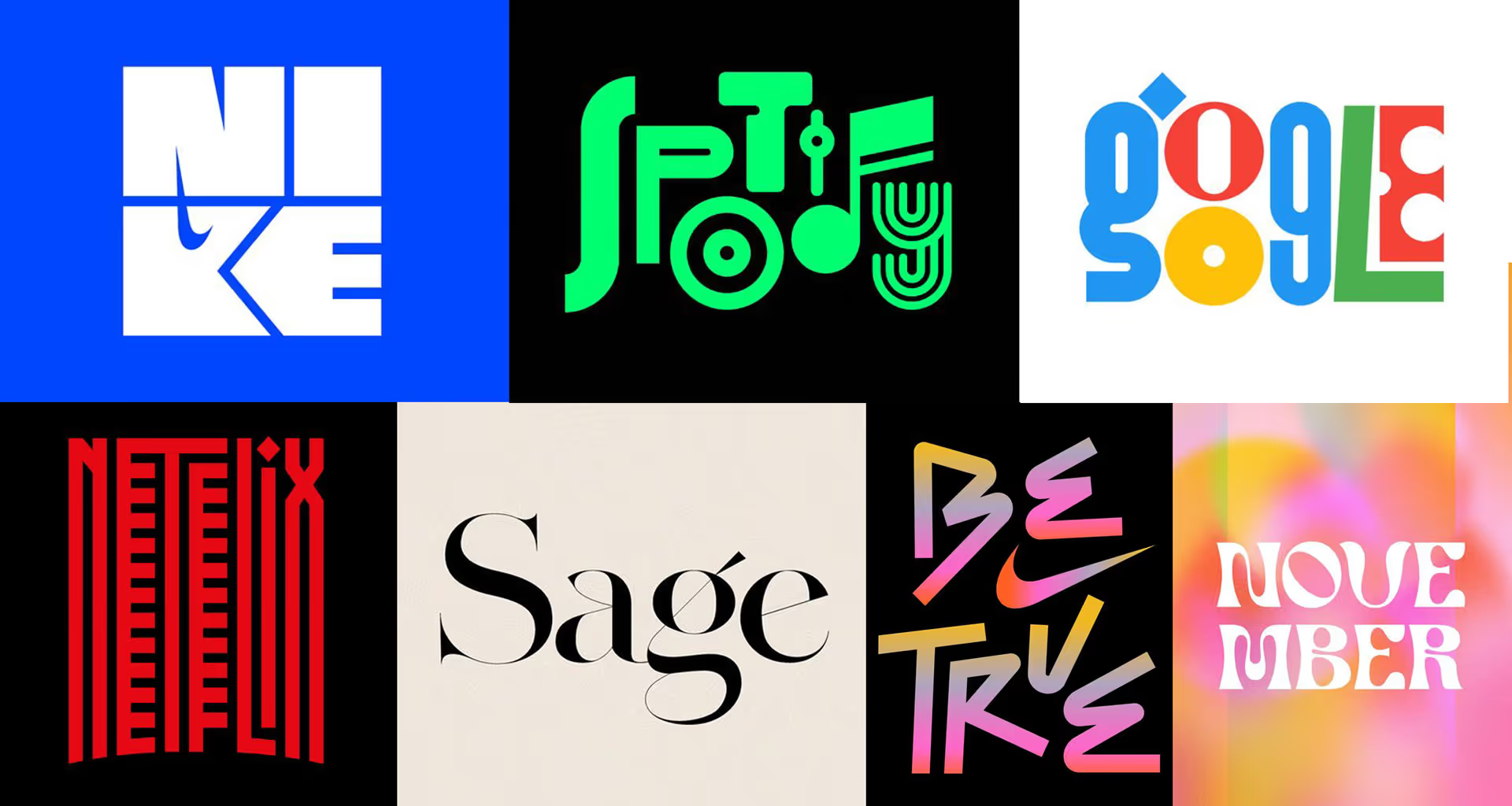
Enough with boring typography! This is a trend I already wrote about at the end of last year. It is still developing dynamically. In my view, it is one of the trends most worth watching.
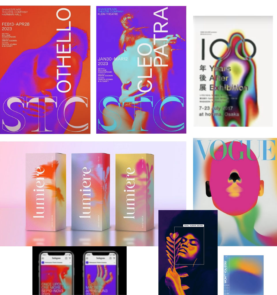
Heat mapping
We've already had a craze for gradients; now it isn't fading at all but evolving. Gradients are taking on a new, figurative form, creating something like heat mapping.