It's 1993. The internet is just beginning to crawl, Photoshop is available on floppy disks in version 2.5. A colour 17“ monitor for the Mac costs the equivalent of around €8,000. The average widely available hard drive has 80 MB of capacity.
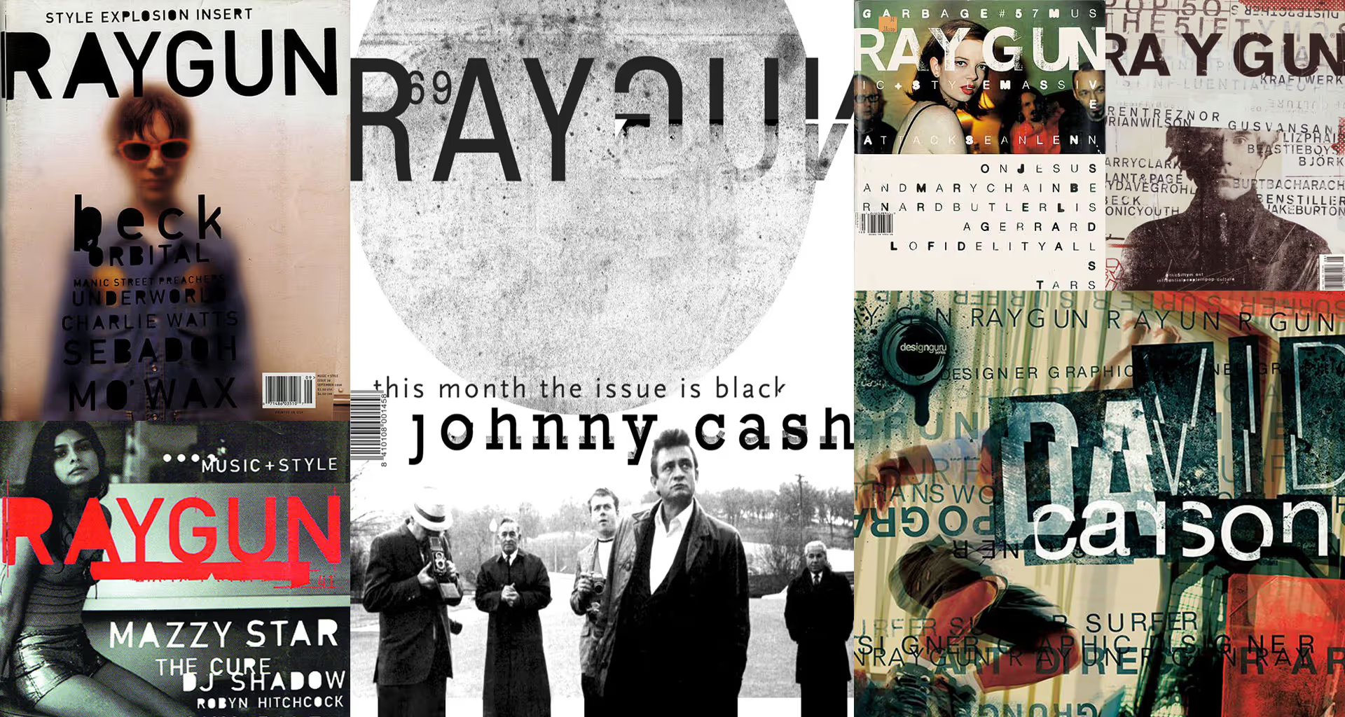
In music, grunge reigns; the same is true in design and typography. The bible and inspiration of all graphic designers wanting to be ‘in’ is the American monthly RayGun, published since 1991, whose art director is David Carson – an absolute superstar and guru of graphic design at the time. A man who completely revolutionised typography by breaking all the rules that applied until then, taking lettering to a whole new level.
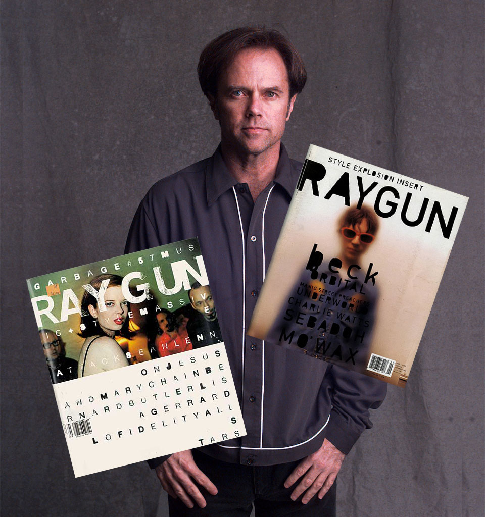
At exactly that time, every new issue of RayGun bought at the international-press kiosk at Hamburg's main station is feverishly passed from hand to hand in the creative department of the JUST advertising agency in Hamburg, where I am Art Director. To be honest, we were all incredibly jealous back then that those people in California had the chance to make such fantastic things, while we were condemned to our conservative agency routine.
‘The label is to be avant-garde and unlike anything that exists on the market so far. There is no name – invent a new one. No other constraints. The whole thing is to be ready by tomorrow.’
One day, I receive a new brief. It comes from an agency client, the Browary Wielkopolski LECH brewery – later taken over by Kompania Piwowarska.
The brewery has a large quantity of beer that was ordered and not collected by some contractor of theirs from the East. They have to get this beer onto the market as fast as possible and need a new brand a.s.a.p., because this particular type can't be sold under any of the brands they already have in their portfolio.
The only person in the agency with any sort of ‘experience’ with packaging is me – I once made pizza packaging for a friend from university, and on top of that I'm Polish. That's why the task lands on my desk. The same desk on which, next to the Macintosh II with the 13-inch black-and-white monitor I worked on, lay the latest issue of RayGun.
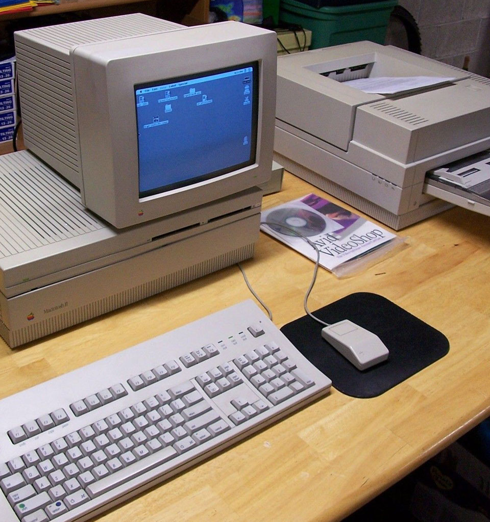
The brief boiled down to practically one sentence: a standard die-cut and the 0.5l bottle from Lech Pils. The label is to be avant-garde and unlike anything that exists on the market so far. There is no name – invent a new one. No other constraints. The whole thing is to be ready by tomorrow.
‘In the blink of an eye, I made a decision: I'll make Lech a Carson.’
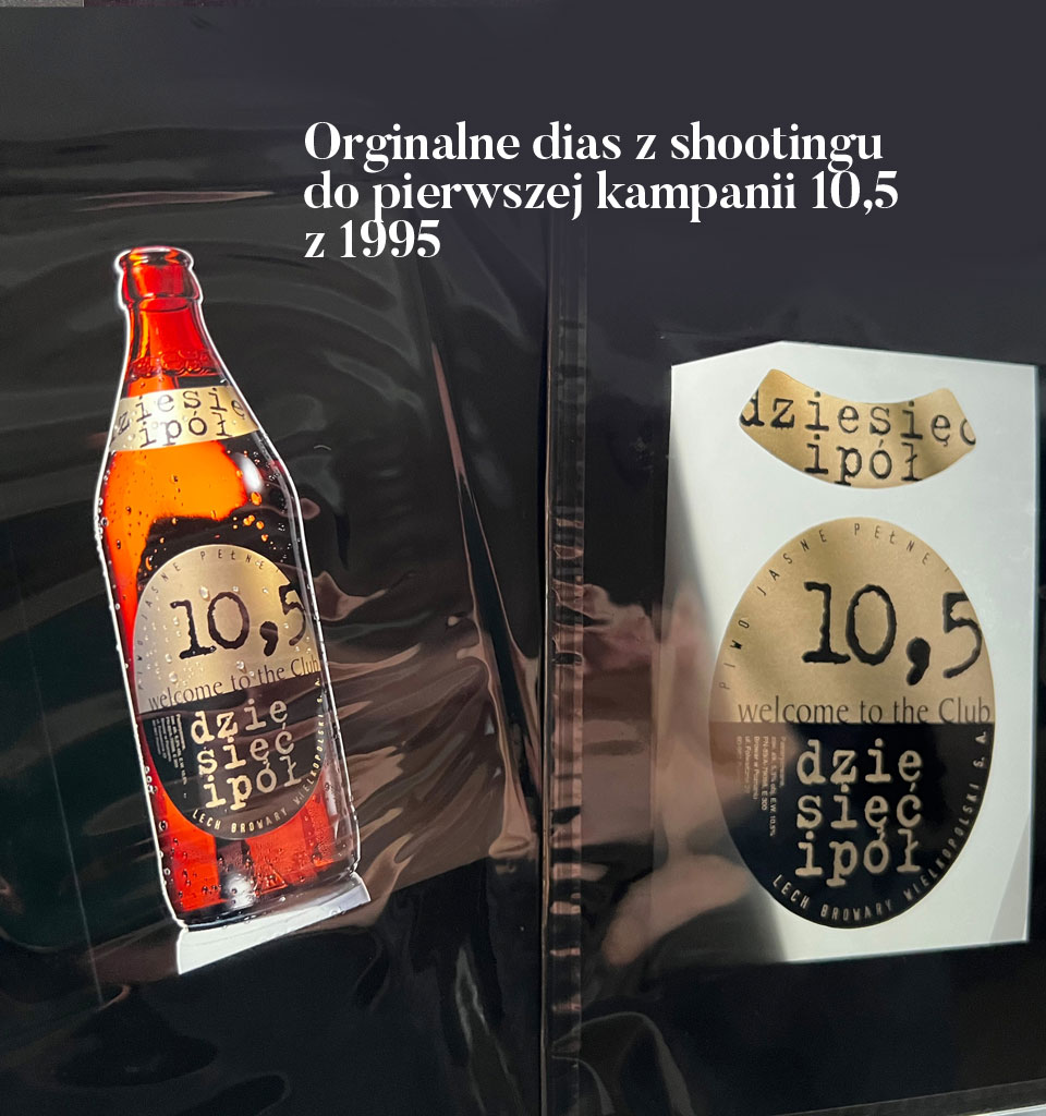
Because I was given complete freedom, in the blink of an eye I made a decision: I'll make Lech a Carson. – the name 10,5 is the amount of extract given in the beer's composition, welcome to the club – was meant to suggest exclusivity, the Trixi typeface – in which I set 10,5 in a block – is the quintessence of grunge, and the division of the label into two parts is inspired by the RayGun cover. All of it in black and gold, to add quality. Done. The whole creative process took maybe 2 hours.
The next morning, I presented the design to my boss. He grunted: hmm – not bad, but it won't fly. As it later turned out, he did decide to show it to the client after all. What happened next is history now, and the most successful launch of a new beer brand in Poland. Ever.
‘Inspired by Carson's work and grunge, the beer packaging is still present on the market in its original form 30 years after its debut.’
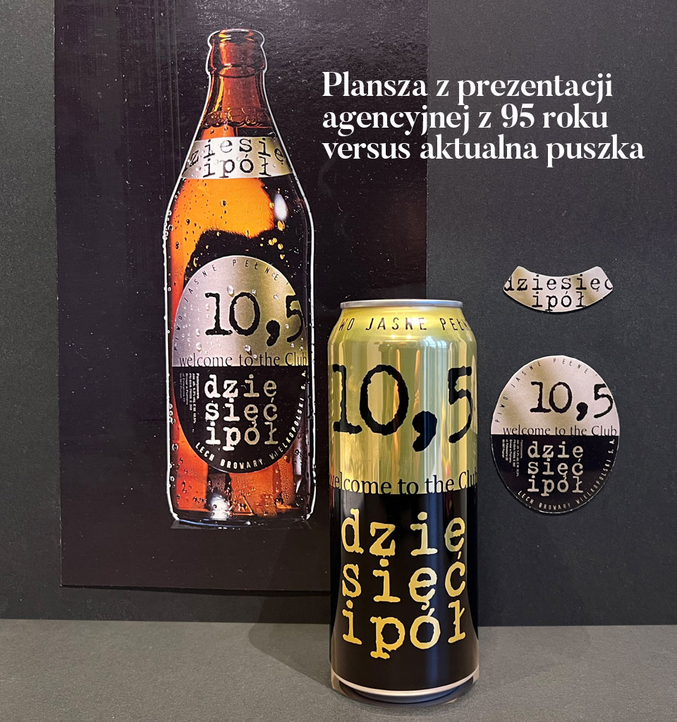
However, what makes this story truly interesting is the fact that, inspired by Carson's work and grunge, the beer packaging is still present on the market in its original form 30 years after its debut – available, for example, in every Żabka. For a while, the word ‘welcome’ in the claim was changed to ‘back’. At the moment, it corresponds 100% to the original.
It's fair to say that this is the only packaging on the Polish market that has survived 30 years practically unchanged and that still remains current and sells – if it were otherwise, it would have disappeared from the shelves forever long ago.
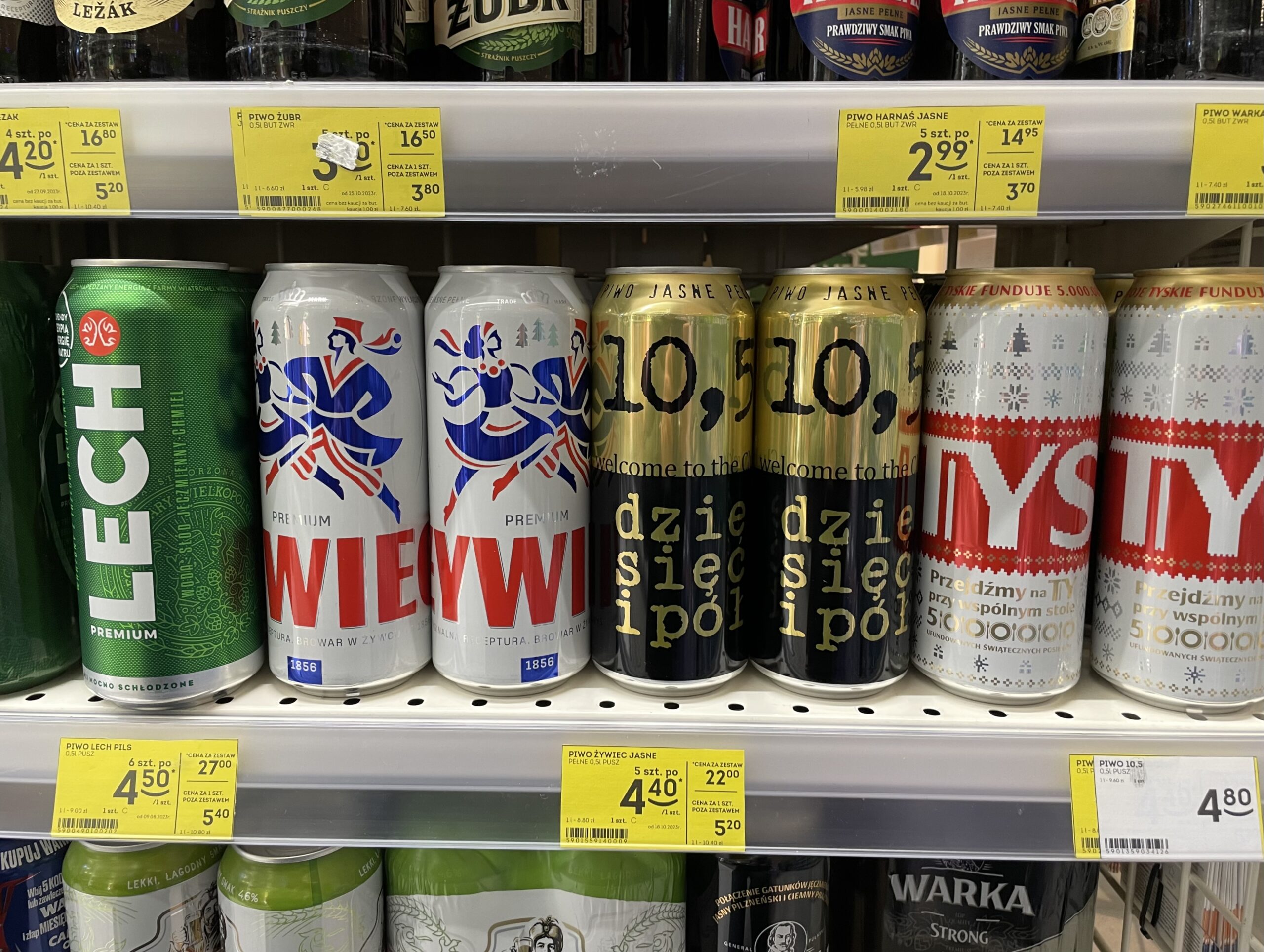
It is surely also the only ‘current’ packaging in the world in which a fascination with Carson's typography, the RayGun aesthetic and the trends of the early 90s has withstood the test of time, still lives on – and with every can of 10,5 sold, that life after life grows longer.