Woolite. We assure the Woo effect!

Brand visual identity / Packaging / Structural design consultations / Portfolio / Communication

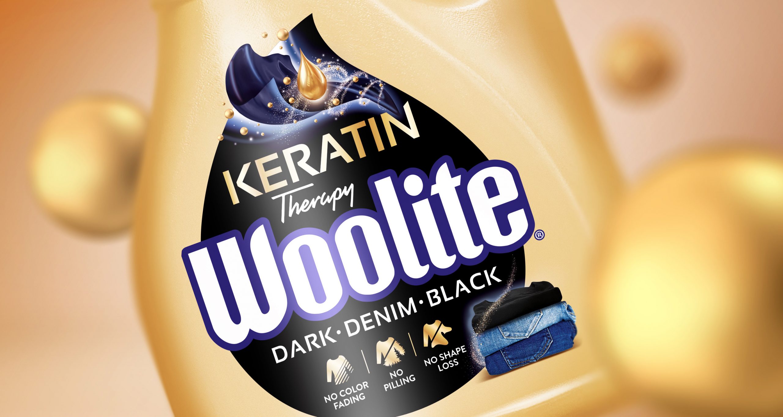
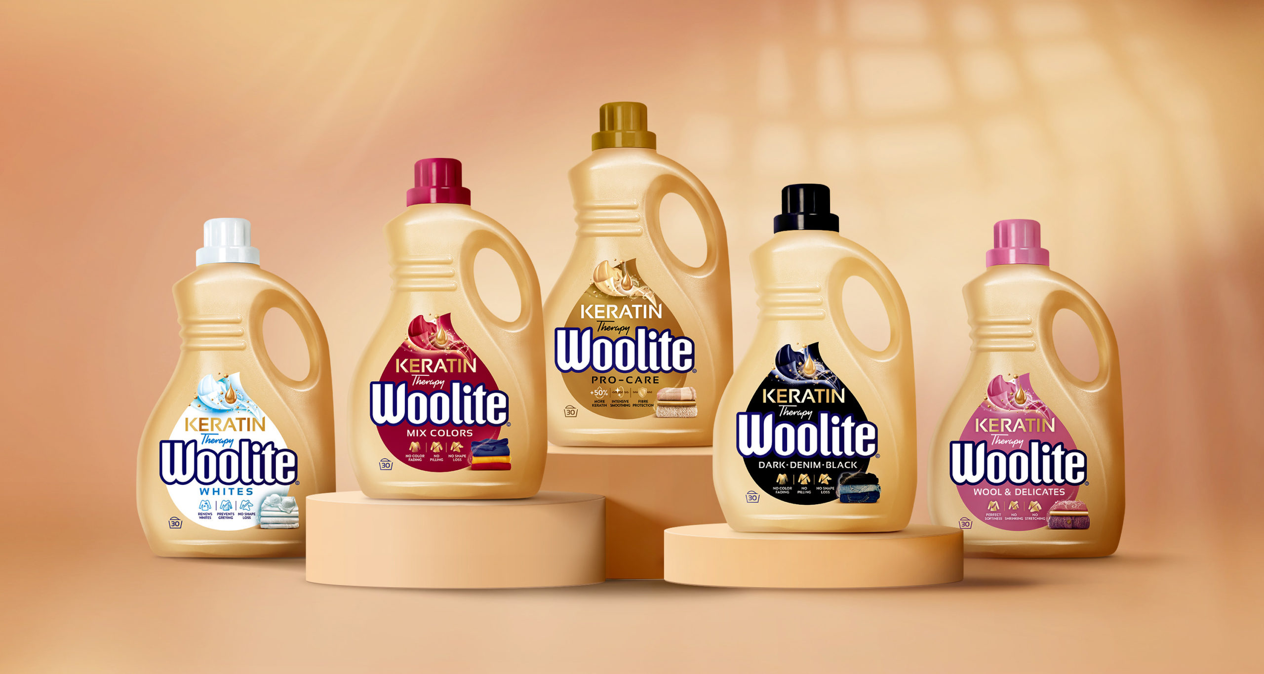
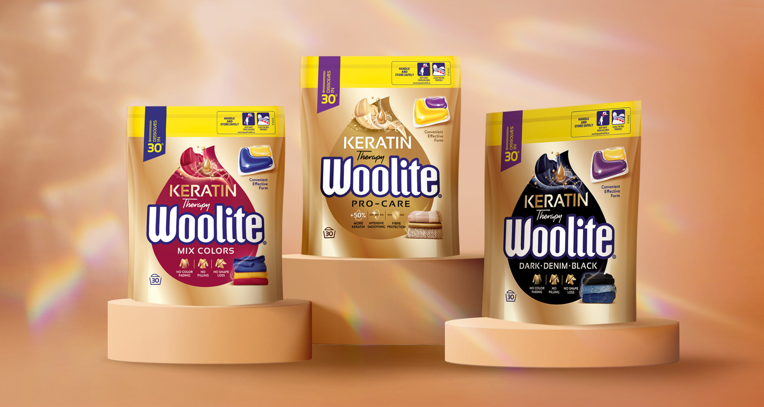
Woolite is a top brand in the category of gentle detergents. Our client wanted to refresh the brand identity by implementing new strategy and new positioning. We like such projects. What are the results?

Our task was to redesign Woolite packaging basing on a new brand positioning concept and create an aspiring visual identity, more associated with the premium segment. The brand should gain a modern touch and communicate the main benefits, so that it can stand out on the shelf from similar, competing products.

We effectively encouraged the client to make a thorough and bold change. We started with a structural packaging. We proposed one consistent color of the bottles. Thanks to this we have built a dedicated, distinctive color block on the shelf. Then a label was created that visually stands out from the standard solutions. The shape of a drop additionally draws attention to the main benefit of the brand – the keratin. The whole thing gained a new shine and elegant style thanks to subtle decorations and illustrations. Nevertheless, with the benefits visible on the label, the brand maintained its image as an expert in delicate laundry. Finally, we were asked to create all brand outside communication – consistent with the packaging design, positioning, strategy and target.
Woolite it a perfect example of design integrated by us in every aspect.