Orial. Maximum minimalism.
Creation of a new brand / Visual identification / Typography / Iconography / Packaging / Portfolio
Electrolytes are a popular form of supplements gaining more and more market and consumer interest in Poland. An active lifestyle, support for the body or simply the need to quickly replenish vitamins and minerals have made the electrolyte market already highly saturated.
USP Zdrowie, our long-term partner, has decided to introduce a new brand in the electrolyte category to the market. We conducted a comprehensive market analysis and the conditions for entering the new brand. Competitive products are projects often filled with content and graphics. This makes them hardly distinguishable and the category itself, despite the characteristic offer, is monotonous and conservative. We decided to offer our client something else…
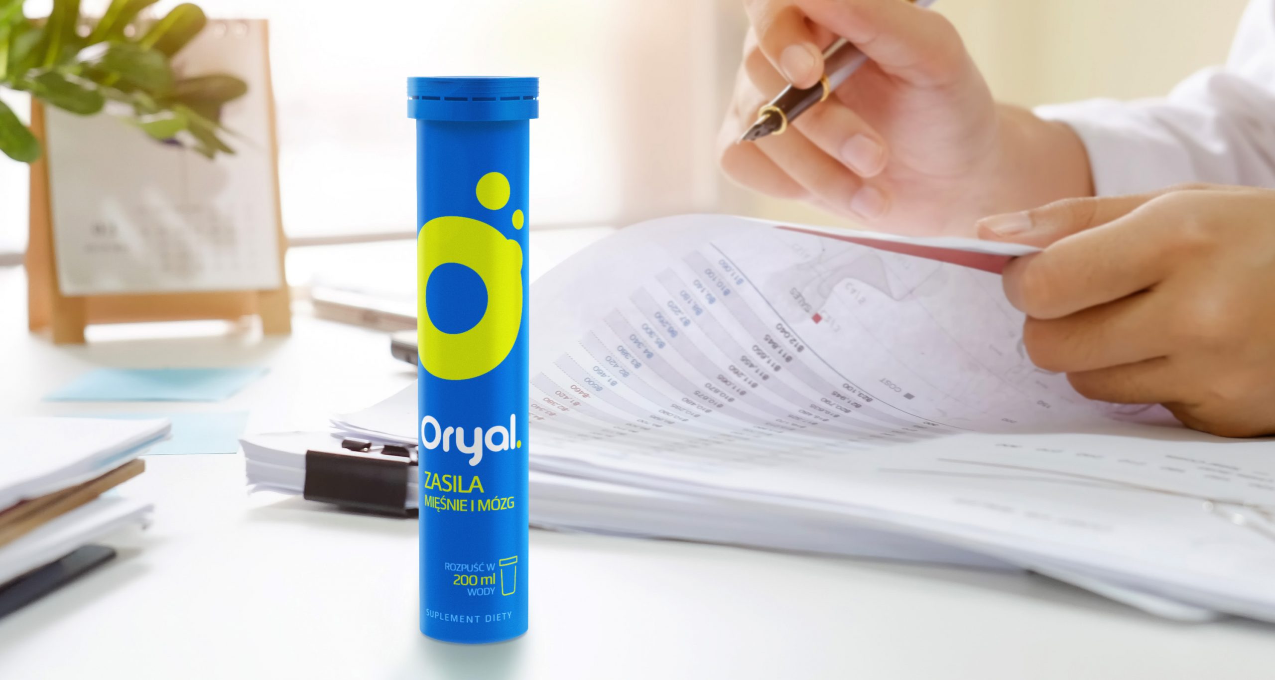
A new brand and a new approach to branding. In design, we focused on minimalism. A strong, uniform colour for the brand and contrasting for the variants together form a duo that has never been seen before on the shelves. The whole thing is completed by hand-made typography of names and simple icons. The large brand logo draws attention and makes it easy to distinguish.
We wanted the symbol to be simple, unique and easily associated with the form of the product. At first glance, Oryal is a medical and modern product.